Graphic Designing
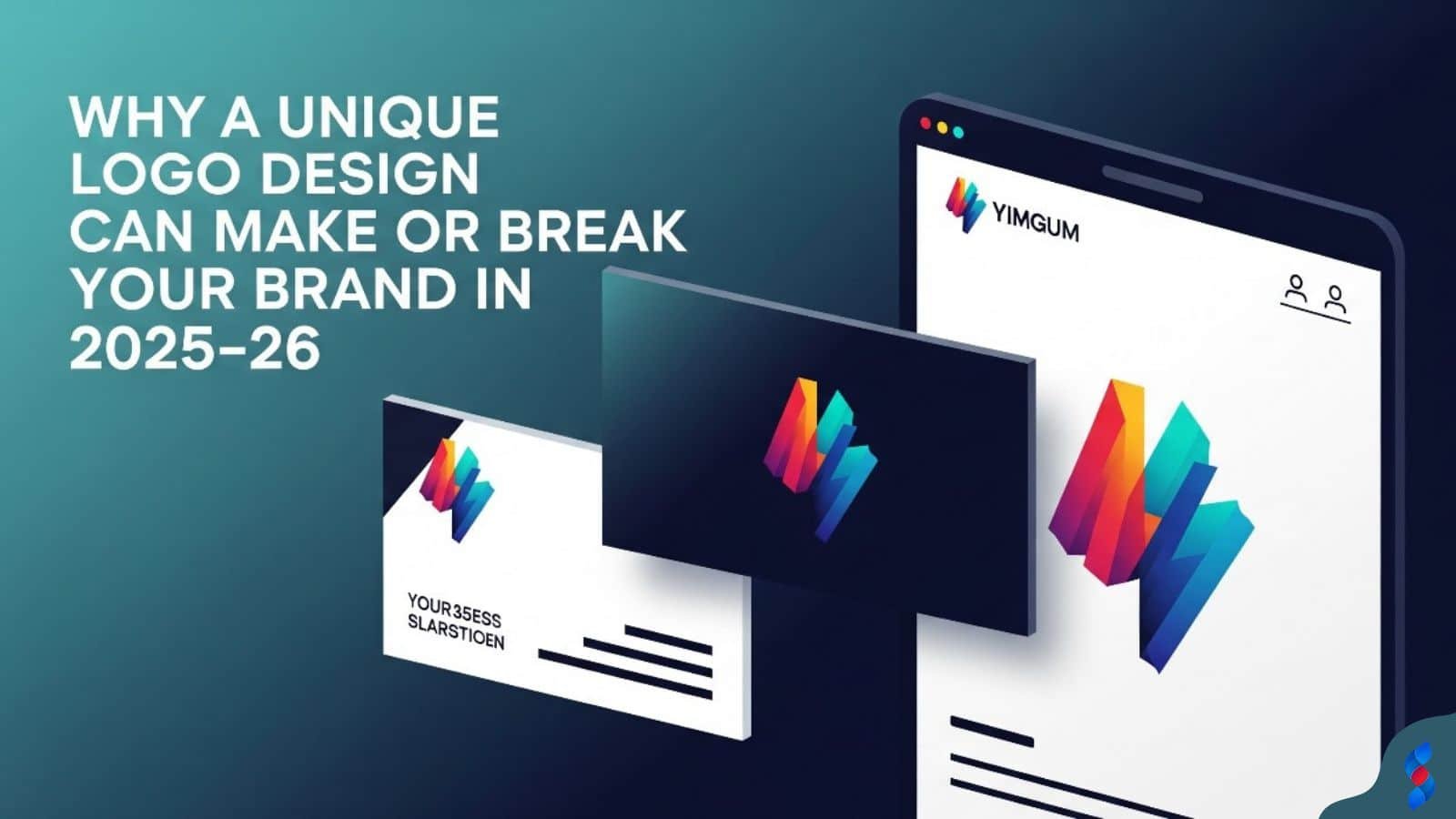
Why a Unique Logo Design Can Make or Break Your Brand in 2025–26
Why a Unique Logo Design Can Make or Break Your Brand in 2025–26: In today’s hyper-digital world, where first impressions are everything and brand identity...
Need help? Call us:
+92 320 1516 585
Graphic design is a powerful tool that shapes how we perceive the world, influences our decisions, and communicates messages effectively. However, even the most talented designers can fall victim to common graphic design mistakes. Recognizing and avoiding these pitfalls is crucial for creating impactful and professional designs. In this article, we’ll explore some of the most prevalent graphic design mistakes and provide proven fixes to help you elevate your work in 2026. We at SkySol Media have put together the ultimate list for 2026 to make sure your projects shine.
💡 Visual hierarchy is the arrangement of elements in a design to guide the viewer’s eye and emphasize important information. When a design lacks a clear visual hierarchy, it becomes confusing and ineffective. A solid understanding of visual hierarchy is crucial for effective communication through design.
Designers often fail to establish a dominant element, leaving viewers unsure where to focus their attention first. This can lead to a scattered and unfocused viewing experience, where the message gets lost in the noise. Without a focal point, the viewer’s eye wanders aimlessly, making it difficult to grasp the key message or call to action.
Solution: Prioritize elements based on importance, using size, color, contrast, and placement to guide the eye. Make the most important element the largest, brightest, or most prominently placed. Employ techniques like the use of leading lines to draw the eye towards the focal point. We have seen significant improvements with clients in Lahore when implementing a strong focal point strategy in their marketing materials.
Applying visual hierarchy inconsistently throughout a design creates confusion and weakens its overall impact. A strong hierarchy needs to be implemented throughout the entire composition, not just in certain sections. When elements of similar importance are treated differently, it disrupts the flow and makes it difficult for viewers to understand the relationships between different parts of the design.
Solution: Establish a clear hierarchy system and adhere to it consistently. Use a combination of size, color, typography, and placement to differentiate between primary, secondary, and tertiary elements. Ensure that the hierarchy is maintained across all pages or screens of a design. For instance, using different font sizes for headings, subheadings, and body text, and sticking to those sizes throughout the design.
Cramming too many elements onto a page negates any attempt at hierarchy, making the design feel cluttered and overwhelming. An overcrowded design feels busy and chaotic, making it difficult for viewers to focus on any single element. This negatively impacts the overall user experience and can lead to a loss of engagement.
Solution: Practice restraint, using white space to create breathing room and improve readability. Remove any unnecessary elements that don’t contribute to the overall message. White space, also known as negative space, is an essential design element that helps to separate and highlight important elements. For many of our clients, here in Lahore, we’ve seen that less is often more when it comes to design.
✨ Typography plays a crucial role in conveying a message effectively. Poor typography mistakes can undermine even the most visually appealing designs. Selecting the right fonts and using them appropriately is essential for creating a professional and readable design.
Choosing fonts that are difficult to read, regardless of their aesthetic appeal, hinders communication. Ornate or overly stylized fonts can be visually appealing but often sacrifice readability, especially in large blocks of text. This can frustrate viewers and prevent them from fully understanding the message.
Solution: Prioritize readability, especially for body text. Test fonts across different sizes and mediums. Stick to classic, legible fonts like Arial, Helvetica, Times New Roman, or Georgia for body text. Use more decorative fonts sparingly for headings or accents, but always ensure they are still easy to read.
Combining too many fonts creates a disjointed and unprofessional look. A design with too many fonts appears chaotic and lacks visual harmony. It can also distract viewers and make it difficult to focus on the message.
Solution: Limit the number of fonts to a maximum of two or three, and ensure they complement each other. Use one font for headings and another for body text. Choose fonts that have different weights and styles to create visual interest without adding too many different fonts.
Neglecting kerning (spacing between letters) and leading (spacing between lines) significantly impacts readability and visual appeal. Incorrect kerning can make words look unbalanced and difficult to read, while improper leading can make text feel cramped or too spaced out. These details are essential for creating a polished and professional design.
Solution: Pay close attention to these details, adjusting them as needed to create even and visually pleasing text. Kerning and leading are often adjusted in design software like Adobe Illustrator or InDesign. Even small adjustments can make a significant difference in the overall readability of the text.
✅ The color palette is a crucial aspect of design, influencing mood, conveying meaning, and creating visual appeal. Mistakes in color selection can detract from the overall effectiveness of a design. Thoughtful color choices are essential for impactful design.
Selecting colors that clash or are visually jarring creates an unpleasant viewing experience. Colors that are too similar can also create a monotonous and uninteresting design. Understanding color theory is crucial for creating harmonious and visually appealing color palettes.
Solution: Use color theory principles to create harmonious palettes. Tools like Adobe Color can help. Experiment with different color combinations to find the ones that best suit your brand and message. Consider the emotional impact of different colors and choose them accordingly.
Using colors randomly throughout a design without a clear purpose undermines brand identity and visual consistency. Inconsistent color use can make a design look unprofessional and disjointed. It can also confuse viewers and weaken brand recognition.
Solution: Develop a brand color palette and adhere to it strictly, using colors strategically to convey meaning and reinforce brand identity. A brand color palette should consist of a primary color, a secondary color, and a few accent colors. These colors should be used consistently across all branding materials.
Failing to consider color contrast for users with visual impairments makes content inaccessible to a significant portion of the audience. This is a critical oversight that can exclude a significant portion of the audience. Ensuring accessibility is not just ethical, it’s also good business practice.
Solution: Ensure sufficient color contrast between text and background, following WCAG guidelines. There are many online tools that can help you check the color contrast ratio of your designs. Aim for a contrast ratio of at least 4.5:1 for normal text and 3:1 for large text.
➡️ Image quality can significantly impact the perceived professionalism of a design. Using low-resolution images or improperly resizing images can detract from the overall impact. High-quality images are a must for creating visually appealing designs.
Using low-resolution images results in pixelated and unprofessional-looking visuals. Pixelated images appear blurry and lack detail, making the design look cheap and unprofessional. This can negatively impact the viewer’s perception of the brand or message.
Solution: Always use high-resolution images suitable for the intended output size. Use images with a resolution of at least 300 DPI for print and 72 DPI for web. When scaling images, make sure to maintain their original aspect ratio to avoid distortion.
Distorting images by stretching them out of proportion creates a distorted and unprofessional appearance. Stretching images can make them look unnatural and visually unappealing. This can detract from the overall quality of the design and make it look amateurish.
Solution: Maintain the original aspect ratio of images when resizing them. Use design software like Adobe Photoshop or Illustrator to resize images proportionally. Avoid stretching or skewing images to fit a specific space.
Using unoptimized images increases page load times and degrades user experience, especially online. Large image files can significantly slow down website loading times, leading to a poor user experience. This can increase bounce rates and decrease engagement.
Solution: Compress images without sacrificing quality to reduce file size. Use image optimization tools to compress images without losing too much quality. Choose the appropriate file format for the image (e.g., JPEG for photos, PNG for graphics with transparency).
✅ Consistent branding is essential for building brand recognition and establishing a strong brand identity. Inconsistent branding can confuse viewers and weaken the brand’s message. Brand consistency builds trust and recognition with your audience.
Failing to adhere to established brand guidelines creates a fragmented and inconsistent brand identity. Brand guidelines are a set of rules and standards that dictate how the brand should be represented visually. Deviating from these guidelines can weaken brand recognition and create confusion.
Solution: Always consult brand guidelines before starting a design project. Ensure that you are using the correct logo, colors, fonts, and imagery. If you are unsure about any aspect of the brand guidelines, ask for clarification.
Using outdated logos, colors, or fonts weakens brand recognition and creates a dated impression. Using outdated brand assets can make the brand appear out of touch and irrelevant. This can damage the brand’s credibility and reputation.
Solution: Ensure you are using the most current brand assets. Regularly update brand assets to reflect the brand’s current image and values. Communicate any changes to brand assets to all stakeholders.
Failing to consider the target audience’s preferences when designing visual elements. Designs that don’t resonate with the target audience are unlikely to be effective. Understanding the target audience is crucial for creating designs that are relevant and engaging.
Solution: Conduct research to understand the audience and tailor the design accordingly. Consider their demographics, interests, and preferences. Use this information to inform your design choices.
➡️ White space, also known as negative space, is the empty space around and between elements in a design. It is an essential design element that helps to create balance, improve readability, and highlight important elements. Neglecting white space can lead to cluttered and overwhelming designs.
Overfilling the design with elements leaves no room for the eye to rest, resulting in a visually overwhelming experience. Cluttered layouts can make it difficult for viewers to focus on the message. This can negatively impact the user experience and lead to a loss of engagement.
Solution: Embrace white space as a design element, using it to create balance and improve readability. Remove any unnecessary elements that don’t contribute to the overall message. Use white space to separate and highlight important elements.
Inconsistent spacing around elements creates a haphazard and unprofessional appearance. Inconsistent margins and padding can make a design look sloppy and unorganized. This can detract from the overall quality of the design and make it look amateurish.
Solution: Establish consistent margins and padding to create a clean and structured layout. Use a grid system to ensure consistent spacing between elements. Pay attention to detail and make sure that all elements are aligned properly.
Neglecting to use white space to separate elements makes it difficult for viewers to distinguish between them. This can lead to confusion and make it difficult for viewers to understand the message. White space is essential for creating clear visual separation.
Solution: Use white space strategically to create clear visual separation. Use white space to separate headings from body text, images from text, and different sections of the design. This will make the design easier to read and understand.
✨ The design process should be iterative, involving feedback and refinement. Ignoring feedback and failing to iterate can lead to designs that are not as effective as they could be. Feedback is essential for identifying flaws and improving the design.
Failing to seek feedback from others can lead to overlooking flaws and missed opportunities for improvement. It’s easy to become too attached to your own designs and miss obvious flaws. Getting feedback from others can help you see your designs from a fresh perspective.
Solution: Share designs with colleagues, clients, or target users for feedback. Be open to hearing their opinions and suggestions. Use their feedback to refine and improve your designs.
Being defensive about design choices prevents growth and improvement. Criticism can be difficult to hear, but it is essential for growth and improvement. Resisting criticism will only prevent you from becoming a better designer.
Solution: Be open to constructive criticism and use it as an opportunity to refine your designs. Listen carefully to the feedback and try to understand the other person’s perspective. Don’t take criticism personally; instead, use it as a tool for improvement.
Stopping at the first iteration without exploring alternative solutions limits the potential of the design. The first iteration is rarely the best solution. It’s important to explore different options and iterate on your designs to find the best possible solution.
Solution: Be willing to experiment and iterate on designs based on feedback and testing. Try different layouts, color palettes, fonts, and imagery. Don’t be afraid to scrap your initial ideas and start over if necessary.
✅ A clear understanding of the project brief is crucial for creating designs that meet the client’s needs and objectives. Not understanding the brief can lead to designs that miss the mark and fail to achieve their intended purpose. The project brief is the foundation for successful design.
Failing to fully grasp the client’s objectives and requirements leads to designs that miss the mark. Misinterpreting the client’s needs can result in designs that are irrelevant or ineffective. This can lead to dissatisfaction and require significant revisions.
Solution: Ask clarifying questions and actively listen to the client’s needs. Document all requirements clearly. Make sure you have a clear understanding of the client’s goals, target audience, and desired message.
Infrequent communication with the client results in misunderstandings and delays. Lack of communication can lead to misinterpretations and prevent you from addressing the client’s concerns in a timely manner. This can delay the project and lead to dissatisfaction.
Solution: Maintain open and regular communication throughout the design process. Provide regular updates on your progress and seek feedback from the client at each stage. Be responsive to their questions and concerns.
Making assumptions about the client’s preferences or expectations can lead to incorrect design choices. Assumptions can be dangerous because they are often based on incomplete or inaccurate information. Always clarify any uncertainties with the client.
Solution: Always clarify any uncertainties by asking the client directly. Don’t be afraid to ask questions, even if you think they are obvious. It’s better to be safe than sorry.
➡️ While staying current with design trends is important, blindly following them can lead to designs that are generic and lack originality. Overusing trends can also make designs appear dated quickly. It’s important to strike a balance between trendy and timeless design principles.
Adopting every new trend without considering its relevance to the brand or target audience leads to designs that are generic and lack staying power. Trends come and go, so it’s important to choose them selectively and integrate them thoughtfully into the design. Blindly following trends can make your designs look like everyone else’s.
Solution: Choose trends selectively and integrate them thoughtfully into the design. Consider whether the trend aligns with the brand’s identity and values. Think about how the trend will be perceived by the target audience.
Focusing solely on trends while ignoring fundamental design principles results in designs that are visually appealing but lack substance. Timeless design principles like balance, contrast, and visual hierarchy are essential for creating effective and enduring designs. These principles are the foundation of good design, regardless of current trends.
Solution: Prioritize timeless design principles like balance, contrast, and visual hierarchy. Use these principles as a foundation for your designs and then incorporate trends selectively. This will help you create designs that are both current and enduring.
Heavily relying on fleeting trends can make designs appear outdated sooner than necessary. Designs that are heavily reliant on trends can quickly become obsolete as new trends emerge. This can require frequent redesigns and updates.
Solution: Aim for a balance between trendy and classic elements to create designs that are both current and enduring. Incorporate trends in a subtle and thoughtful way, while focusing on timeless design principles. This will help you create designs that will stand the test of time.
💡 In today’s digital landscape, mobile responsiveness is no longer optional; it’s essential. A significant portion of web traffic comes from mobile devices, making it crucial to ensure that designs are optimized for mobile viewing. Ignoring mobile responsiveness can lead to a poor user experience and lost opportunities.
Explanation: Many designers focus on desktop, forgetting the majority of users are on mobile. This can result in designs that are difficult to view and navigate on smaller screens. Mobile optimization is crucial for reaching a wider audience and providing a positive user experience.
Solution: Design mobile-first and test across multiple devices and screen sizes. This will ensure that your designs are optimized for the mobile experience. Consider using a responsive design framework to make it easier to create mobile-friendly designs.
Explanation: Tiny buttons or text links are hard to tap on a touchscreen. This can frustrate users and make it difficult for them to interact with the design. Touch elements should be large and easy to tap with a finger.
Solution: Ensure touch elements are large and easy to tap with a finger. Aim for a minimum touch target size of 44×44 pixels. Use clear and concise labels for touch elements.
Explanation: Slow-loading pages lead to high bounce rates and poor mobile UX. Mobile users are often on slower internet connections, making page load speed even more critical. Slow-loading pages can frustrate users and cause them to abandon the site.
Solution: Optimize images and code to reduce page load times on mobile devices. Compress images, minify CSS and JavaScript files, and leverage browser caching. Use a content delivery network (CDN) to distribute your content across multiple servers.
✅ Grid systems provide a framework for organizing elements in a design, ensuring alignment and consistency. Not using a grid system can lead to designs that look disorganized and unprofessional. Grid systems are essential for creating visually appealing and structured layouts.
Explanation: Elements placed haphazardly without a grid look unprofessional and messy. Lack of alignment can make a design look chaotic and difficult to read. Alignment is crucial for creating a clean and structured layout.
Solution: Use a grid system to align elements vertically and horizontally for a clean and structured layout. Choose a grid system that is appropriate for the type of design you are creating. Use the grid as a guide for placing elements and ensuring consistent spacing.
Explanation: Uneven column widths disrupt the visual flow and make the design look unbalanced. Inconsistent column widths can make a design look unprofessional and amateurish. Consistency is key for creating a visually appealing and balanced layout.
Solution: Maintain consistent column widths and gutters throughout the design. Use the grid system to ensure that all columns are the same width. Adjust the number of columns as needed to accommodate different types of content.
Explanation: Neglecting the baseline grid can cause text to appear misaligned, even if the overall layout is gridded. The baseline grid is a series of horizontal lines that are used to align text. Ignoring the baseline grid can make text look uneven and unprofessional.
Solution: Align text to the baseline grid to create a more polished and professional look. Use the baseline grid feature in your design software. Adjust the line height of your text to match the baseline grid.
✨ Properly exporting files is crucial for ensuring that they are displayed correctly and optimized for their intended use. Exporting files incorrectly can lead to poor image quality, compatibility issues, and increased file sizes. Attention to detail during the export process is essential.
Explanation: Using the wrong file format results in poor image quality or compatibility issues. Different file formats are designed for different types of content. Using the wrong file format can lead to a loss of quality or prevent the file from being opened on certain devices.
Solution: Choose the appropriate file format based on the intended use (e.g., JPEG for photos, PNG for graphics with transparency). JPEG is a good choice for photos because it offers good compression and relatively small file sizes. PNG is a good choice for graphics with transparency because it supports lossless compression.
Explanation: Exporting files with the wrong resolution can lead to pixelation or unnecessarily large file sizes. Resolution refers to the number of pixels in an image. Higher resolution images have more pixels and therefore more detail. However, higher resolution images also have larger file sizes.
Solution: Set the resolution based on the intended output (e.g., 300 DPI for print, 72 DPI for web). 300 DPI (dots per inch) is the standard resolution for print because it provides good image quality. 72 DPI is the standard resolution for web because it provides a good balance between image quality and file size.
Explanation: Failing to optimize files for web use increases page load times and degrades user experience. Large file sizes can significantly slow down website loading times, leading to a poor user experience. This can increase bounce rates and decrease engagement.
Solution: Compress images and other assets to reduce file size without sacrificing quality. Use image optimization tools to compress images without losing too much quality. Minify CSS and JavaScript files to reduce their file sizes.
| Mistake | Solution |
|---|---|
| Ignoring Visual Hierarchy | Prioritize elements based on importance. |
| Poor Typography Choices | Prioritize readability and limit font usage. |
| Color Palette Catastrophes | Use color theory principles and ensure accessibility. |
| Image Resolution Issues | Use high-resolution images and optimize them for the web. |
| Inconsistent Branding | Adhere to brand guidelines and use current assets. |
| Ignoring Mobile Responsiveness | Design mobile-first and optimize load speeds. |
“The best designs are often the simplest. Focus on clear communication and user experience, and the rest will fall into place.” – Paul Rand
Conclusion
Avoiding these graphic design mistakes is crucial for creating impactful, professional, and effective designs. By focusing on visual hierarchy, typography, color palette, image quality, branding consistency, and responsiveness, you can elevate your work and create designs that resonate with your audience. Remember that design is an iterative process, so be open to feedback and willing to experiment. By implementing these fixes, you can avoid common pitfalls and create designs that achieve their intended purpose. We at SkySol Media are confident that following these guidelines will help you create designs that stand out and achieve your goals.
FAQ Section
Q: What is the most important graphic design principle to keep in mind?
A: Visual hierarchy is arguably the most important principle. It dictates how viewers perceive and interact with your design, ensuring key messages are easily understood.
Q: How many fonts should I use in a design?
A: Limit yourself to a maximum of two or three fonts. Using too many fonts can create a disjointed and unprofessional look.
Q: How can I ensure my designs are accessible to users with visual impairments?
A: Ensure sufficient color contrast between text and background, following WCAG guidelines. There are many online tools that can help you check the color contrast ratio of your designs.
Q: What resolution should I use for images in my designs?
A: Use images with a resolution of at least 300 DPI for print and 72 DPI for web. This will ensure that your images look sharp and clear, regardless of the output medium.
Q: How important is it to adhere to brand guidelines?
A: Adhering to brand guidelines is essential for maintaining a consistent brand identity. This helps to build brand recognition and establish a strong brand presence.
Don’t forget to share it

We’ll Design & Develop a Professional Website Tailored to Your Brand
Enjoy this post? Join our newsletter
Newsletter
Related Articles
Why a Unique Logo Design Can Make or Break Your Brand in 2025–26

How Professional Graphic Design Boosts Your Brand Identity in 2025–26
Top 10 Reasons to Outsource Your Graphic Design Needs Today
Graphic Design SEO: 7 Amazing Ways to Boost Your Website in 2025
Graphic Design Skills: The Amazing 2025 Boost for WordPress Traffic
Ultimate Guide to Boosting WordPress Website Success with Graphic Design Experience in 2025