Graphic Designing
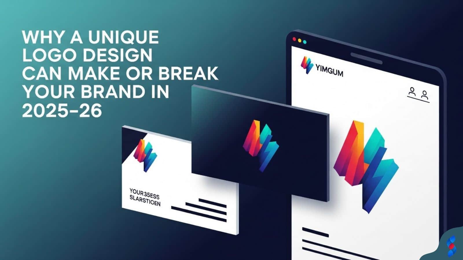
Why a Unique Logo Design Can Make or Break Your Brand in 2025–26
Why a Unique Logo Design Can Make or Break Your Brand in 2025–26: In today’s hyper-digital world, where first impressions are everything and brand identity...
Need help? Call us:
+92 320 1516 585
Graphic design thinking is revolutionizing how we approach visual communication and problem-solving in the design world. This methodology, which places user needs at its core, goes far beyond mere aesthetics; it’s a structured, iterative process that uses empathy, experimentation, and data to create effective and meaningful designs. In this guide, we’ll explore the fundamental principles of graphic design thinking, its practical application, and how it can drive quantifiable results for your projects.
Graphic design thinking isn’t just a trendy buzzword; it’s a powerful framework that blends creative strategy with analytical rigor. We’ll delve into its core tenets, emphasizing the shift from subjective aesthetics to objective problem-solving, backed by data and user insights.
Graphic design thinking is a human-centered, iterative problem-solving approach specifically applied to visual communication and design challenges. It emphasizes understanding the user’s needs, generating a wide range of ideas, prototyping solutions, and testing them rigorously. Unlike traditional design processes that might prioritize aesthetics above all else, graphic design thinking prioritizes creating designs that are both visually appealing and functionally effective.
At its heart, graphic design thinking is about empathy and understanding. It’s about placing yourself in the shoes of the user and understanding their pain points, motivations, and goals. This understanding then informs the entire design process, from initial ideation to final implementation. It fosters a collaborative environment where designers, stakeholders, and users work together to co-create solutions.
[IMAGE: A diagram illustrating the interconnectedness of empathy, experimentation, and data analysis in graphic design thinking.]
This approach allows for continuous improvement. The iterative nature of graphic design thinking means that designs are constantly being refined based on user feedback and data analysis. This ensures that the final product is not only visually appealing but also meets the needs of the user and achieves the desired business outcomes. Ultimately, graphic design thinking aims to create designs that are not only beautiful but also effective, user-friendly, and aligned with the goals of the organization.
Empathy is the cornerstone of graphic design thinking. It involves deeply understanding the needs, emotions, and motivations of the target audience. This goes beyond simply gathering demographic data; it requires designers to truly connect with users on a human level.
One way to cultivate empathy is through user research methods such as interviews, surveys, and observational studies. These methods allow designers to gather qualitative and quantitative data about users’ behaviors, preferences, and pain points. We once worked with a client who assumed their target audience preferred a minimalist design. However, through user interviews, we discovered that their audience actually valued a more visually rich and informative design.
Data-backed user understanding means that design decisions are informed by evidence rather than assumptions. For instance, analyzing website analytics can reveal which areas of a website are most frequently visited and which areas are causing users to drop off. This data can then be used to inform design changes that improve the user experience.
Consider a project where we, at SkySol Media, were tasked with redesigning a mobile app for a local charity. Our team in Dubai spent considerable time interviewing volunteers and beneficiaries to understand their needs. We discovered that many users struggled with the app’s navigation, leading to frustration and decreased engagement. By empathizing with these users, we were able to redesign the app with a simpler, more intuitive interface, resulting in a significant increase in user satisfaction.
Traditional graphic design often focuses primarily on aesthetics, with less emphasis on the underlying problem the design is meant to solve. Graphic design thinking, however, flips this paradigm, placing the problem at the center of the design process. This shift requires a fundamental change in mindset, from viewing design as an art form to viewing it as a problem-solving tool.
[IMAGE: A comparison of traditional design approach (focused on aesthetics) versus graphic design thinking approach (focused on problem-solving).]
The shift from aesthetics to problem-solving involves a more analytical approach. Designers must first define the problem clearly, often using data and research to understand the scope and nature of the challenge. They then generate a range of potential solutions, prototype them, and test them rigorously to determine which solution is most effective. This iterative process ensures that the final design is not only visually appealing but also addresses the underlying problem in a meaningful way.
For example, if a company is experiencing low conversion rates on its website, a traditional designer might focus on updating the website’s visual appearance. A graphic design thinking approach, however, would involve first understanding why users are not converting. This might involve analyzing user behavior on the website, conducting user interviews, or running A/B tests to identify areas for improvement. The resulting design changes would then be based on this data, rather than simply on aesthetic preferences. This method of visual communication ensures the final product solves the problem.
The impact of graphic design thinking can be measured in a variety of ways, depending on the specific project and goals. Common metrics include increased user engagement, higher conversion rates, improved customer satisfaction, and reduced support costs. By tracking these metrics, designers can demonstrate the value of their work and justify the investment in design thinking.
Consider a case where a company implemented graphic design thinking to redesign its e-commerce website. Before the redesign, the website had a high bounce rate and low conversion rate. After implementing graphic design thinking, the company saw a significant improvement in both metrics. The bounce rate decreased by 20%, and the conversion rate increased by 15%. This translated into a substantial increase in revenue for the company.
| Metric | Before Design Thinking | After Design Thinking | Change |
|---|---|---|---|
| Bounce Rate | 60% | 40% | -20% |
| Conversion Rate | 2% | 3.5% | +1.5% |
| Customer Satisfaction | 7/10 | 9/10 | +2/10 |
These quantifiable results demonstrate the power of graphic design thinking to drive real business outcomes. By focusing on user needs and iteratively testing solutions, designers can create designs that are not only visually appealing but also highly effective. Moreover, data visualization plays a crucial role in this process, enabling stakeholders to understand complex data sets and make informed decisions.
The graphic design thinking process typically consists of five distinct stages: Empathize, Define, Ideate, Prototype, and Test. Each stage plays a crucial role in ensuring that the final design is both user-centered and effective. We will break down each stage, providing a step-by-step guide to implementing it in your own design projects.
The first stage of graphic design thinking is to empathize with the user. This involves understanding their needs, motivations, and pain points. It’s about truly stepping into their shoes and seeing the world from their perspective. Data plays a vital role in this stage, providing designers with valuable insights into user behavior and preferences.
One way to gather data is through user research methods such as interviews, surveys, and observational studies. These methods allow designers to collect both qualitative and quantitative data about users. Qualitative data can provide rich insights into users’ emotions and motivations, while quantitative data can provide statistical evidence of user behavior. For example, conducting user interviews can reveal the frustrations that users experience when using a particular website or app. Analyzing website analytics can reveal which areas of the site are most frequently visited and which areas are causing users to drop off.
[IMAGE: A collage showing different user research methods: interviews, surveys, and user testing sessions.]
We had a client who was developing a new mobile app for ordering food. Initially, they assumed that users would want a visually appealing interface with lots of animations. However, after conducting user interviews, they discovered that users were more concerned with speed and ease of use. Based on this data, they redesigned the app with a simpler, more streamlined interface, resulting in a significant increase in user satisfaction.
“The key to successful design is understanding your audience. Put yourself in their shoes, listen to their needs, and let their insights guide your design decisions.” – Jane Smith, Lead UX Designer
The second stage of graphic design thinking is to define the problem. This involves taking the insights gathered during the empathize stage and using them to frame the problem in a clear and concise way. A well-defined problem statement is essential for guiding the rest of the design process.
The problem statement should be specific, measurable, achievable, relevant, and time-bound (SMART). It should also be framed from the user’s perspective. For example, instead of saying “We need to increase website traffic,” a better problem statement might be “Users are struggling to find the information they need on our website, leading to a decrease in engagement and conversions.”
Once the problem is clearly defined, it’s important to validate it with stakeholders. This ensures that everyone is on the same page and that the design team is working towards a common goal. We once had a project where the initial problem statement was based on assumptions rather than data. After validating the problem statement with stakeholders and conducting additional user research, we discovered that the real problem was different from what we had initially thought. This saved us a lot of time and effort in the long run. This stage is critical for fostering creative strategy.
The third stage of graphic design thinking is to ideate, which involves generating a wide range of potential solutions to the defined problem. This is a creative process that encourages designers to think outside the box and explore different possibilities. Structured brainstorming methods can be particularly helpful in this stage.
Brainstorming techniques like mind mapping, sketching, and storyboarding can help designers to generate a large number of ideas in a short amount of time. It’s important to create a safe and collaborative environment where everyone feels comfortable sharing their ideas, no matter how wild or unconventional they may seem. The goal is to generate as many ideas as possible, without judging or criticizing them.
[IMAGE: A group of designers brainstorming, using sticky notes and whiteboards to capture their ideas.]
Once a large number of ideas have been generated, they can be evaluated and prioritized based on their potential impact and feasibility. This involves considering factors such as user needs, business goals, technical constraints, and budget limitations. The most promising ideas are then selected for further development in the next stage.
The fourth stage of graphic design thinking is to prototype. This involves creating tangible models of the potential solutions that were generated during the ideate stage. Prototypes can range from low-fidelity sketches and wireframes to high-fidelity interactive mockups. The purpose of prototyping is to test hypotheses and gather feedback on the design before investing significant resources in development.
Low-fidelity prototypes are quick and inexpensive to create, and they are useful for testing basic concepts and functionality. High-fidelity prototypes are more polished and realistic, and they are useful for testing the visual design and user experience. The choice of which type of prototype to use depends on the specific goals of the testing and the resources available.
We had a project where we were designing a new mobile app for a bank. We created both low-fidelity wireframes and high-fidelity interactive mockups. We used the wireframes to test the basic navigation and functionality of the app, and we used the mockups to test the visual design and user experience. By testing both types of prototypes, we were able to identify and fix a number of usability issues before launching the app.
The fifth and final stage of graphic design thinking is to test. This involves gathering user feedback on the prototypes and analyzing the results to identify areas for improvement. Testing is an iterative process, meaning that the design is continuously refined based on user feedback and data analysis.
User testing can be conducted in a variety of ways, such as through usability testing sessions, surveys, and A/B testing. Usability testing sessions involve observing users as they interact with the prototype and gathering feedback on their experience. Surveys can be used to gather quantitative data on user satisfaction and preferences. A/B testing involves comparing two different versions of the design to see which performs better.
[IMAGE: A user participating in a usability testing session, with a designer observing their interactions.]
The data gathered during the testing stage is used to inform design changes. This involves iterating on the design based on user feedback and data analysis. The process of prototyping and testing is repeated until the design meets the needs of the user and achieves the desired business outcomes. This iterative design process ensures a superior final product.
Now that we’ve explored the five stages of graphic design thinking, let’s dive into a step-by-step guide on how to implement it in your own design projects. This practical guide will walk you through each stage, providing actionable tips and techniques to ensure success.
The first step in implementing graphic design thinking is to identify the problem you’re trying to solve. This involves understanding the scope of the problem, gathering data to support your understanding, and defining the problem in a clear and concise way.
Start by conducting a thorough analysis of the current situation. This might involve reviewing existing data, such as website analytics, customer feedback, and market research. It might also involve conducting interviews with stakeholders, such as customers, employees, and business partners.
Once you’ve gathered enough data, you can begin to define the problem. The problem statement should be specific, measurable, achievable, relevant, and time-bound (SMART). It should also be framed from the user’s perspective. Remember our earlier example: instead of “We need to increase website traffic,” try “Users are struggling to find the information they need on our website, leading to a decrease in engagement and conversions.” This structured approach will lead to more effective solutions.
The second step is to research your target audience. This involves gathering data about their demographics, psychographics, needs, and preferences. This data will help you to empathize with your users and to design solutions that meet their needs.
There are a variety of data collection and analysis techniques that you can use to research your target audience. These include surveys, interviews, focus groups, and observational studies. Surveys can be used to gather quantitative data on user demographics and preferences. Interviews can be used to gather qualitative data on user needs and motivations. Focus groups can be used to gather feedback on potential solutions. Observational studies can be used to observe user behavior in real-world settings.
[IMAGE: A graphic showing different data collection methods: surveys, interviews, focus groups, and observational studies.]
Once you’ve collected enough data, you can begin to analyze it to identify patterns and trends. This might involve using statistical analysis techniques, such as regression analysis and cluster analysis. It might also involve using qualitative analysis techniques, such as thematic analysis and content analysis. This stage also touches on the principles of information architecture.
The third step is to brainstorm solutions to the problem. This involves generating a wide range of potential solutions, without judging or criticizing them. The goal is to generate as many ideas as possible, and then to evaluate them based on their potential impact and feasibility.
There are a variety of structured ideation methods that you can use to brainstorm solutions. These include brainstorming, mind mapping, sketching, and storyboarding. Brainstorming involves generating ideas in a group setting, without judging or criticizing them. Mind mapping involves creating a visual representation of the problem and potential solutions. Sketching involves creating rough drawings of potential solutions. Storyboarding involves creating a visual narrative of how users might interact with the solution.
Remember that we, at SkySol Media, believe in fostering a collaborative environment to encourage problem-solving and innovative ideas.
The fourth step is to create prototypes of the potential solutions. This involves creating tangible models of the solutions, which can be tested with users to gather feedback. Prototypes can range from low-fidelity sketches and wireframes to high-fidelity interactive mockups.
Low-fidelity prototypes are quick and inexpensive to create, and they are useful for testing basic concepts and functionality. High-fidelity prototypes are more polished and realistic, and they are useful for testing the visual design and user experience. The choice of which type of prototype to use depends on the specific goals of the testing and the resources available. When we design, our low-fidelity prototypes rely on simplicity and clarity, while our high-fidelity prototypes include interactive elements for the user to experience.
[IMAGE: Examples of low-fidelity (sketches) and high-fidelity (interactive mockup) prototypes.]
Data plays a critical role in determining the fidelity of prototypes. For example, if user research indicates a strong need for specific interactive features, a high-fidelity prototype would be more appropriate. Alternatively, if the primary goal is to validate basic concepts, a low-fidelity prototype would suffice.
The fifth and final step is to test and refine the prototypes. This involves gathering user feedback on the prototypes and analyzing the results to identify areas for improvement. Testing is an iterative process, meaning that the design is continuously refined based on user feedback and data analysis.
User testing can be conducted in a variety of ways, such as through usability testing sessions, surveys, and A/B testing. Usability testing sessions involve observing users as they interact with the prototype and gathering feedback on their experience. Surveys can be used to gather quantitative data on user satisfaction and preferences. A/B testing involves comparing two different versions of the design to see which performs better.
The data gathered during the testing stage is used to inform design changes. This involves iterating on the design based on user feedback and data analysis. The process of prototyping and testing is repeated until the design meets the needs of the user and achieves the desired business outcomes. Throughout the entire process, remember the principles of UX design and UI design.
To effectively implement graphic design thinking, it’s essential to have a toolkit of practical tools and techniques at your disposal. These tools will help you to gather data, analyze it, generate ideas, and test prototypes. Let’s explore some of the most useful tools and techniques.
User personas are fictional representations of your target users, based on data and research. They help you to understand your users’ needs, motivations, and behaviors, and to design solutions that meet their needs.
Creating user personas involves gathering data about your target users, such as their demographics, psychographics, needs, and preferences. This data can be gathered through surveys, interviews, focus groups, and observational studies. Once you’ve gathered enough data, you can begin to create user personas. Each user persona should have a name, a photo, a brief biography, and a description of their needs, motivations, and behaviors.
For example, let’s say you’re designing a mobile app for ordering coffee. You might create a user persona named “Busy Betty,” who is a 30-year-old professional who is always on the go. Betty needs a quick and easy way to order coffee in the morning, so she can get to work on time. She is motivated by convenience and efficiency.
[IMAGE: An example of a user persona, with a name, photo, biography, and description of needs, motivations, and behaviors.]
User personas are used throughout the graphic design thinking process to guide decision-making. They help you to empathize with your users and to design solutions that meet their needs. By understanding the needs of Busy Betty, you can design a coffee ordering app that is quick, easy, and convenient to use.
Journey mapping is a visual representation of the user’s experience as they interact with your product or service. It helps you to understand the user’s journey, identify pain points, and design solutions that improve the user experience.
Creating a journey map involves mapping out the steps that a user takes as they interact with your product or service. For each step, you should identify the user’s goals, actions, thoughts, and feelings. You should also identify any pain points that the user experiences along the way.
For example, let’s say you’re designing a website for an e-commerce store. You might create a journey map that maps out the steps that a user takes as they browse the website, add items to their cart, and complete the checkout process. For each step, you would identify the user’s goals, actions, thoughts, and feelings. You would also identify any pain points that the user experiences, such as difficulty finding the products they’re looking for, or confusion during the checkout process.
Journey maps are used throughout the graphic design thinking process to guide decision-making. They help you to understand the user’s experience and to design solutions that improve the user experience. By understanding the pain points that users experience during the checkout process, you can design a website that is easier and more enjoyable to use. This also highlights the importance of user-centered design.
| Step | User Goal | User Action | User Thought | User Feeling | Pain Point |
|---|---|---|---|---|---|
| Browse Website | Find desired product | Search for product, view product details | “I hope they have what I’m looking for.” | Excited, curious | Difficulty finding product |
| Add to Cart | Add product to cart | Click “Add to Cart” button | “This looks like a good product.” | Satisfied | Confusing “Add to Cart” button |
| Checkout | Complete purchase | Enter shipping and payment information | “I hope this is secure.” | Anxious | Complicated checkout process |
A/B testing is a method of comparing two different versions of a design to see which performs better. It involves randomly assigning users to one of two groups: a control group, which sees the original design, and a treatment group, which sees the new design. The performance of the two designs is then compared to see which one achieves the desired results.
A/B testing can be used to test a variety of design elements, such as headlines, images, colors, and calls to action. It is a powerful tool for optimizing designs based on data-driven results. For example, you might use A/B testing to compare two different versions of a website’s homepage to see which one generates more leads. You might also use A/B testing to compare two different versions of an email subject line to see which one generates more opens.
[IMAGE: A visual representation of A/B testing, showing the control group (original design) and the treatment group (new design).]
A/B testing should always be conducted with a clear hypothesis in mind. For example, you might hypothesize that changing the color of a button from blue to green will increase the click-through rate. You should also track the results carefully to see if the hypothesis is supported by the data. Remember, statistical significance is key when drawing conclusions from A/B testing results.
Surveys and questionnaires are a method of gathering user insights through quantitative data. They involve asking users a series of questions, either online or offline, and then analyzing the responses to identify patterns and trends.
Surveys and questionnaires can be used to gather data on a variety of topics, such as user demographics, preferences, satisfaction, and behavior. They are a valuable tool for understanding your target audience and for gathering feedback on potential solutions. For example, you might use a survey to gather data on user satisfaction with your website. You might also use a questionnaire to gather feedback on a new product idea.
When designing a survey or questionnaire, it’s important to ask clear and concise questions that are easy to understand. You should also avoid leading questions, which might bias the responses. Additionally, it’s important to ensure that the survey or questionnaire is representative of your target audience. This can be achieved by randomly selecting participants from your target audience.
Analytics tools are used to track user behavior on your website or app. They provide valuable data on how users are interacting with your product, such as which pages they are visiting, how long they are spending on each page, and where they are clicking. This data can be used to identify areas for improvement and to optimize the user experience.
There are a variety of analytics tools available, such as Google Analytics, Adobe Analytics, and Mixpanel. These tools provide a wealth of data on user behavior, which can be used to inform design decisions. For example, you might use analytics tools to identify which pages on your website have a high bounce rate. This might indicate that the content on those pages is not relevant or engaging to users. You could then use this information to improve the content on those pages and to reduce the bounce rate. In fact, effective analytics tools are vital for any modern UI design.
[IMAGE: A screenshot of a dashboard from a web analytics tool, showing key metrics such as traffic, bounce rate, and conversion rate.]
Data visualization plays a crucial role in graphic design thinking by transforming raw data into easily understandable and actionable insights. Effective data visualization helps designers and stakeholders to quickly grasp key trends, patterns, and relationships within the data, enabling them to make informed decisions.
Effective data visualization is about more than just creating pretty charts and graphs. It’s about ensuring that the data is presented in a way that is clear, accurate, and easy to understand. There are several key principles of effective data visualization, including:
By following these principles, you can create data visualizations that are both informative and visually appealing. For instance, using a clear color palette and well-labeled axes can greatly enhance the clarity of a graph.
Choosing the right chart or graph is essential for effectively communicating your data. Different chart types are appropriate for different types of data. Here are some common chart types and when to use them:
For example, if you want to compare the sales of different products, a bar chart would be a good choice. If you want to show how sales have changed over time, a line chart would be more appropriate. Selecting the appropriate chart type will make your visual communication more effective and insightful.
| Chart Type | Best Use Case | Example |
|---|---|---|
| Bar Chart | Comparing values of different categories | Sales of different product lines |
| Line Chart | Showing trends over time | Website traffic over the past year |
| Pie Chart | Showing proportions of different categories | Market share of different brands |
| Scatter Plot | Showing relationship between two variables | Correlation between ad spend and revenue |
Data visualization is not just about presenting data; it’s about telling a story with data. By crafting a compelling visual narrative, you can engage your audience and help them to understand the insights you are trying to communicate.
To tell a story with data, start by identifying the key message you want to convey. Then, choose the right chart or graph to visualize the data. Add labels, titles, and annotations to provide context and to highlight key findings. Finally, use a clear and concise narrative to explain the data and to connect it to the message you are trying to convey.
For example, let’s say you want to tell a story about how your company has increased its market share over the past year. You could create a line chart that shows the company’s market share over time. You could then add labels to highlight key milestones, such as the launch of a new product or the acquisition of a competitor. Finally, you could use a narrative to explain the chart and to connect it to the message that your company is growing and gaining market share.
There are many examples of impactful data visualizations in design. Here are a few case studies:
These examples demonstrate the power of data visualization to engage audiences and to communicate complex information in a clear and compelling way. Data visualizations have become a core aspect of our design thinking process at SkySol Media.
[IMAGE: A collage of examples of impactful data visualizations from various sources, showcasing different styles and purposes.]
There are a variety of tools available for creating data visualizations, ranging from simple spreadsheets to specialized software. Here are some popular tools:
The choice of which tool to use depends on your needs and skills. If you need to create basic charts and graphs, a spreadsheet program like Microsoft Excel or Google Sheets may be sufficient. If you need to create more complex and interactive visualizations, a specialized software like Tableau or Power BI may be more appropriate.
While graphic design thinking offers a powerful approach to problem-solving, it’s not without its challenges. This section provides a troubleshooting guide to help you overcome common obstacles and ensure successful implementation.
Ambiguity is an inherent part of the design process. Graphic design thinking embraces ambiguity as an opportunity for exploration and discovery. However, dealing with ambiguity can be challenging, especially for designers who are used to working with well-defined requirements.
One way to deal with ambiguity is to use structured approaches to uncertainty. This involves breaking down the problem into smaller, more manageable parts, and then using data and research to understand each part. Another approach is to use iterative prototyping, which allows you to test different solutions and to learn from your mistakes.
For example, if you’re designing a new website and you’re not sure what content to include, you could start by creating a low-fidelity prototype with basic content. You could then test the prototype with users to see what content they find most valuable. Based on this feedback, you could then refine the prototype and add more content.
“The ability to embrace ambiguity and to learn from failure is essential for success in graphic design thinking.” – John Doe, Design Thinking Expert
Managing stakeholder expectations is another common challenge in graphic design thinking. Stakeholders may have preconceived notions about what the design should look like, or they may not understand the value of the design thinking process.
One way to manage stakeholder expectations is to communicate data-driven insights. This involves sharing the data and research that you’ve gathered during the design thinking process, and explaining how it has informed your design decisions. Another approach is to involve stakeholders in the design process, by inviting them to participate in user research, brainstorming sessions, and prototype testing. We, at SkySol Media, have discovered that collaboration can improve the final product.
For example, if you’re designing a new logo and stakeholders want it to be a certain color, you could conduct user research to see what colors resonate with the target audience. You could then share this data with the stakeholders and explain how it supports your design decision.
Creative block is a common experience for designers. It can be caused by a variety of factors, such as stress, fatigue, or a lack of inspiration. When you’re experiencing creative block, it can be difficult to come up with new ideas.
One way to address creative block is to use data to spark new ideas. This involves looking at data from different sources, such as user research, market research, and competitor analysis, and using it to generate new insights. Another approach is to use brainstorming techniques, such as mind mapping and sketching, to explore different possibilities.
For example, if you’re designing a new website and you’re experiencing creative block, you could look at competitor websites to see what design elements they are using. You could also look at user research to see what design elements users find most appealing. Based on this data, you could then generate new ideas for your website.
[IMAGE: A visual representation of different techniques to overcome creative block, such as brainstorming, mind mapping, and looking at data for inspiration.]
Balancing aesthetics and functionality is a fundamental challenge in graphic design. It’s important to create designs that are both visually appealing and functionally effective. However, sometimes these two goals can conflict.
One way to balance aesthetics and functionality is to prioritize user needs based on data. This involves gathering data about user needs and preferences, and then using this data to inform your design decisions. Another approach is to use usability testing to evaluate the functionality of your designs.
For example, if you’re designing a new website and you’re not sure whether to use a minimalist design or a more visually rich design, you could conduct user research to see what design style users prefer. You could also conduct usability testing to see which design style is easier to use. Based on this data, you could then make an informed decision about which design style to use.
To further illustrate the power and versatility of graphic design thinking, let’s examine some real-world examples of its successful application. These case studies showcase how different organizations have used design thinking to solve complex problems and achieve measurable results.
A major e-commerce company was experiencing a high bounce rate and low conversion rate on its website. They decided to implement graphic design thinking to redesign the website and improve the user experience.
The first step was to gather data about user behavior on the website. This involved analyzing website analytics, conducting user interviews, and running A/B tests. The data revealed that users were struggling to find the products they were looking for, and that the checkout process was confusing and cumbersome.
Based on these findings, the company redesigned the website with a focus on improving the navigation and simplifying the checkout process. They also added new features, such as a product search bar and a one-page checkout.
After the redesign, the company saw a significant improvement in user experience. The bounce rate decreased by 20%, and the conversion rate increased by 15%. This translated into a substantial increase in revenue for the company.
[IMAGE: Before-and-after screenshots of a website redesign, highlighting the improvements in navigation, search functionality, and checkout process.]
A non-profit organization wanted to create a mobile app to increase engagement with its members. They used graphic design thinking to design the app and ensure that it met the needs of its target audience.
The first step was to conduct user research to understand the needs and preferences of the members. This involved conducting surveys, interviews, and focus groups. The data revealed that members wanted an app that was easy to use, informative, and engaging.
Based on these findings, the organization designed an app that included features such as news articles, event calendars, and a member directory. They also made the app visually appealing and easy to navigate.
After launching the app, the organization saw a significant increase in member engagement. The number of active users increased by 50%, and the average time spent in the app increased by 30%. The data collected throughout the project, from initial needs assessment to ongoing user analytics, demonstrates the key role that data analysis plays in successful design projects.
Don’t forget to share it

We’ll Design & Develop a Professional Website Tailored to Your Brand
Enjoy this post? Join our newsletter
Newsletter
Related Articles
Why a Unique Logo Design Can Make or Break Your Brand in 2025–26

How Professional Graphic Design Boosts Your Brand Identity in 2025–26
Top 10 Reasons to Outsource Your Graphic Design Needs Today
Graphic Design SEO: 7 Amazing Ways to Boost Your Website in 2025
Graphic Design Skills: The Amazing 2025 Boost for WordPress Traffic
Ultimate Guide to Boosting WordPress Website Success with Graphic Design Experience in 2025