Graphic Designing
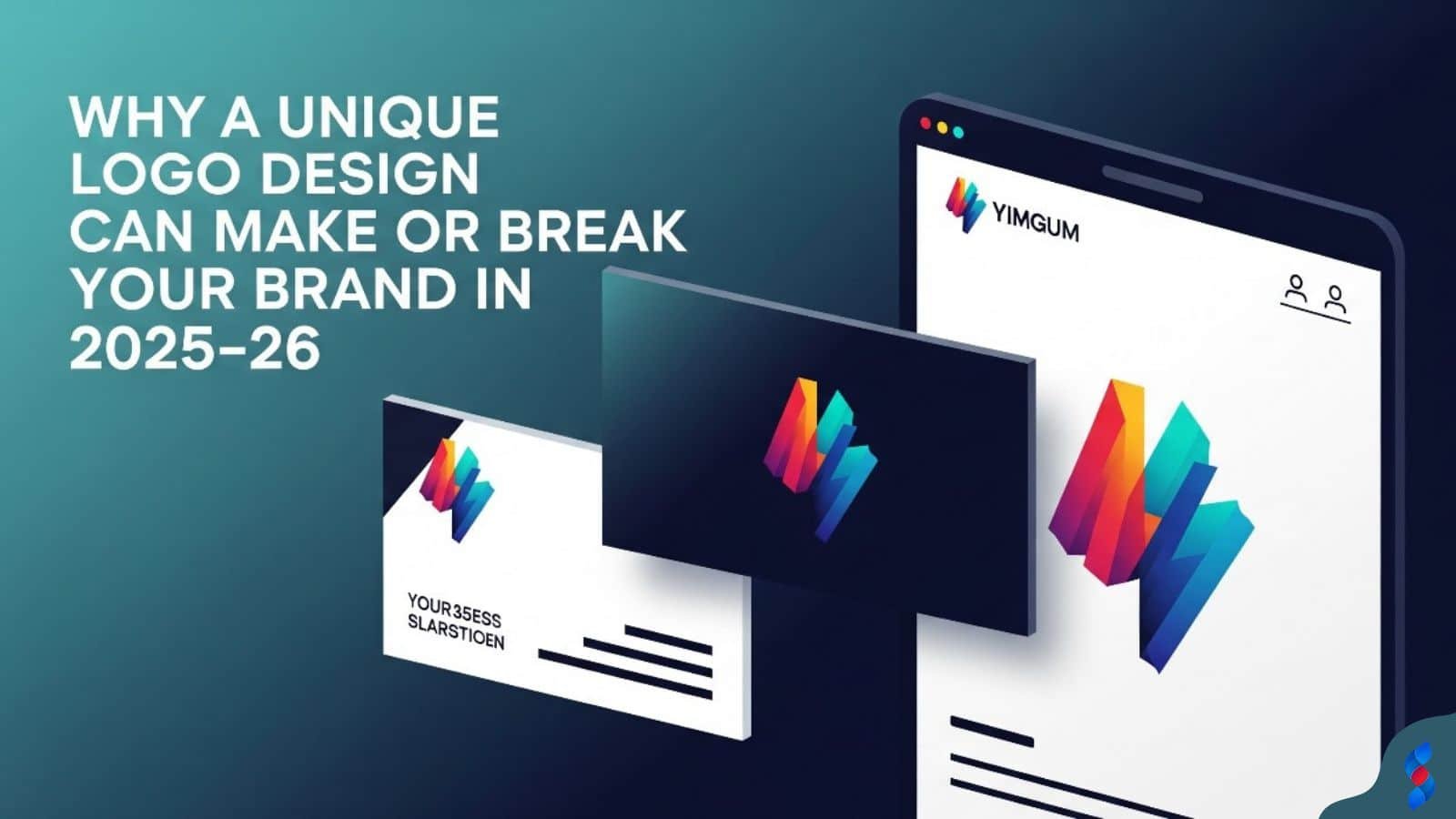
Why a Unique Logo Design Can Make or Break Your Brand in 2025–26
Why a Unique Logo Design Can Make or Break Your Brand in 2025–26: In today’s hyper-digital world, where first impressions are everything and brand identity...
Need help? Call us:
+92 320 1516 585
In the ever-evolving world of visual communication, staying ahead of the curve is essential, especially for beginners eager to make their mark. The graphic design landscape is constantly shifting, with new technologies, aesthetics, and philosophies emerging all the time. Our team at SkySol Media has compiled this ultimate guide to graphic design trends in 2026 to help you navigate this exciting field. Understanding these graphic design trends will not only enhance your creative skills but also position you for success in today’s competitive market.
Artificial Intelligence is no longer a futuristic concept but a present-day reality transforming various aspects of graphic design. For beginners, AI presents an accessible and user-friendly means of creating design elements that once required extensive technical knowledge or years of experience. AI tools can now handle complex tasks such as image generation, layout design, and even typography selection, opening doors for individuals with limited design backgrounds to produce professional-quality work. This democratization of design tools empowers beginners to experiment, learn, and innovate without being constrained by traditional skill barriers. At SkySol Media, we have observed that designers who embrace AI tools are more efficient and capable of exploring a wider range of creative possibilities.
Several AI-powered image generation tools are becoming increasingly popular among beginners for their ability to create stunning visuals quickly. Platforms like DALL-E 2, Midjourney, and Stable Diffusion allow users to generate images based on simple text prompts. For example, a beginner could type “a futuristic cityscape with neon lights” and the AI would generate several variations of that image within seconds. These tools are invaluable for creating unique assets, prototyping ideas, and experimenting with different styles without needing advanced drawing or photography skills. [IMAGE: Example of an image generated using an AI tool like DALL-E 2 or Midjourney, showing the text prompt used and the resulting image]. The key is to use descriptive and specific prompts to guide the AI towards the desired outcome, iterating and refining until the perfect visual is achieved.
One of the most practical applications of AI for beginners is the creation of quick mockups. Instead of spending hours manually placing designs onto product templates, AI can automate this process. For example, you can upload a logo and use an AI tool to generate mockups of that logo on t-shirts, mugs, business cards, and website layouts. This allows you to visualize your designs in real-world contexts and present them professionally to clients or stakeholders. Our team has found that using AI for mockups significantly reduces the time and effort required in the design process, freeing up resources for more creative tasks.
Inclusive design is a design philosophy that prioritizes accessibility and user experience for all individuals, regardless of their abilities, backgrounds, or circumstances. It goes beyond simply meeting minimum accessibility standards and aims to create designs that are usable, understandable, and enjoyable for the widest possible audience. Inclusive design takes into account factors such as visual impairments, cognitive disabilities, motor impairments, and cultural differences. By embracing inclusive design principles, beginners can create more impactful and meaningful designs that resonate with a diverse range of users. Here at SkySol Media, we firmly believe that inclusive design is not just a trend but a fundamental responsibility for all designers.
Color contrast is a critical aspect of inclusive design, particularly for users with visual impairments. Insufficient color contrast between text and background can make content difficult or impossible to read. Beginners should use tools like the WebAIM Contrast Checker or Accessible Colors to ensure that their designs meet accessibility standards. These tools analyze color combinations and provide a contrast ratio, indicating whether the combination passes accessibility guidelines such as WCAG (Web Content Accessibility Guidelines). Aim for a contrast ratio of at least 4.5:1 for normal text and 3:1 for large text. [IMAGE: Screenshot of a color contrast checker tool, showing a passing and failing color combination]. Remember, thoughtful color choices can significantly improve the user experience for individuals with visual impairments.
Selecting the right font is crucial for ensuring readability and accessibility. Opt for font families that are clear, legible, and available in a variety of weights and styles. Sans-serif fonts like Arial, Helvetica, and Open Sans are generally considered more accessible than serif fonts, especially for body text. Avoid using overly decorative or stylized fonts, as these can be difficult to read. Also, pay attention to font size and line height. Ensure that the font size is large enough to be easily readable and that the line height provides sufficient spacing between lines of text. Our experience shows that thoughtful font choices can greatly enhance the overall readability and user experience of a design.
In contrast to the minimalist designs that have dominated recent years, there’s a growing trend toward bold, expressive, and even maximalist typography. This involves using large, eye-catching fonts, unconventional letterforms, and intricate typographic arrangements to create visually striking designs. For beginners, experimenting with maximalist typography can be a fun and creative way to push boundaries and explore new styles. However, it’s important to use this trend judiciously, ensuring that the typography enhances the overall design rather than overwhelming it. Try pairing bold typography with simple backgrounds and minimal graphics to create a balanced and impactful composition.
Layering and overlapping text is a popular technique for adding depth, visual interest, and a sense of dynamism to designs. This involves positioning multiple text elements on top of each other, creating a layered effect. Beginners can achieve this effect using free design software like Canva or GIMP. Experiment with different font sizes, colors, and opacities to create unique and visually appealing compositions. Be mindful of readability when layering text; ensure that the underlying text is still legible and that the overall design remains clear and understandable. [IMAGE: Example of layered and overlapping text in a graphic design, showcasing different font sizes and opacities]. This technique is especially effective for creating impactful headlines and eye-catching posters.
Access to high-quality fonts is essential for any designer, but purchasing fonts can be expensive, especially for beginners. Fortunately, there are many reputable websites offering free fonts that can be used for personal and commercial projects. Some popular resources include Google Fonts, Font Squirrel, and DaFont. These websites offer a wide variety of fonts in different styles, weights, and languages, allowing you to find the perfect font for your project. Before using a free font, be sure to check the licensing terms to ensure that it is suitable for your intended use. Here at SkySol Media, we often encourage our clients to use Google Fonts due to their accessibility and ease of integration with web projects.
Nostalgia is a powerful design trend that evokes feelings of warmth, comfort, and familiarity. Retro color palettes, such as 70s earth tones and 80s neon colors, are making a comeback in graphic design. 70s earth tones typically include muted shades of brown, orange, yellow, and green, creating a warm and organic aesthetic. 80s neon colors, on the other hand, are bold and vibrant, featuring bright shades of pink, blue, green, and yellow. Beginners can incorporate these retro color palettes into their designs to create a nostalgic and visually appealing look. Experiment with different combinations and see how they can evoke different emotions and time periods.
Vintage illustrations and graphics are another popular way to incorporate nostalgia into designs. These elements can add character, charm, and a sense of history to your projects. You can find free or low-cost vintage illustrations and graphics on websites like The Graphics Fairy, Pixabay, and Unsplash. Look for illustrations of old advertisements, vintage posters, and classic packaging designs. When using vintage elements, be mindful of copyright issues and ensure that you have the right to use the images for your intended purpose. [IMAGE: Example of a vintage illustration or graphic used in a modern graphic design, showcasing a retro aesthetic]. Integrating these elements can be an effective way to create unique and memorable designs.
Even if you don’t have access to vintage illustrations or graphics, you can still create a “vintage” effect using filters and textures in photo editing software. Programs like Photoshop, GIMP, and even mobile apps like VSCO offer a variety of filters and effects that can simulate the look of old photographs, film, and printed materials. Experiment with adding grain, scratches, and color casts to your images to give them a vintage feel. You can also overlay textures like paper, canvas, or wood to create a more tactile and authentic look. These techniques are a simple and effective way to add a touch of nostalgia to your designs.
In today’s data-driven world, the ability to present data in a visually appealing and easy-to-understand way is a valuable skill for any designer. However, data visualization doesn’t have to be cold and impersonal. By adding a human touch, you can make data more engaging and relatable for your audience. This involves using storytelling techniques, incorporating emotional elements, and focusing on the human impact of the data. For example, instead of simply presenting statistics about poverty, you could use infographics to illustrate the stories of individuals affected by poverty, making the data more meaningful and impactful.
Infographics are a powerful tool for visualizing data and communicating complex information in a clear and concise manner. For beginners, creating infographics may seem daunting, but there are many simple templates and tools available that can make the process easier. Platforms like Canva, Piktochart, and Venngage offer a variety of infographic templates that you can customize to suit your needs. These templates provide a starting point for your design and include pre-designed layouts, graphics, and fonts. Simply add your data and customize the design to create a professional-looking infographic in minutes. [IMAGE: Example of a simple infographic template that beginners can use on platforms like Canva or Piktochart]. We at SkySol Media have seen how effective infographics can be in conveying complex information to a broad audience.
Selecting the appropriate chart type is crucial for effectively visualizing data. Different chart types are suited for different types of data and different purposes. For example, bar charts are ideal for comparing values across different categories, while pie charts are best for showing proportions of a whole. Line charts are useful for visualizing trends over time, and scatter plots are used to show the relationship between two variables. When choosing a chart type, consider the type of data you are presenting and the message you want to convey. If you’re unsure which chart type to use, there are many online resources and guides that can help you make the right choice.
3D design is no longer limited to advanced professionals with specialized software. Beginners can now start incorporating simple 3D elements into their designs without needing advanced skills. This can involve using pre-made 3D models, creating basic 3D shapes, or simply adding 3D effects to existing 2D designs. The key is to start small and gradually experiment with more complex techniques as you gain confidence. 3D elements can add depth, realism, and visual interest to your designs, making them more engaging and impactful.
Access to 3D models is essential for incorporating 3D elements into your designs. Fortunately, there are many websites offering free 3D models that beginners can use in their projects. Some popular resources include Sketchfab, TurboSquid, and Free3D. These websites offer a wide variety of 3D models in different categories, including furniture, vehicles, characters, and architectural elements. Before using a free 3D model, be sure to check the licensing terms to ensure that it is suitable for your intended use. [IMAGE: Screenshot of a website like Sketchfab or TurboSquid showing a selection of free 3D models]. Using these resources can significantly speed up the design process and allow you to focus on the creative aspects of your project.
Even without using actual 3D models, you can create the illusion of 3D using shadows, gradients, and perspective in 2D design software. This involves using these techniques to create the appearance of depth and dimension in your designs. For example, you can add a subtle drop shadow to an object to make it appear to float above the background. You can also use gradients to create the illusion of curves and contours. By mastering these techniques, you can add a sense of depth and realism to your designs without needing advanced 3D modeling skills.
Sustainable design is a growing trend that reflects a growing awareness of environmental issues and a desire to create more responsible and ethical designs. For beginners, this means making environmentally friendly choices in your design process, such as using recycled materials, reducing waste, and minimizing energy consumption. You can also promote eco-conscious design by creating designs that raise awareness of environmental issues and inspire positive change. By embracing sustainable design principles, you can create designs that are not only visually appealing but also environmentally responsible.
One way to incorporate sustainable design into your projects is to use textures and visual elements that evoke recycled materials and environmental awareness. This can involve using images of recycled paper, cardboard, or other sustainable materials. You can also use textures that mimic the look of natural elements like wood, stone, or leaves. These visual elements can help to convey a sense of sustainability and environmental responsibility in your designs. [IMAGE: Example of a design incorporating recycled textures and materials, such as recycled paper or cardboard]. Integrating these elements can be a powerful way to communicate your commitment to sustainability.
Minimalist design is often associated with sustainability because it emphasizes simplicity, functionality, and efficiency. Simpler, minimalist designs typically require less ink, paper, and energy to produce, aligning with sustainability goals. By adopting a minimalist approach, you can reduce the environmental impact of your designs while still creating visually appealing and effective communication. Focus on essential elements, eliminate unnecessary clutter, and use a limited color palette to create a clean and sustainable design.
Motion graphics and animated logos are becoming increasingly popular as a way to capture attention, engage audiences, and convey information in a dynamic and memorable way. Beginners can easily learn basic animation techniques, such as looping animations and simple transitions, using user-friendly software and online resources. Looping animations involve creating short, repeating animations that play continuously, while simple transitions involve smoothly transitioning between different scenes or elements. These techniques can add movement, visual interest, and a sense of dynamism to your designs.
Creating animated logos may seem daunting, but there are many user-friendly tools available for beginners, including mobile apps and online platforms. Apps like Adobe Spark Post and Animoto offer a variety of pre-designed templates and animation effects that you can use to create animated logos quickly and easily. Online platforms like Canva and Crello also offer animation features that allow you to add movement to your logo designs. These tools provide a simple and intuitive way to create professional-looking animated logos without needing advanced animation skills. [IMAGE: Screenshot of a user-friendly tool for creating animated logos, such as Adobe Spark Post or Animoto]. Our team at SkySol Media has seen a significant increase in the demand for animated logos in recent years.
Even subtle movement can make a big impact on static designs. Adding subtle movement to static designs can make them more engaging, eye-catching, and memorable. This can involve adding a slight wiggle to an object, a gentle fade-in effect, or a subtle parallax scrolling effect. These small details can add a sense of dynamism and visual interest to your designs without being overwhelming or distracting. Experiment with different types of subtle movement and see how they can enhance the overall impact of your designs.
Augmented reality (AR) is an emerging technology that overlays digital content onto the real world, creating interactive and immersive experiences. While AR may seem complex, beginners can start exploring AR integration in graphic design without needing advanced technical skills. This involves understanding the basics of AR technology and how it can be used to enhance visual communication. AR can be used to create interactive product demos, immersive storytelling experiences, and engaging marketing campaigns.
Designing visuals for augmented reality environments requires a different approach than designing for traditional media. AR visuals need to be optimized for mobile devices and designed to interact with the real world. This involves considering factors such as lighting, perspective, and user interaction. Beginners can start by designing simple AR experiences, such as adding interactive overlays to printed materials or creating virtual try-on experiences for clothing and accessories. [IMAGE: Example of an augmented reality experience where digital content is overlaid onto the real world]. Here in Lahore, we’ve noticed a growing interest among our clients in exploring AR applications for their marketing efforts.
One of the easiest ways for beginners to explore AR design is by experimenting with creating simple AR filters for social media platforms like Instagram and Snapchat. These platforms offer user-friendly tools for creating AR filters that can be used to add fun and interactive effects to photos and videos. You can create filters that add virtual makeup, change hair colors, or overlay 3D objects onto the user’s face. This is a great way to learn the basics of AR design and experiment with different visual effects.
Color is a fundamental element of graphic design, and understanding color harmony is essential for creating visually appealing and effective designs. Color harmony refers to the pleasing arrangement of colors that creates a sense of balance, unity, and visual interest. Beginners should learn basic color theory concepts, such as complementary colors, analogous colors, and triadic colors, to understand how different colors interact with each other. There are many online tools and resources that can help you learn about color theory and create harmonious color palettes.
While color trends are constantly evolving, some color combinations consistently prove popular and effective. Some trending color combinations for 2026 include:
Experiment with these color combinations and see how they can evoke different emotions and moods in your designs.
Creating a visually appealing color scheme can be challenging, especially for beginners. Fortunately, there are many online color palette generators that can help you quickly create harmonious and effective color schemes. These tools allow you to input a base color and generate a variety of color palettes based on different color harmony principles. Some popular color palette generators include Adobe Color, Coolors, and Paletton. [IMAGE: Screenshot of an online color palette generator, such as Adobe Color or Coolors, showing a generated color palette]. These tools can be a valuable resource for beginners looking to create professional-looking color schemes.
| Trend | Description | Benefits |
|---|---|---|
| AI-Enhanced Design | Using AI tools for image generation and design assistance. | Increased efficiency, accessibility, and creativity. |
| Inclusive Design | Prioritizing accessibility and user experience for all. | Wider audience reach, ethical design practices. |
| Bold Typography | Experimenting with expressive and eye-catching typography. | Visual impact, unique aesthetic. |
| Nostalgic Elements | Incorporating retro color palettes and vintage graphics. | Evokes positive emotions, adds character. |
| Data Visualization | Presenting data in an engaging and human-centered way. | Improved understanding, emotional connection. |
| 3D Design | Adding 3D elements and effects to designs. | Depth, realism, visual interest. |
| Sustainable Design | Making environmentally responsible design choices. | Reduced environmental impact, ethical design practices. |
| Motion Graphics | Animating logos and adding movement to designs. | Increased engagement, dynamic communication. |
| AR Integration | Integrating augmented reality into graphic designs. | Interactive experiences, cutting-edge technology. |
| Simplified Palettes | Using harmonious and curated color palettes. | Visually appealing, professional look. |
“The best design trends are those that solve real problems and enhance the user experience, rather than just being aesthetically pleasing.” – John Maeda, former president of RISD
Top 3 Graphic Design Trends for 2026:
1. AI-Enhanced Design
2. Inclusive Design
3. Motion Graphics and Animated Logos
Creative trends and design innovation are essential to staying competitive. Keeping up with branding trends and emerging design practices will help you succeed. Understanding UI design trends, web design trends, illustration trends, and how to choose effective color palettes is key. Pay attention to the graphic design forecast and embrace visual communication.
As we journey further into 2026, the landscape of graphic design trends continues to evolve at a rapid pace. Embracing these trends, from AI-enhanced design to sustainable practices, will not only elevate your creative work but also ensure its relevance in a dynamic market. By focusing on inclusive design, mastering bold typography, and incorporating engaging data visualization, you can create designs that are both visually stunning and deeply meaningful. Remember to explore nostalgic elements, experiment with 3D design, and leverage the power of motion graphics and augmented reality. Ultimately, staying informed about these trends and adapting them to your unique style will empower you to create impactful designs that resonate with audiences and drive positive change. Here at SkySol Media, we’re committed to helping you navigate this exciting landscape and achieve your creative goals.
Q: How important is it for beginners to follow graphic design trends?
A: Following graphic design trends is essential for beginners as it helps them stay current, adapt to market demands, and produce relevant work. While it’s crucial to understand and experiment with new trends, it’s equally important to develop a personal style and not blindly follow every trend. Integrating trend knowledge with individual creativity leads to innovative and impactful designs.
Q: What are the key benefits of using AI in graphic design?
A: AI significantly enhances efficiency, accessibility, and creativity in graphic design. It allows designers to automate repetitive tasks, generate design elements quickly, and explore innovative ideas. AI tools democratize design, making it easier for beginners to create professional-quality work.
Q: Why is inclusive design important, and how can beginners implement it?
A: Inclusive design ensures that designs are accessible and usable by the widest possible audience, regardless of abilities or backgrounds. Beginners can implement it by focusing on color contrast, font readability, and providing alternative text for images. Understanding diverse user needs and incorporating accessibility guidelines are crucial steps.
Q: How can beginners effectively use bold and experimental typography?
A: Beginners can effectively use bold and experimental typography by pairing them with simple backgrounds, ensuring readability, and using them judiciously. Experimenting with layering, overlapping text, and unconventional letterforms can add visual interest, but it’s important to balance creativity with clarity.
Q: Where can beginners find free and high-quality design resources?
A: Beginners can find free and high-quality design resources on platforms like Google Fonts, Unsplash, Pixabay, and Canva. These resources offer a wide variety of fonts, images, templates, and tools for creating professional-looking designs without significant financial investment.
Q: How can graphic design contribute to sustainability?
A: Graphic design can contribute to sustainability by using recycled materials, minimizing ink usage, and promoting eco-conscious messaging. Adopting minimalist designs, using sustainable textures, and raising awareness about environmental issues can also support sustainability goals.
Q: What is the role of motion graphics and animation in modern graphic design?
A: Motion graphics and animation enhance engagement, capture attention, and communicate information in a dynamic way. They add visual interest, create memorable experiences, and convey complex ideas effectively. Animated logos and subtle movement can significantly impact the overall design.
Q: How can augmented reality (AR) be integrated into graphic design?
A: Augmented reality integrates digital content with the real world, creating interactive and immersive experiences. Designers can create AR filters, interactive overlays, and product demos that enhance user engagement and provide unique value. Understanding AR technology is key to effective integration.
Q: What are some trending color combinations for 2026?
A: Trending color combinations for 2026 include earthy tones (greens, browns, beige), pastel hues (soft pinks, blues, yellows), bold contrasts (electric blue, neon pink), and monochromatic schemes (various shades of a single color). Experimenting with these combinations can evoke different emotions and create visually appealing designs.
Q: How can beginners stay updated with the latest graphic design trends?
A: Beginners can stay updated by following design blogs, attending webinars, joining online communities, and experimenting with new tools and techniques. Continuously learning and adapting to industry changes is essential for professional growth and staying competitive.
Q: How does SkySol Media incorporate these graphic design trends into their projects?
A: SkySol Media integrates these graphic design trends by actively researching and experimenting with new techniques. We collaborate with clients to understand their unique needs and create customized designs that align with both their brand and the latest trends. Our focus is on creating innovative, effective, and visually appealing solutions that deliver results.
Don’t forget to share it

We’ll Design & Develop a Professional Website Tailored to Your Brand
Enjoy this post? Join our newsletter
Newsletter
Related Articles
Why a Unique Logo Design Can Make or Break Your Brand in 2025–26
How Professional Graphic Design Boosts Your Brand Identity in 2025–26
Top 10 Reasons to Outsource Your Graphic Design Needs Today
Graphic Design SEO: 7 Amazing Ways to Boost Your Website in 2025
Graphic Design Skills: The Amazing 2025 Boost for WordPress Traffic
Ultimate Guide to Boosting WordPress Website Success with Graphic Design Experience in 2025