Graphic Designing
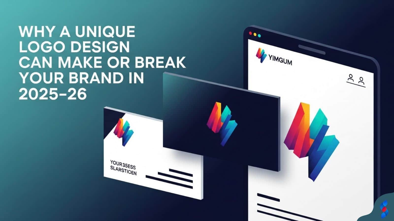
Why a Unique Logo Design Can Make or Break Your Brand in 2025–26
Why a Unique Logo Design Can Make or Break Your Brand in 2025–26: In today’s hyper-digital world, where first impressions are everything and brand identity...
Need help? Call us:
+92 320 1516 585
As we navigate the ever-evolving landscape of visual design, staying ahead of the curve is paramount. The world of graphic design trends is dynamic, with new styles, techniques, and technologies constantly emerging. However, amidst the excitement of innovation, it’s crucial to avoid common pitfalls that can undermine even the most creative efforts. In this comprehensive guide, we’ll explore the key graphic design trends to watch out for in 2026, along with critical design mistakes to avoid. By understanding these potential missteps and implementing best practices, you can ensure your designs are not only visually stunning but also effective and user-friendly.
✅ Accessibility is no longer a niche consideration; it’s a fundamental aspect of responsible design. Ignoring accessibility can alienate a significant portion of your audience and even lead to legal repercussions. We’ve seen many designers make this mistake, particularly with color choices and font sizes. Prioritizing accessibility ensures your designs are inclusive and reach the widest possible audience, aligning with ethical and practical considerations.
Many designers fail to ensure sufficient color contrast, making designs difficult to read for visually impaired users. This is a common design mistake, especially when aesthetics are prioritized over usability.
Solution: Use color contrast checkers and adhere to WCAG guidelines for optimal readability. There are many free tools available online to test color contrast ratios and ensure they meet accessibility standards. For many of our clients here in Lahore, we’ve emphasized the importance of this, and those who’ve implemented these changes have seen a more inclusive user base.
Forgetting to add alt text to images excludes users who rely on screen readers. Alt text provides a textual description of an image, allowing screen readers to convey its content to visually impaired users.
Solution: Always provide descriptive alt text that accurately describes the image’s content and function. We at SkySol Media always ensure that our designs include comprehensive alt text for every image. This not only improves accessibility but also benefits SEO by providing search engines with valuable context.
Using fonts that are too small or difficult to read can frustrate users. This is a particularly common issue on mobile devices, where screen size is limited.
Solution: Choose legible fonts and ensure adequate font size for comfortable reading across different devices. We recommend testing your designs on various devices and screen sizes to ensure optimal readability. Consider using responsive typography techniques to adjust font sizes based on screen size.
✅ A design that resonates with one audience may completely miss the mark with another. Understanding your target audience is crucial for creating designs that are not only visually appealing but also effective in communicating your message. We’ve seen countless campaigns fail because they simply didn’t connect with the intended audience.
Creating designs without considering the target audience’s preferences and needs leads to ineffective communication. A generic approach often results in bland, uninspired designs that fail to capture the attention of the intended audience.
Solution: Conduct thorough audience research to understand their demographics, psychographics, and design preferences. We always recommend our clients invest in market research to gain valuable insights into their target audience. This research should inform every aspect of the design, from color choices to typography.
Selecting images that don’t resonate with the target audience can weaken the design’s impact. Irrelevant imagery can confuse the audience and distract them from the core message.
Solution: Choose visuals that are relevant to the audience’s interests and cultural background. Understanding the cultural nuances and preferences of your target audience is crucial for selecting appropriate imagery. For example, using imagery that is culturally insensitive can be a major design mistake.
Adopting a tone and style that doesn’t align with the target audience can create a disconnect. This can damage the brand’s credibility and alienate potential customers.
Solution: Tailor the design’s tone and style to match the audience’s expectations and values. We often advise our clients to create detailed audience personas to guide their design decisions. This helps ensure that the tone and style of the design are appropriate for the intended audience.
✅ In today’s mobile-dominated world, ignoring the mobile-first approach is a critical error. More and more users are accessing the internet primarily through their mobile devices, making mobile optimization essential. We at SkySol Media have consistently emphasized the importance of mobile-first design to our clients.
Failing to optimize designs for mobile devices results in a poor user experience for a significant portion of users. Non-responsive designs can be difficult to navigate on mobile devices, leading to frustration and abandonment.
Solution: Prioritize responsive design principles to ensure designs adapt seamlessly to different screen sizes and devices. Responsive design involves using flexible layouts, images, and CSS media queries to create designs that adapt to different screen sizes. This ensures a consistent and user-friendly experience across all devices.
Overcrowding mobile screens with too much information can overwhelm users. A cluttered layout can make it difficult for users to find the information they need, leading to a negative user experience.
Solution: Simplify mobile layouts by prioritizing essential content and using clear, concise typography. We recommend focusing on the most important elements and eliminating unnecessary clutter. Use white space effectively to create a clean and visually appealing layout.
Unoptimized images and excessive animations can cause slow loading times on mobile devices. Slow loading times can frustrate users and lead to higher bounce rates.
Solution: Optimize images, minimize animations, and leverage browser caching to improve mobile loading speeds. We always advise our clients to compress images and use appropriate file formats to reduce file sizes. Also, minimize the use of animations and other resource-intensive elements.
✅ Typography is a powerful tool that can significantly impact the effectiveness of a design. Misusing typography can detract from the overall message and make the design difficult to read. We’ve seen instances where poor typography choices have completely undermined otherwise strong designs.
Selecting fonts that don’t match the design’s overall tone or purpose can detract from its effectiveness. A font that is too playful may not be appropriate for a serious business, while a font that is too formal may not be suitable for a casual brand.
Solution: Carefully choose fonts that align with the design’s message and target audience, considering factors like legibility and personality. We recommend creating a typography style guide to ensure consistency across all designs. This style guide should specify the fonts to be used for headings, body text, and other elements.
Failing to establish a clear visual hierarchy can make it difficult for users to scan and understand the content. A lack of hierarchy can lead to a confusing and overwhelming user experience.
Solution: Use font size, weight, and spacing to create a clear visual hierarchy that guides the reader’s eye. We advise using different font sizes and weights to distinguish between headings, subheadings, and body text. Also, use spacing effectively to create visual separation between elements.
Neglecting to adjust kerning (space between letters) and leading (space between lines) can negatively impact readability. Improper kerning and leading can make text difficult to read and detract from the overall visual appeal of the design.
Solution: Fine-tune kerning and leading to improve the overall readability and visual appeal of the typography. Kerning and leading are often overlooked, but they can make a significant difference in the readability of text. Pay attention to these details to ensure your typography is visually appealing and easy to read.
✅ Less is often more when it comes to design. Overdoing design elements can lead to cluttered, overwhelming designs that detract from the overall message. We’ve observed that designs that embrace simplicity and white space tend to be more effective in capturing the audience’s attention.
Overusing effects and filters can make designs look cluttered and unprofessional. Excessive effects and filters can distract from the core message and make the design appear dated.
Solution: Use effects and filters sparingly and purposefully to enhance specific elements, not to mask poor design. We recommend using effects and filters subtly to add depth and visual interest to the design. Avoid using them excessively, as this can make the design look cluttered and unprofessional.
Using too many colors can overwhelm the viewer and create a sense of chaos. A chaotic color palette can make it difficult to focus on key information and detract from the overall visual appeal of the design.
Solution: Stick to a limited color palette and use color theory principles to create a harmonious and balanced design. We advise using a color palette of no more than three to five colors. Use color theory principles to choose colors that complement each other and create a visually appealing design.
Filling the design with too many elements without sufficient white space can make it difficult to focus on key information. A cluttered layout can overwhelm the viewer and make it difficult to understand the message.
Solution: Embrace white space to create visual breathing room and improve the overall clarity and impact of the design. White space is the empty space around design elements. It helps to create visual separation between elements and improve the overall readability of the design. We recommend using white space strategically to guide the reader’s eye and create a balanced and visually appealing layout.
✅ The design landscape is constantly evolving, and staying updated with current design trends is crucial for remaining relevant and competitive. Neglecting to keep up with the latest trends can make your work appear stale and uninspired. At SkySol Media, we dedicate significant time to researching and analyzing emerging creative trends.
Relying on outdated design styles can make your work appear stale and uninspired. Outdated styles can make your brand look out of touch and less appealing to potential customers.
Solution: Continuously research and experiment with new design trends to keep your work fresh and relevant. We recommend subscribing to design blogs, attending industry conferences, and following leading designers on social media to stay updated with the latest trends. Also, experiment with new techniques and styles in your own work to keep your skills sharp.
Failing to incorporate emerging technologies like AI and AR can limit your creative potential. Emerging technologies offer new possibilities for creating innovative and engaging designs.
Solution: Explore how emerging technologies can be integrated into your designs to create innovative and engaging experiences. We encourage our designers to experiment with AI-powered design tools and AR applications. These technologies can help you automate tasks, generate new ideas, and create more immersive experiences.
Restricting your inspiration to only graphic design can lead to repetitive and unoriginal work. Looking beyond the field of graphic design can spark new ideas and perspectives.
Solution: Seek inspiration from other fields like art, architecture, and fashion to broaden your creative horizons. We often encourage our designers to visit museums, attend art shows, and explore different cultures to gain new perspectives. Inspiration can come from anywhere, so be open to exploring different sources.
✅ Branding is more than just a logo; it’s the entire identity of a company. A poor understanding of branding principles can lead to inconsistent and ineffective designs that damage the brand’s credibility. At SkySol Media, we emphasize the importance of aligning every design decision with the brand’s core values and messaging.
Using inconsistent design elements across different platforms can weaken brand recognition. Inconsistency can confuse customers and make it difficult to build a strong brand identity.
Solution: Develop a comprehensive brand style guide and ensure all design elements adhere to its guidelines. A brand style guide should specify the colors, fonts, logos, and imagery to be used across all platforms. This helps ensure consistency and strengthens brand recognition. We at SkySol Media help our clients create these comprehensive guides.
Disregarding established brand guidelines can damage the brand’s integrity and create confusion. Ignoring guidelines can lead to designs that are inconsistent with the brand’s overall identity.
Solution: Always refer to and follow brand guidelines when creating designs for a specific brand. We advise our designers to familiarize themselves with the brand guidelines before starting any design project. This ensures that the design aligns with the brand’s overall identity and messaging.
Failing to communicate the brand’s values and personality through design can result in a bland and unmemorable brand identity. A design that doesn’t reflect the brand’s values can fail to connect with the target audience.
Solution: Infuse the design with elements that reflect the brand’s core values and personality. We recommend working closely with the client to understand their brand values and personality. Use colors, fonts, and imagery that reflect these values and create a design that is authentic and memorable.
“The key to great branding is consistency. A strong brand is built on consistent messaging, visual identity, and customer experience across all touchpoints.” – Al Ries
✅ Design is not a solitary activity; it’s a collaborative process that involves gathering and incorporating user feedback. Neglecting user feedback and testing can lead to designs that are ineffective and user-unfriendly. We at SkySol Media always emphasize the importance of user-centered design.
Releasing designs without proper testing can lead to usability issues and negative user experiences. Untested designs may contain bugs or usability issues that can frustrate users and damage the brand’s reputation.
Solution: Conduct thorough user testing to identify and address any potential problems before launch. We recommend conducting both usability testing and A/B testing to gather valuable feedback. Usability testing involves observing users as they interact with the design, while A/B testing involves comparing different versions of the design to see which performs better.
Ignoring user feedback can prevent you from improving the design and meeting user needs. User feedback provides valuable insights into how users perceive and interact with the design.
Solution: Actively solicit and incorporate user feedback to iteratively improve the design and ensure it meets user expectations. We recommend using surveys, feedback forms, and social media to gather user feedback. Also, actively monitor user reviews and comments to identify areas for improvement.
Failing to track key metrics can make it difficult to assess the effectiveness of the design. Without tracking performance, it’s difficult to know whether the design is achieving its goals.
Solution: Track metrics like click-through rates, conversion rates, and user engagement to measure the design’s performance and identify areas for improvement. We advise our clients to use analytics tools like Google Analytics to track key metrics. Also, set clear goals for the design and monitor progress towards achieving those goals.
Here is a helpful table showcasing key performance indicators (KPIs) for design and how to track them:
| KPI | Description | Tracking Method | Tools |
|---|---|---|---|
| Click-Through Rate (CTR) | Percentage of users who click on a specific element (e.g., button, link). | Track clicks on calls-to-action. | Google Analytics, Adobe Analytics |
| Conversion Rate | Percentage of users who complete a desired action (e.g., sign-up, purchase). | Track goal completions. | Google Analytics, Mixpanel |
| Bounce Rate | Percentage of users who leave the website after viewing only one page. | Monitor single-page visits. | Google Analytics |
| Time on Page | Average time users spend on a specific page. | Track session duration. | Google Analytics |
| User Engagement | Level of interaction and participation from users (e.g., comments, shares). | Monitor social shares, comments, and interactions. | Social Media Analytics, Google Analytics |
| Task Completion Rate | Percentage of users who successfully complete a specific task (e.g., filling out a form). | Track form submissions and task completions. | Google Analytics, Usability Testing Tools |
| User Satisfaction | Level of satisfaction users express with the design and overall experience. | Conduct surveys and gather feedback. | SurveyMonkey, Qualtrics |
✅ A design without a clear call to action is like a ship without a rudder. It fails to guide the user towards the desired action. We’ve consistently observed that designs with prominent and compelling calls to action are far more effective in driving conversions.
Making the call to action difficult to find or understand can reduce conversion rates. A buried call to action can be easily overlooked by users, leading to missed opportunities.
Solution: Make the call to action prominent and use clear, concise language that encourages users to take the desired action. We recommend using a contrasting color for the call to action button to make it stand out. Also, use action-oriented language that clearly communicates the desired outcome.
Using vague or ambiguous language in the call to action can confuse users and deter them from clicking. Vague language can leave users unsure of what will happen when they click the call to action.
Solution: Use specific and action-oriented language that clearly communicates the desired outcome. Instead of using vague language like “Learn More,” use specific language like “Download Your Free Ebook.” This tells users exactly what they will get when they click the call to action.
Using inconsistent styling for the call to action can make it less noticeable and effective. Inconsistency can make it difficult for users to recognize the call to action and understand its purpose.
Solution: Maintain a consistent style for the call to action across all designs to ensure it stands out and encourages engagement. We recommend using the same color, font, and button style for all calls to action. This helps users quickly recognize the call to action and understand its purpose.
✅ White space, also known as negative space, is the empty space around design elements. Forgetting the importance of white space can lead to cluttered, overwhelming designs that are difficult to read and understand. We at SkySol Media believe that white space is an essential design element that should be used strategically to improve the overall clarity and impact of the design.
Filling every available space with elements can lead to a cluttered and overwhelming design. An overcrowded design can make it difficult to focus on key information and detract from the overall visual appeal.
Solution: Strategically use white space to create visual breathing room and improve the overall clarity and balance of the design. We recommend using white space to create visual separation between elements and guide the reader’s eye. Also, use white space to create a sense of calm and balance in the design.
Failing to use white space to guide the reader’s eye can make it difficult to scan and understand the content. A lack of white space can make the design appear chaotic and difficult to navigate.
Solution: Use white space to create a visual hierarchy and guide the reader’s eye through the design in a logical and intuitive way. We advise using white space to draw attention to key elements and create a clear path for the reader to follow. This helps users quickly scan the design and find the information they need.
Inconsistent white space distribution can create a sense of imbalance and disrupt the flow of the design. Inconsistency can make the design appear unprofessional and unpolished.
Solution: Distribute white space evenly and thoughtfully to create a harmonious and visually appealing design. We recommend using a grid system to ensure consistent white space distribution. This helps create a balanced and visually appealing layout.
✅ Design is a collaborative process that benefits from diverse perspectives and constructive feedback. Avoiding collaboration and feedback can lead to designs that are flawed and ineffective. We at SkySol Media foster a collaborative environment where designers are encouraged to share their ideas and seek feedback from their peers.
Designing in isolation can limit your perspective and prevent you from identifying potential issues. Working alone can lead to tunnel vision and a lack of awareness of potential problems.
Solution: Collaborate with other designers and stakeholders to gather diverse perspectives and improve the quality of your work. We recommend participating in design critiques and workshops to get feedback from other designers. Also, collaborate with stakeholders like marketing managers and sales representatives to ensure the design aligns with their goals.
Being resistant to constructive criticism can hinder your growth as a designer. Resistance to feedback can prevent you from learning from your mistakes and improving your skills.
Solution: Embrace constructive criticism as an opportunity to learn and improve your skills. We advise our designers to approach feedback with an open mind and a willingness to learn. Also, remember that feedback is not a personal attack, but rather an opportunity to improve the design.
Waiting until the end of the design process to seek feedback can result in wasted time and effort. Discovering problems late in the process can require significant rework and delay the project.
Solution: Seek feedback early and often throughout the design process to ensure you’re on the right track. We recommend seeking feedback at key milestones throughout the design process, such as after creating the initial wireframes or after developing the first prototype. This helps ensure that you’re on the right track and avoid wasting time on designs that are not effective.
✅ A visually stunning design is useless if it takes forever to load. Ignoring performance optimization can lead to slow loading times and a poor user experience. We at SkySol Media always prioritize performance optimization to ensure our designs are not only visually appealing but also fast and efficient.
Using large, unoptimized images can significantly slow down page loading times. Large images can consume a significant amount of bandwidth and delay the loading of the page.
Solution: Compress images and use appropriate file formats (e.g., JPEG for photos, PNG for graphics) to optimize them for web use. We recommend using image compression tools to reduce file sizes without sacrificing quality. Also, use appropriate file formats for different types of images. JPEG is best for photos, while PNG is best for graphics with transparency.
Overusing scripts and plugins can bloat the design and negatively impact performance. Excessive scripts and plugins can add unnecessary code to the design, slowing down the loading time.
Solution: Minimize the use of scripts and plugins and choose lightweight alternatives whenever possible. We advise using only the scripts and plugins that are absolutely necessary. Also, choose lightweight alternatives that are optimized for performance.
Failing to test the design on different browsers and devices can result in compatibility issues and a poor user experience. Designs that are not tested on different browsers and devices may not display correctly or function properly on all platforms.
Solution: Thoroughly test the design on a variety of browsers and devices to ensure it works seamlessly for all users. We recommend using browser testing tools and device emulators to test the design on different platforms. Also, ask users to test the design on their own devices to get real-world feedback.
Conclusion
In conclusion, navigating the ever-changing world of graphic design trends requires a keen eye for both innovation and potential pitfalls. By avoiding the design mistakes outlined above – such as neglecting accessibility, misunderstanding your audience, and ignoring performance optimization – you can ensure your designs are not only visually stunning but also effective, user-friendly, and aligned with current best practices. Remember to stay updated with the latest creative trends, embrace collaboration, and prioritize user feedback to create designs that truly resonate. At SkySol Media, we’re committed to helping our clients create impactful designs that achieve their business goals. We believe that by understanding these potential missteps and implementing best practices, you can create designs that stand out from the crowd and deliver exceptional results.
FAQ Section
Q: What are the most important things to consider when designing for accessibility?
A: Color contrast, alt text for images, and font size/readability are paramount. Ensure your designs are usable by people with disabilities.
Q: How can I stay updated with the latest graphic design trends?
A: Follow design blogs, attend industry conferences, and explore other creative fields for inspiration.
Q: Why is mobile-first design so important?
A: A majority of users access the internet via mobile devices, making mobile optimization crucial for a positive user experience.
Q: What role does white space play in design?
A: White space creates visual breathing room, improves clarity, and guides the reader’s eye through the design.
Q: How can I ensure my designs align with the brand’s identity?
A: Develop a comprehensive brand style guide and follow it consistently across all platforms.
Don’t forget to share it

We’ll Design & Develop a Professional Website Tailored to Your Brand
Enjoy this post? Join our newsletter
Newsletter
Related Articles
Why a Unique Logo Design Can Make or Break Your Brand in 2025–26
How Professional Graphic Design Boosts Your Brand Identity in 2025–26
Top 10 Reasons to Outsource Your Graphic Design Needs Today
Graphic Design SEO: 7 Amazing Ways to Boost Your Website in 2025
Graphic Design Skills: The Amazing 2025 Boost for WordPress Traffic
Ultimate Guide to Boosting WordPress Website Success with Graphic Design Experience in 2025