Graphic Designing
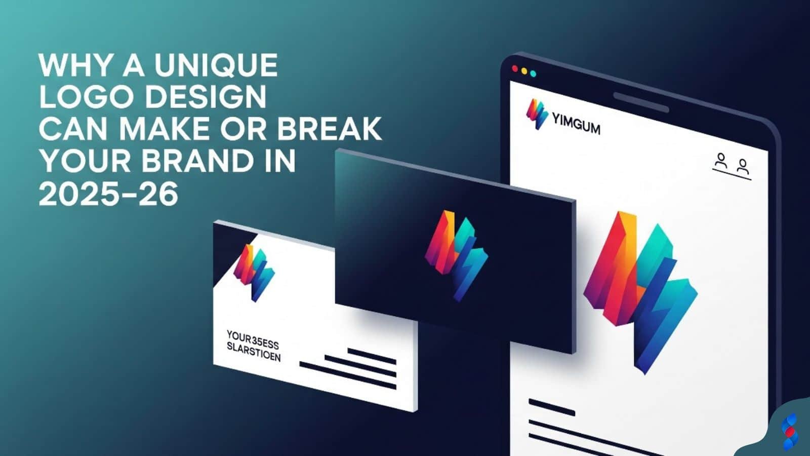
Why a Unique Logo Design Can Make or Break Your Brand in 2025–26
Why a Unique Logo Design Can Make or Break Your Brand in 2025–26: In today’s hyper-digital world, where first impressions are everything and brand identity...
Need help? Call us:
+92 320 1516 585
Graphic design is more than just aesthetics; it’s a vital component of user experience (UX), especially within the WordPress ecosystem. A well-designed website not only looks appealing but also guides users effectively, enhances brand credibility, and drives conversions. In this comprehensive guide, we’ll explore how graphic design principles can revolutionize your WordPress UX, making your website more engaging, accessible, and ultimately, more successful.
Graphic design for a WordPress website encompasses all visual elements that contribute to the user’s overall experience. It’s about strategically using visuals to communicate effectively, guide users through the site, and create a positive impression. When our team in Dubai tackles this issue, they often find that many clients underestimate the importance of cohesive graphic elements.
How does it differ from general web design? While web design includes the overall structure and functionality of a website, graphic design focuses specifically on the visual aspects. This includes the layout, color scheme, typography, imagery, and other graphic elements that contribute to the site’s aesthetic and usability. The goal of graphic design is to create an aesthetically pleasing and intuitive interface that enhances the user experience.
The role of visual communication in UX is paramount. Visuals are processed much faster than text, allowing users to quickly grasp the essence of a website and its content. Effective visual communication can enhance clarity, improve navigation, and create a more engaging experience. For example, using clear icons to represent different sections of a website can make it easier for users to find what they’re looking for.
First impressions matter, and your website is often the first interaction a potential customer has with your brand. Effective graphic design helps create a positive first impression and establish credibility. A visually appealing and well-organized website signals professionalism and trustworthiness.
Guiding users through the website effectively is another key benefit. Through strategic use of visual hierarchy, color, and typography, graphic design helps users navigate the site intuitively. This ensures they can easily find the information they need and complete desired actions, such as making a purchase or filling out a form.
Creating a memorable and engaging experience is essential for building brand loyalty. Graphic design can help you create a unique and visually appealing website that captures the user’s attention and leaves a lasting impression. A well-designed website is more likely to be remembered and recommended by users.
Visual hierarchy is the arrangement of elements in a way that guides the user’s eye to the most important information first. This is achieved through size, contrast, and spacing. A clear visual hierarchy ensures that users can quickly scan the page and understand the key message.
Color theory explores how different colors impact user emotions and behavior. Choosing the right color palette can evoke specific feelings and create a cohesive brand identity. Understanding color relationships and using them effectively can greatly enhance the user experience.
Typography plays a crucial role in readability and brand consistency. Selecting the right fonts, optimizing font sizes, and ensuring proper line spacing are all essential for creating a comfortable and engaging reading experience. Consistent typography reinforces brand recognition and enhances overall website aesthetics.
Using size, contrast, and spacing effectively is critical for creating a clear visual hierarchy. Larger elements naturally draw more attention, while high contrast ensures that important information stands out. Spacing, or whitespace, helps to separate elements and improve readability.
Implementing the “F” and “Z” patterns for content placement is a common technique. The “F” pattern is often observed on text-heavy pages, where users scan the top and left side of the content. The “Z” pattern is more common on visually driven pages, where the eye moves in a zigzag motion. Understanding these patterns can help you place key information in the most strategic locations.
Guiding the user’s eye through key information ensures that they don’t miss important details. By strategically placing headings, subheadings, and call-to-action buttons, you can guide users through the content and encourage them to take the desired actions.
The power of negative space in design cannot be overstated. Whitespace, or negative space, refers to the empty areas around elements on a page. It helps to separate elements, improve readability, and create a sense of balance.
Improving readability and reducing visual clutter are key benefits of whitespace. By giving elements room to breathe, you make it easier for users to scan the page and focus on the key information. This is especially important on mobile devices, where screen space is limited.
Balancing elements with strategic whitespace involves carefully considering the placement of elements and the amount of empty space around them. The goal is to create a visually appealing and balanced layout that is easy on the eyes.
Arrows, icons, and other visual signifiers are effective tools for directing user attention. Arrows can point to specific elements, while icons can represent different sections or functions. These visual cues help users navigate the site more intuitively.
Highlighting important elements with color and animation can also draw attention. For example, using a bright color for a call-to-action button can make it stand out. Subtle animations can also be used to highlight important information or guide the user through a process.
Creating a seamless and intuitive navigation experience is the ultimate goal. By using visual cues effectively, you can make it easier for users to find what they’re looking for and complete desired actions. This leads to a more positive and engaging user experience.
How different colors impact user emotions and behavior is a key aspect of color theory. For example, blue is often associated with trust and reliability, while red can evoke excitement or urgency. Understanding these associations can help you choose a color palette that aligns with your brand values and target audience.
Choosing a color palette that aligns with your brand identity is essential for creating a cohesive and recognizable brand. Your color palette should reflect your brand’s personality and values, and it should be consistent across all of your marketing materials, including your website.
Creating a cohesive and visually appealing design involves carefully considering the relationships between different colors. Using color combinations that are harmonious and visually pleasing can enhance the user experience and create a more professional-looking website.
Ensuring readability for users with visual impairments is a critical aspect of website accessibility. Using sufficient color contrast between text and background colors ensures that text is legible for all users, including those with low vision or color blindness.
Meeting WCAG guidelines for color contrast ratios is essential for creating an accessible website. The Web Content Accessibility Guidelines (WCAG) provide specific recommendations for color contrast ratios, which should be followed to ensure that your website is accessible to all users.
Creating an inclusive and accessible website is not only ethical but also beneficial for your business. By ensuring that your website is accessible to all users, you can reach a wider audience and improve your overall user experience.
Strategic use of accent colors for calls to action is a common technique. Using a bright and contrasting color for your call-to-action buttons can make them stand out and encourage users to click.
Visual cues for important announcements and notifications can also be achieved through color. For example, using a red color for error messages or urgent notifications can draw attention to them.
Creating a clear and intuitive user interface involves using color consistently and strategically. By using color to highlight important elements and guide users through the site, you can create a more user-friendly and engaging experience.
Considering readability, personality, and target audience is crucial when selecting fonts. Readability should always be a top priority, as users need to be able to easily read the text on your website. The font should also reflect your brand’s personality and appeal to your target audience.
Pairing fonts effectively for visual harmony can greatly enhance the aesthetics of your website. Combining a heading font with a body font that complements it can create a more visually appealing and balanced design.
Using font psychology to convey the right message is a subtle but powerful technique. Different fonts can evoke different emotions and associations. For example, a serif font might convey a sense of tradition and authority, while a sans-serif font might feel more modern and approachable.
Ensuring readability across different devices and screen sizes is essential for creating a responsive website. Font sizes should be adjusted to ensure that text is legible on both desktop and mobile devices.
Creating a comfortable and engaging reading experience involves optimizing line height and letter spacing. Sufficient line height and letter spacing can make text easier to read and reduce eye strain.
Avoiding common typography mistakes, such as using too many fonts or inconsistent font styles, is crucial for creating a professional-looking website. Consistency and simplicity are key when it comes to typography.
Establishing a clear typographic style guide is essential for maintaining brand consistency. Your style guide should outline the fonts, font sizes, and styles that should be used throughout your website and other marketing materials.
Using consistent fonts and styles throughout the website reinforces brand recognition and identity. This helps to create a cohesive and professional-looking brand.
Reinforcing brand recognition and identity through typography can make your website more memorable and recognizable. By using consistent typography, you can create a strong and lasting impression on your audience.
Selecting visuals that are relevant, engaging, and optimized is critical for creating a visually appealing website. Images and videos should be high-quality, relevant to the content, and optimized for web use.
Compressing images for faster loading times is essential for improving website performance. Large image files can slow down your website, which can negatively impact user experience and SEO.
Using visuals to tell a story and connect with users can make your website more engaging and memorable. Images and videos can be used to illustrate concepts, showcase products, and create an emotional connection with your audience.
Creating unique visuals that represent your brand can help you stand out from the competition. Custom icons and illustrations can add personality and charm to your website.
Using icons to enhance navigation and understanding can make your website more user-friendly. Icons can represent different sections or functions of your website, making it easier for users to navigate.
Adding personality and charm to your website through custom visuals can create a more engaging and memorable experience for your users. This can lead to increased brand loyalty and customer satisfaction.
Adding subtle animations to guide users and provide feedback can enhance the user experience. Animations can be used to highlight important elements, provide visual feedback, and guide users through a process.
Using micro-interactions to create a delightful experience can make your website more engaging and enjoyable to use. Micro-interactions are small, subtle animations that respond to user actions, such as hovering over a button or submitting a form.
Avoiding overwhelming animations that distract users is crucial. Animations should be used sparingly and purposefully to enhance the user experience, not detract from it.
Debunking the myth that aesthetics are the only concern is important because graphic design is far more than just making things look nice. It’s a strategic discipline that combines aesthetics with functionality to achieve specific business goals.
Emphasizing the importance of functionality and usability highlights that a beautiful design is useless if it’s not functional and easy to use. Graphic design should always prioritize usability and ensure that users can easily navigate and interact with the website.
Highlighting the strategic role of design in achieving business goals demonstrates that graphic design is an investment that can drive conversions, increase brand awareness, and improve customer satisfaction. It’s a powerful tool that can help businesses achieve their objectives.
Exploring cost-effective design solutions can make good graphic design accessible to businesses of all sizes. There are many affordable design tools and resources available, such as freelance designers and online design platforms.
Highlighting the ROI of investing in quality design demonstrates that good graphic design is an investment that pays for itself in the long run. A well-designed website can attract more customers, increase conversions, and improve brand reputation.
Providing resources for finding affordable design talent can help businesses find qualified designers who fit their budget. There are many online platforms where businesses can find freelance designers and agencies.
Acknowledging the skills and expertise required for effective design emphasizes that graphic design is a specialized field that requires training and experience. While anyone can use design tools, creating effective designs requires a deep understanding of design principles, user psychology, and branding.
Emphasizing the importance of hiring a professional designer highlights that investing in a professional designer can lead to better results than trying to do it yourself. A professional designer can bring a unique perspective, expertise, and creativity to your project.
Highlighting the risks of DIY design can help businesses avoid common mistakes that can negatively impact their brand and user experience. Poorly designed websites can damage brand reputation, reduce conversions, and frustrate users.
Testing design changes with real users is essential for ensuring that your designs are effective and user-friendly. User testing can reveal usability issues and areas for improvement that you might not have noticed on your own.
Gathering feedback through surveys, interviews, and analytics can provide valuable insights into user preferences and behaviors. This feedback can be used to iterate on your designs and create a better user experience.
Iterating on designs based on user feedback is a continuous process. You should regularly test your designs with users and make changes based on their feedback to ensure that your website is always improving.
Testing different versions of design elements, such as headlines, buttons, and images, can help you identify the most effective designs. A/B testing involves showing different versions of a design element to different groups of users and measuring which version performs better.
Measuring the impact of design changes on key metrics, such as click-through rates, conversion rates, and bounce rates, can help you understand how your designs are affecting user behavior. This data can be used to make informed design decisions and optimize your website for better performance.
Making data-driven design decisions ensures that your designs are based on evidence rather than assumptions. By using data to inform your design decisions, you can create a website that is both visually appealing and effective at achieving your business goals.
Tracking key metrics such as bounce rate, time on page, and conversion rate can provide insights into how users are interacting with your website. These metrics can be used to identify areas for improvement and measure the impact of your design changes.
Identifying areas for improvement based on analytics data allows you to focus your efforts on the areas that will have the biggest impact on user experience. By addressing usability issues and optimizing your designs, you can create a more user-friendly and engaging website.
Measuring the ROI of graphic design improvements helps you justify your design investments and demonstrate the value of good design. By tracking the impact of your design changes on key metrics, you can show how design is contributing to your business goals.
Bounce rate and time on page are key indicators of user engagement. A low bounce rate and a high time on page suggest that users are finding your website engaging and relevant.
Conversion rates and sales are important metrics for measuring the success of your website. If users are converting and making purchases, it indicates that your website is effectively guiding them through the sales funnel.
User satisfaction scores and feedback can provide valuable insights into how users feel about your website. Surveys, reviews, and feedback forms can be used to gather this information.
Google Analytics and Google Search Console provide a wealth of data about website traffic, user behavior, and search engine performance. These tools can be used to track key metrics and identify areas for improvement.
Heatmaps and user session recordings can provide visual insights into how users are interacting with your website. Heatmaps show where users are clicking and moving their mouse, while user session recordings capture video of users navigating your website.
Usability testing platforms allow you to test your website with real users and gather feedback on its usability. These platforms provide tools for recruiting participants, conducting tests, and analyzing results.
Examples of websites that have seen significant UX improvements through design can provide inspiration and guidance. Analyzing the design strategies used by these websites can help you identify best practices and apply them to your own website.
Analyzing the design strategies used by these websites can reveal common themes and principles that contribute to success. These strategies may include a clear visual hierarchy, a consistent brand identity, and a focus on user needs.
Highlighting the ROI of investing in quality design can convince businesses of the value of good design. By showcasing examples of websites that have seen significant improvements in key metrics after investing in design, you can demonstrate the potential benefits of good design.
> “Design is not just what it looks like and feels like. Design is how it works.” – Steve Jobs
The rise of AI-powered design tools is transforming the design landscape. AI-powered tools can automate repetitive tasks, generate design ideas, and provide personalized design recommendations.
The increasing importance of accessibility and inclusivity is driving designers to create websites that are accessible to all users, regardless of their abilities. This includes designing for users with visual impairments, hearing impairments, and cognitive disabilities.
The continued evolution of user expectations and behaviors is requiring designers to stay up-to-date on the latest trends and technologies. Users are becoming increasingly demanding and expect websites to be fast, responsive, and easy to use.
Following design blogs and industry publications is a great way to stay informed about the latest trends and best practices. Many excellent design blogs and publications offer insights, tutorials, and inspiration for designers.
Attending conferences and workshops can provide opportunities to learn from experts, network with other designers, and get hands-on experience with new tools and technologies.
Continuously learning and experimenting with new techniques is essential for staying relevant in the ever-evolving field of graphic design. Designers should be constantly seeking new knowledge and skills to improve their craft. In our experience here at SkySol Media, that is what separates the good designers from the truly exceptional ones.
Investing in responsive and adaptable designs ensures that your website will look and function well on all devices, from desktops to smartphones. Responsive design is a must-have for modern websites.
Prioritizing accessibility and inclusivity ensures that your website is accessible to all users, regardless of their abilities. This is not only ethical but also beneficial for your business, as it can expand your reach and improve user satisfaction.
Creating a user-centered design strategy that evolves with user needs is crucial for long-term success. By putting the user at the center of your design process, you can create a website that is both visually appealing and effective at achieving your business goals.
In Conclusion: Understanding and implementing the principles of graphic design is essential for creating a successful WordPress website that not only looks great but also provides an exceptional user experience. By focusing on visual hierarchy, color theory, typography, and visual elements, you can create a website that engages users, drives conversions, and builds brand loyalty. At SkySol Media, we are committed to helping our clients achieve their goals through strategic graphic design and UX solutions. We’ve seen first-hand how a thoughtful and user-centric approach to graphic design can transform a website and significantly improve its performance.
Q: What is the difference between graphic design and web design?
A: Graphic design focuses on the visual elements of a website, such as layout, color scheme, and typography, while web design encompasses the overall structure, functionality, and user experience. Graphic design is a subset of web design.
Q: Why is graphic design important for WordPress UX?
A: Graphic design is crucial for creating a positive first impression, guiding users through the website effectively, and creating a memorable and engaging experience. It can improve usability, increase conversions, and build brand loyalty.
Q: What are the key elements of graphic design that impact UX?
A: Key elements include visual hierarchy, color theory, typography, and visual elements such as images, icons, and animations.
Q: How can I improve the visual hierarchy of my WordPress website?
A: You can improve visual hierarchy by using size, contrast, and spacing effectively, implementing the “F” and “Z” patterns for content placement, and using visual cues to direct user attention.
Q: How can I use color to evoke emotions and drive engagement?
A: You can use color to evoke emotions and drive engagement by understanding the psychology of color, choosing a color palette that aligns with your brand identity, and implementing color contrast for accessibility.
Q: How can I enhance readability with strategic typography choices?
A: You can enhance readability by selecting the right fonts for your brand and audience, optimizing font size, line height, and letter spacing, and maintaining brand consistency with typography.
Q: What are some common misconceptions about graphic design and UX?
A: Common misconceptions include the belief that graphic design is just about making things look pretty, that good graphic design is expensive, and that anyone can do graphic design.
Q: How can I measure the impact of graphic design on WordPress UX?
A: You can measure the impact of graphic design by tracking key metrics such as bounce rate, time on page, conversion rates, and user satisfaction scores. You can also use tools such as Google Analytics, heatmaps, and usability testing platforms.
| Metric | Description | Tool |
|---|---|---|
| Bounce Rate | Percentage of visitors who leave the site after viewing only one page. | Google Analytics |
| Time on Page | Average time visitors spend on a specific page. | Google Analytics |
| Conversion Rate | Percentage of visitors who complete a desired action (e.g., purchase, sign-up). | Google Analytics |
| User Satisfaction Score | Rating or score given by users regarding their experience on the site. | Surveys, Feedback Forms |
| Heatmaps | Visual representation of where users click, move, and scroll on a page. | Hotjar, Crazy Egg |
Don’t forget to share it

We’ll Design & Develop a Professional Website Tailored to Your Brand
Enjoy this post? Join our newsletter
Newsletter
Related Articles
Why a Unique Logo Design Can Make or Break Your Brand in 2025–26

How Professional Graphic Design Boosts Your Brand Identity in 2025–26
Top 10 Reasons to Outsource Your Graphic Design Needs Today
Graphic Design SEO: 7 Amazing Ways to Boost Your Website in 2025
Graphic Design Skills: The Amazing 2025 Boost for WordPress Traffic
Ultimate Guide to Boosting WordPress Website Success with Graphic Design Experience in 2025