Graphic Designing
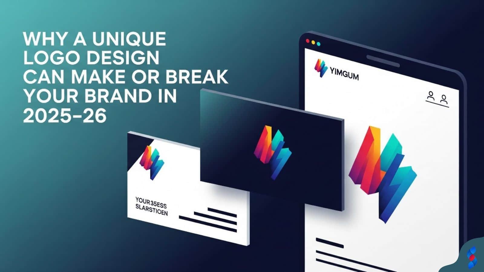
Why a Unique Logo Design Can Make or Break Your Brand in 2025–26
Why a Unique Logo Design Can Make or Break Your Brand in 2025–26: In today’s hyper-digital world, where first impressions are everything and brand identity...
Need help? Call us:
+92 320 1516 585
Graphic design is critical for creating a positive user experience (UX) on WordPress websites. In today’s digital landscape, where first impressions matter more than ever, visually appealing and well-designed websites attract and retain visitors. Understanding how graphic design principles interact with WordPress UX can significantly enhance engagement, usability, and ultimately, conversion rates. This comprehensive guide will explore how to optimize your WordPress site using graphic design best practices to achieve a superior user experience.
Graphic design is much more than just making a website look pretty; it’s about strategically using visual elements to guide users, convey information, and reinforce your brand. A well-designed website creates a positive first impression, builds trust, and encourages visitors to explore further. Effective graphic design ensures that your message is communicated clearly and concisely, which is essential for retaining user interest. In essence, good graphic design is an investment in your online presence and user satisfaction. When our team in Dubai works on website overhauls, the first thing they always address is the graphic design to ensure the site matches the client’s branding and goals.
Visuals play a significant role in shaping the user experience. Studies show that users form an opinion about a website within seconds of landing on the page. High-quality images, thoughtful layouts, and consistent branding contribute to a professional and trustworthy image. Visual cues guide users through the site, helping them find the information they need quickly and efficiently. A visually appealing website reduces bounce rates, increases engagement, and fosters a positive connection with your brand. Essentially, the better the graphic design, the better the user experience.
This guide will provide a comprehensive overview of how to leverage graphic design principles to enhance the UX of your WordPress website. We’ll delve into the fundamentals of visual hierarchy, color theory, and typography. We’ll also explore practical strategies for optimizing website navigation, enhancing visual appeal through branding, ensuring mobile responsiveness, and improving website performance through image optimization. Furthermore, we will look at designing for accessibility and measuring the impact of graphic design on UX. By the end of this guide, you’ll have the knowledge and tools to create a visually stunning and highly functional WordPress website that delights your users.
Visual hierarchy is the arrangement of elements on a page in a way that guides the user’s eye and communicates the importance of different pieces of information. It’s about creating a clear path for the user to follow, ensuring they see the most important content first. Elements like size, color, contrast, and placement all play a role in establishing visual hierarchy. For instance, larger headlines grab attention, while strategic use of color can highlight key calls to action. A well-defined visual hierarchy makes it easier for users to scan and understand your content, improving overall website usability.
To effectively implement visual hierarchy:
1. Prioritize Content: Identify the most important information you want users to see.
2. Use Size and Scale: Make important elements larger to draw attention.
3. Leverage Contrast: Use contrasting colors to make elements stand out.
4. Strategic Placement: Place key elements in prominent locations on the page (e.g., above the fold).
5. Whitespace: Use whitespace to separate and highlight elements.
By mastering visual hierarchy, you can create a more intuitive and engaging user experience.
Color theory is the science and art of using color effectively. Understanding color psychology and how different colors evoke different emotions is crucial for creating a color palette that resonates with your target audience and reinforces your branding. Colors can influence user behavior, create a mood, and guide users through your site. A well-chosen color palette enhances the overall aesthetic appeal and contributes to a cohesive and professional design.
Key aspects of color theory include:
When selecting a color palette for your WordPress website, consider your brand identity, target audience, and the overall message you want to convey. Using tools like Adobe Color or Coolors can help you create harmonious and effective color schemes.
Typography plays a vital role in website design and user experience. The fonts you choose can impact readability, legibility, and the overall tone of your website. Selecting fonts that are both visually appealing and easy to read is essential for keeping users engaged. Consider factors like font size, line height, letter spacing, and contrast when making your font choices.
Here’s a breakdown of key typographic considerations:
Choosing the right fonts can significantly enhance the user experience and reinforce your brand identity. Use tools like Google Fonts to explore a wide range of free and open-source fonts.
Whitespace, also known as negative space, is the empty space around elements on a page. It’s a crucial element of graphic design that helps to improve readability, reduce clutter, and draw attention to important content. Effective use of whitespace can make a website feel more open, inviting, and easy to navigate.
Benefits of using whitespace include:
When designing your WordPress website, be mindful of whitespace and use it strategically to create a better user experience. Avoid overcrowding your pages with too much content, and give your elements plenty of room to breathe.
A clear and intuitive menu is the cornerstone of effective website navigation. Your menu should be easy to find, easy to understand, and easy to use. Use clear and concise labels for your menu items, and organize them logically. A well-designed menu helps users quickly find the information they need, improving overall website usability and reducing frustration.
Best practices for menu design include:
A thoughtfully designed menu can significantly enhance the user experience and encourage users to explore your website.
Icons and visual cues can enhance website navigation by providing visual reinforcement for menu items and call-to-action buttons. Icons can help users quickly identify the purpose of a link or button, making navigation more intuitive. When used effectively, icons and visual cues can improve website usability and reduce cognitive load.
Tips for using icons and visual cues:
Icons can be a powerful tool for enhancing website navigation and improving the user experience.
Call-to-action (CTA) buttons are essential for guiding users towards desired actions, such as making a purchase, signing up for a newsletter, or contacting your business. A well-designed CTA button should be visually prominent, easy to click, and clearly communicate the desired action. Effective CTA buttons can significantly improve conversion rate optimization and drive business results.
Key elements of a compelling CTA button:
Designing effective CTA buttons is crucial for driving conversions and achieving your business goals. We once had a client whose conversion rates jumped by 30% just by optimizing the placement and design of their call-to-action buttons. Here’s the trick: A/B test different button designs and placements to find what works best for your audience.
Breadcrumbs are a secondary navigation aid that helps users understand their location within a website’s structure. They provide a trail of links that shows the path from the homepage to the current page. Breadcrumbs improve website usability by making it easier for users to navigate back to previous pages or sections.
Benefits of using breadcrumbs:
Implementing breadcrumbs on your WordPress website can significantly enhance the user experience and improve overall navigation.
A consistent brand identity is essential for building recognition, trust, and loyalty with your audience. Your brand identity should be reflected in every aspect of your website design, from your logo and color palette to your typography and imagery. A cohesive brand identity helps users easily recognize and remember your brand.
Key elements of a consistent brand identity:
Maintaining a consistent brand identity across your WordPress website reinforces your brand message and creates a professional and trustworthy image.
High-quality images and videos can significantly enhance the visual appeal of your WordPress website. Visual content can capture attention, convey information, and engage users in a way that text alone cannot. Using professional-quality images and videos can improve website usability and create a more immersive and engaging user experience.
Tips for using images and videos:
Investing in high-quality visual content can significantly enhance the user experience and improve the overall effectiveness of your website.
Custom graphics and illustrations can add a unique and personalized touch to your WordPress website. Custom visuals can help you stand out from the competition and create a more memorable user experience. Whether you’re creating custom icons, illustrations, or infographics, incorporating original visuals can enhance your branding and improve website usability.
Benefits of using custom graphics and illustrations:
Consider incorporating custom graphics and illustrations into your WordPress website to create a more unique and engaging user experience.
Visual consistency is crucial for creating a cohesive and professional-looking WordPress website. Every page on your website should adhere to the same design principles, including color palette, typography, imagery, and layout. Visual consistency reinforces your branding, improves website usability, and creates a seamless user experience.
Tips for ensuring visual consistency:
Maintaining visual consistency across your WordPress website creates a professional and trustworthy image, enhancing the user experience and reinforcing your branding.
With the increasing use of mobile devices, it’s essential to design your WordPress website to be responsive. A responsive website adapts to different screen sizes and devices, providing an optimal user experience regardless of how users access your site. Designing for mobile responsiveness ensures that your website is accessible and usable on smartphones, tablets, and desktops.
Key principles of responsive design:
Designing for mobile responsiveness is crucial for providing a positive user experience and reaching a wider audience.
Optimizing images for mobile performance is essential for ensuring fast loading times and a smooth user experience on mobile devices. Large, unoptimized images can significantly slow down your website, leading to frustration and high bounce rates. Optimizing images for mobile performance involves compressing images, using appropriate file formats, and implementing lazy loading.
Tips for optimizing images for mobile performance:
Optimizing images for mobile performance can significantly improve your website’s loading speed and enhance the user experience on mobile devices.
Touch-friendly navigation is essential for providing a seamless user experience on mobile devices. Users should be able to easily tap and swipe to navigate your website without encountering any usability issues. Designing for touch-friendly navigation involves creating larger touch targets, providing ample spacing between links and buttons, and optimizing your website for touch gestures.
Tips for ensuring touch-friendly navigation:
Designing for touch-friendly navigation is crucial for providing a positive user experience on mobile devices.
Testing your website on various devices is essential for ensuring that it is responsive and provides an optimal user experience across all platforms. Testing your website on different screen sizes, browsers, and operating systems can help you identify and fix any compatibility issues. Use responsive design testing tools and real devices to thoroughly test your website.
Tips for testing your website:
Thoroughly testing your website on various devices is crucial for ensuring that it is responsive and provides a positive user experience across all platforms.
Selecting the right image file format is crucial for optimizing website speed and performance. Different file formats have different strengths and weaknesses, and choosing the appropriate format can significantly impact image quality and file size. The most common image file formats for the web are JPEG, PNG, and WebP.
Choosing the right image file format can significantly improve website speed and performance. For most websites, WebP is the preferred format, offering the best balance of image quality and file size.
Compressing images is essential for reducing file sizes and improving website loading times. However, it’s important to compress images without sacrificing too much quality. There are many online tools and WordPress plugins that can help you compress images without significantly impacting their appearance.
Tips for compressing images:
Compressing images can significantly improve website loading times and enhance the user experience.
Lazy loading is a technique that defers the loading of images until they are visible on the screen. This can significantly improve page load times, especially for websites with many images. Lazy loading reduces the initial load on the server and improves the perceived performance of the website.
Benefits of using lazy loading:
Implementing lazy loading on your WordPress website can significantly improve page load times and enhance the user experience.
A Content Delivery Network (CDN) is a network of servers that are distributed around the world. When a user visits your website, the CDN delivers content from the server that is closest to the user’s location. This can significantly improve website loading times, especially for users who are located far from your website’s server.
Benefits of using a CDN:
Implementing a CDN on your WordPress website can significantly improve website speed, reliability, and security, enhancing the user experience.
| Image Optimization Technique | Description | Benefits |
|---|---|---|
| Choosing the Right File Format | Selecting JPEG, PNG, or WebP based on image content. | Reduces file size while maintaining quality. |
| Compressing Images | Reducing file size without sacrificing too much quality. | Improves loading times and reduces bandwidth usage. |
| Using Lazy Loading | Deferring the loading of images until they are visible on the screen. | Speeds up initial page load and enhances user experience. |
| Implementing a CDN | Distributing website content across multiple servers worldwide. | Decreases latency and ensures fast loading times for global users. |
Ensuring sufficient color contrast is crucial for making your website accessible to users with visual impairments. Adequate color contrast ensures that text is easily readable against the background. The Web Content Accessibility Guidelines (WCAG) recommend a color contrast ratio of at least 4.5:1 for normal text and 3:1 for large text.
Tips for ensuring sufficient color contrast:
Ensuring sufficient color contrast is essential for making your website accessible to users with visual impairments.
Providing alternative text (alt text) for images is crucial for making your website accessible to users who cannot see images. Alt text is a text description of an image that is displayed when the image cannot be loaded or when a user is using a screen reader. Alt text should be descriptive, concise, and relevant to the image.
Tips for providing alt text:
Providing alt text for images is essential for making your website accessible to users who cannot see images and for improving SEO.
Designing for users with visual impairments involves considering the needs of users who have low vision, color blindness, or other visual impairments. This includes ensuring sufficient color contrast, providing alternative text for images, using clear and readable typography, and designing a website that is easy to navigate with a screen reader.
Tips for designing for users with visual impairments:
Designing for users with visual impairments is essential for making your website accessible to everyone.
The Web Content Accessibility Guidelines (WCAG) are a set of international standards for making web content accessible to people with disabilities. Meeting WCAG guidelines is crucial for ensuring that your website is accessible to everyone, including users with visual impairments, hearing impairments, motor impairments, and cognitive impairments.
Key WCAG principles:
Meeting WCAG guidelines is essential for making your website accessible to everyone and for complying with accessibility laws and regulations.
> “Accessibility is not a feature, it’s a fundamental right. Designing with accessibility in mind from the start ensures that everyone can access and enjoy your content.” – Sarah P. Jones, Accessibility Consultant
WordPress offers a plethora of plugins that can assist with visual design, enabling users to create visually appealing and engaging websites without extensive coding knowledge. These plugins range from page builders to image optimization tools, providing a wide array of functionalities to enhance graphic design capabilities.
Popular WordPress plugins for visual design:
These plugins can significantly simplify the process of graphic design in WordPress, allowing you to create visually stunning websites with ease.
Online graphic design platforms like Canva and Adobe Creative Cloud Express (formerly Adobe Spark) offer user-friendly interfaces and a wide range of templates and design elements that can be used to create visually appealing graphics for your WordPress website. These platforms are ideal for creating social media graphics, blog headers, infographics, and other visual content.
Benefits of using online graphic design platforms:
These online graphic design platforms can be a valuable resource for creating visually appealing graphics for your WordPress website.
High-quality images are essential for creating a visually appealing WordPress website. There are many free and paid stock photo resources available online that offer a wide range of images to choose from.
Popular stock photo resources:
Choosing the right stock photo resource can help you find the perfect images for your WordPress website.
There are many learning resources and tutorials available online that can help you improve your graphic design skills and learn how to use graphic design tools and techniques effectively.
Popular learning resources and tutorials:
These learning resources and tutorials can help you improve your graphic design skills and create more visually appealing WordPress websites.
Analytics tools, such as Google Analytics, provide valuable insights into how users interact with your website. By tracking user behavior, you can measure the impact of your graphic design choices on the user experience. Key metrics to monitor include bounce rate, time on page, pages per session, and conversion rates.
How to use analytics to measure the impact of graphic design:
By analyzing these metrics, you can gain a better understanding of how your graphic design choices are impacting the user experience and make data-driven decisions to optimize your website.
User testing involves observing real users as they interact with your website. This can provide valuable qualitative feedback on the user experience and help you identify any usability issues. User testing can be conducted in person or remotely, using tools like screen sharing and video conferencing.
How to conduct user testing:
User testing can provide valuable insights into the user experience and help you identify areas where your graphic design can be improved.
Surveys are a cost-effective way to gather feedback from a large number of users. You can use surveys to ask users about their perceptions of your website’s graphic design, usability, and overall user experience. Online survey tools like SurveyMonkey and Google Forms make it easy to create and distribute surveys.
Tips for creating effective surveys:
Surveys can provide valuable feedback on the user experience and help you identify areas where your graphic design can be improved.
Conversion rates measure the percentage of website visitors who complete a desired action, such as making a purchase, signing up for a newsletter, or contacting your business. Monitoring conversion rates can help you assess the effectiveness of your graphic design in guiding users towards these actions. Improved conversion rates suggest that your graphic design is effectively guiding users towards desired actions and enhancing the user experience.
Tips for monitoring conversion rates:
Monitoring conversion rates can help you assess the effectiveness of your graphic design and identify areas where you can make improvements to enhance the user experience and drive business results.
Slow loading times due to large images are a common problem that can significantly impact the user experience. Large images can increase page load times, leading to frustration and high bounce rates.
Troubleshooting steps:
1. Identify Large Images: Use tools like Google PageSpeed Insights to identify large images that are slowing down your website.
2. Compress Images: Compress images using tools like TinyPNG or ImageOptim to reduce file sizes without sacrificing quality.
3. Use Appropriate File Formats: Use JPEG for photographs and PNG for graphics with transparency.
4. Resize Images: Resize images to the appropriate dimensions for your website.
5. Implement Lazy Loading: Use lazy loading to load images only when they are visible on the screen.
Addressing slow loading times due to large images can significantly improve website speed and enhance the user experience.
Broken or misaligned graphics can detract from the visual appeal of your website and create a negative user experience.
Troubleshooting steps:
1. Check Image URLs: Ensure that the URLs for your images are correct and that the images are located in the correct directory.
2. Check Image Paths: Check the image paths in your HTML or CSS code to ensure that they are accurate.
3. Clear Browser Cache: Clear your browser cache to ensure that you are seeing the latest version of your website.
4. Test on Different Browsers: Test your website on different browsers to see if the issue is browser-specific.
5. Use a Validation Tool: Use a website validation tool to identify any HTML or CSS errors that may be causing the issue.
Fixing broken or misaligned graphics can improve the visual appeal of your website and enhance the user experience.
Compatibility issues across different browsers can cause your website to display incorrectly or function improperly on certain browsers.
Troubleshooting steps:
1. Test on Different Browsers: Test your website on different browsers, including Chrome, Firefox, Safari, and Edge.
2. Use Browser-Specific CSS: Use browser-specific CSS to apply different styles to your website based on the browser being used.
3. Use a CSS Reset: Use a CSS reset to normalize the default styles of different browsers.
4. Use a JavaScript Polyfill: Use a JavaScript polyfill to provide support for older browsers that do not support certain features.
5. Validate Your Code: Validate your HTML and CSS code to ensure that it is valid and complies with web standards.
Resolving compatibility issues across different browsers can ensure that your website displays correctly and functions properly for all users.
Mobile responsiveness problems can cause your website to display incorrectly or function improperly on mobile devices.
Troubleshooting steps:
1. **Use a Responsive Design Framework
Don’t forget to share it

We’ll Design & Develop a Professional Website Tailored to Your Brand
Enjoy this post? Join our newsletter
Newsletter
Related Articles
Why a Unique Logo Design Can Make or Break Your Brand in 2025–26
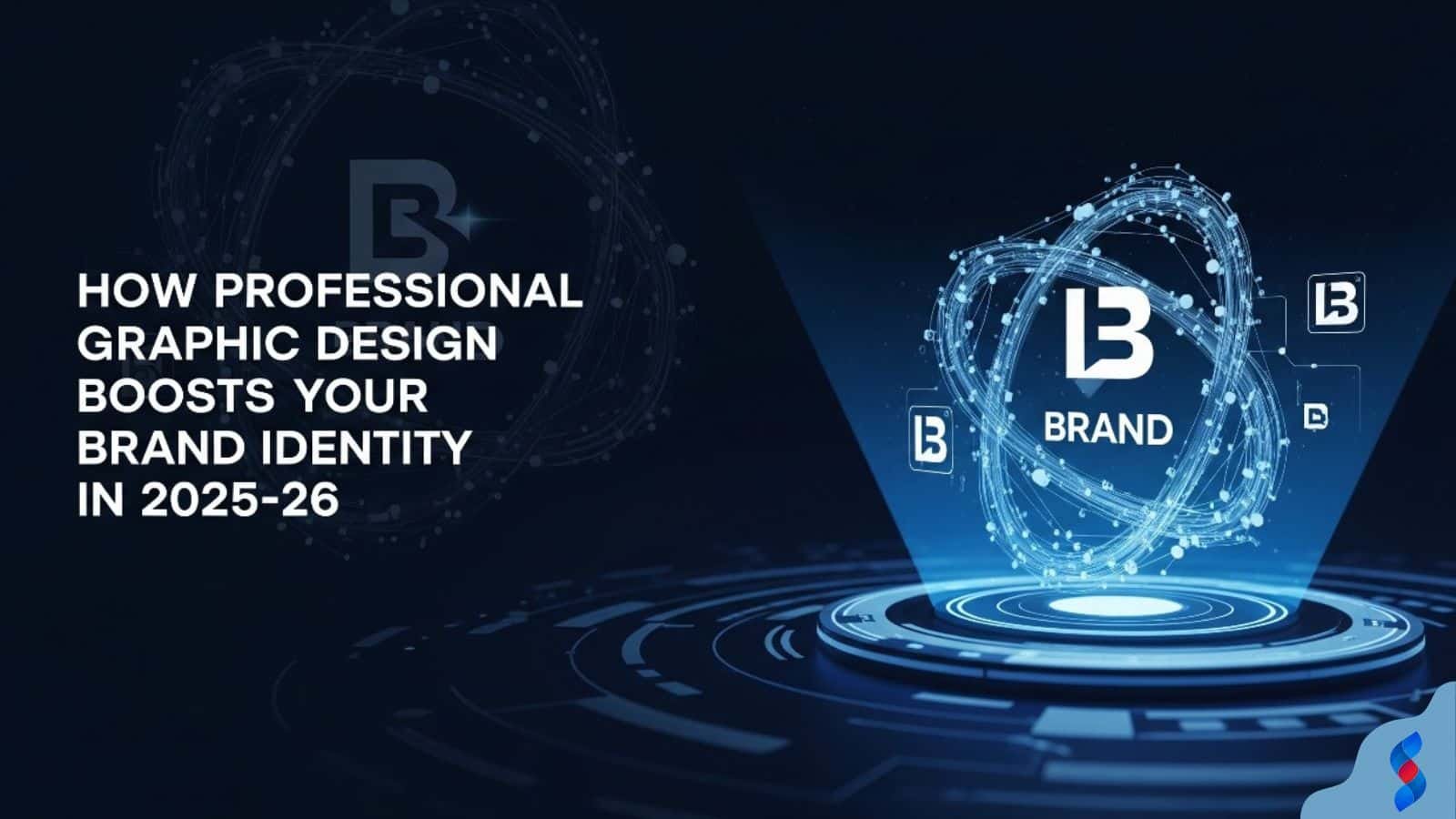
How Professional Graphic Design Boosts Your Brand Identity in 2025–26
Top 10 Reasons to Outsource Your Graphic Design Needs Today
Graphic Design SEO: 7 Amazing Ways to Boost Your Website in 2025
Graphic Design Skills: The Amazing 2025 Boost for WordPress Traffic
Ultimate Guide to Boosting WordPress Website Success with Graphic Design Experience in 2025