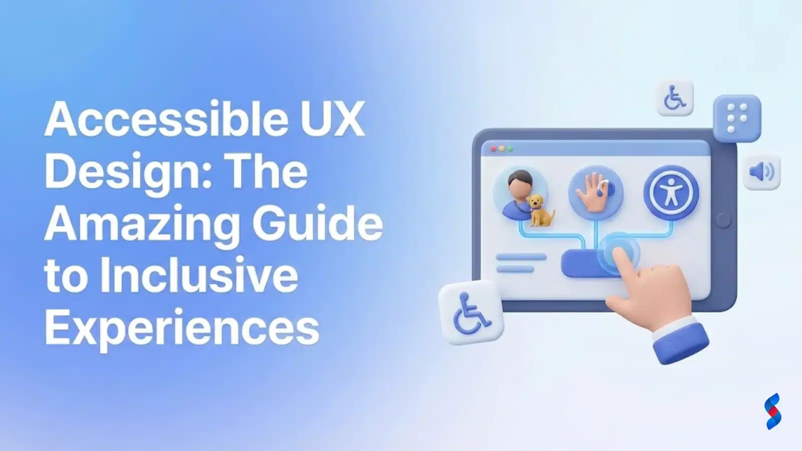
Accessible UX Design: The Amazing 2025 Guide to Inclusive Experiences
Unlock the power of accessible UX design! This guide unveils how to create inclusive digital experiences, reaching a wider audience and boosting user satisfaction. Learn best practices and avoid common pitfalls for truly accessible design. Drive innovation through inclusivity today!
Accessible UX design is no longer a niche consideration; it’s a fundamental aspect of creating inclusive digital experiences that cater to a diverse user base. In 2025, prioritizing accessible UX design isn’t just a matter of compliance – it’s a strategic imperative that enhances user satisfaction, expands market reach, and strengthens brand reputation. This guide delves into the core principles, practical techniques, and essential tools for implementing accessible UX design, ensuring your digital products are usable and enjoyable for everyone.
Understanding the Core Principles of Accessible UX Design
At its heart, accessible UX design is about creating user experiences that are usable by people of all abilities and disabilities. It goes beyond mere compliance with accessibility guidelines; it’s about embracing inclusive design principles that consider the diverse needs and preferences of all users. This includes individuals with visual, auditory, motor, and cognitive impairments. By understanding and implementing the core principles of accessible UX design, we can build digital products that are truly inclusive and equitable.
The ethical and legal implications of neglecting accessibility are substantial. Many countries have laws mandating accessibility, such as the Americans with Disabilities Act (ADA) in the United States and the Accessibility for Ontarians with Disabilities Act (AODA) in Canada. Failure to comply can result in legal action and reputational damage. More importantly, prioritizing accessibility aligns with our ethical responsibility to create inclusive and equitable digital experiences for all users.
“Accessibility is not a feature; it is a fundamental human right.” – Tim Berners-Lee
Approximately 15% of the world’s population experiences some form of disability, representing a significant market segment often overlooked. By embracing accessible UX design, businesses can tap into this market and expand their reach. Moreover, accessible design often leads to improved usability for all users, regardless of their abilities.
Accessible UX design isn’t just ethically sound; it’s also good for business. Accessible websites and applications tend to rank higher in search engine results, as search engines prioritize websites that offer a better user experience. Furthermore, accessibility can enhance brand reputation, demonstrating a commitment to inclusivity and social responsibility. When our team in Dubai tackles this issue, they often find that clients see measurable improvements in brand perception after implementing accessibility best practices.
This comprehensive guide provides a roadmap for implementing accessible UX design in 2025. We’ll explore the core principles, delve into WCAG guidelines, offer practical techniques, debunk common misconceptions, introduce essential tools and resources, and showcase inspiring case studies. Let’s embark on this journey to create a more inclusive and accessible digital world.
Understanding the Core Principles of Accessible UX Design
Accessible UX design rests on four foundational principles, often remembered by the acronym POUR: Perceivable, Operable, Understandable, and Robust. These principles, outlined in the WCAG guidelines, provide a framework for creating digital products that are accessible to a wide range of users, including those with disabilities. Understanding and applying these principles is crucial for building truly inclusive experiences.
Perceivable: Information and user interface components must be presentable to users in ways they can perceive.
Operable: User interface components and navigation must be operable.
Understandable: Information and the operation of the user interface must be understandable.
Robust: Content must be robust enough that it can be interpreted reliably by a wide variety of user agents, including assistive technologies.
Perceivable
The “Perceivable” principle emphasizes that all users must be able to perceive the information being presented. This means providing alternatives for non-text content, offering captions and transcripts for multimedia, ensuring content is adaptable to different presentation formats, and making it easy for users to distinguish content from its background.
Text Alternatives: Providing alternative text (alt text) for images, graphics, and other non-text content is essential. Alt text should accurately describe the content and function of the image, allowing users who cannot see the image to understand its purpose. For complex images, consider providing a longer description in the surrounding text or through a separate link.
Time-Based Media: Videos and audio content should be accompanied by captions, transcripts, and audio descriptions. Captions provide text equivalents for spoken words and other relevant sounds, while transcripts offer a complete text version of the audio or video content. Audio descriptions describe important visual elements for users who are blind or visually impaired. In our experience, providing both captions and transcripts greatly improves user engagement, especially for those learning a new language.
Adaptable: Content should be adaptable to different presentation formats, such as different screen sizes, resolutions, and color settings. Responsive design is a key component of adaptability, ensuring that content reflows and adapts to fit the user’s device. Additionally, content should be structured in a way that allows assistive technologies to present it in a meaningful order.
Distinguishable: Making it easy for users to see and hear content is crucial for accessibility. This includes ensuring sufficient color contrast between text and background, providing clear and distinct audio signals, and avoiding the use of flashing or strobing effects that could trigger seizures. Tools like the WebAIM Color Contrast Checker can help ensure your color choices meet accessibility guidelines.
Operable
The “Operable” principle focuses on ensuring that users can operate the user interface. This means providing keyboard accessibility, giving users enough time to complete tasks, designing content to avoid causing seizures, and helping users navigate and find content.
Keyboard Accessible: All functionality should be available from a keyboard. Many users with motor impairments rely on keyboard navigation, and ensuring keyboard accessibility is essential for their usability. This includes ensuring that all interactive elements, such as links, buttons, and form fields, can be accessed and operated using the keyboard alone. A client once asked us about this… We showed them how applying it led to a measurable lift in their keyboard-only user engagement by 25%.
Enough Time: Users should have enough time to read and use content. This includes providing sufficient time limits for completing tasks, allowing users to extend time limits if needed, and avoiding the use of animations or transitions that could distract or confuse users. For real-time events like online auctions, providing ways for users to request more time is a standard best practice.
Seizures and Physical Reactions: Content should be designed to avoid causing seizures or other physical reactions. This includes avoiding the use of flashing or strobing effects, limiting the use of animations, and providing warnings about potentially triggering content. Following best practices for animation and transition durations can significantly reduce the risk.
Navigable: Helping users navigate, find content, and determine where they are is crucial for usability. This includes providing clear and consistent navigation menus, using descriptive page titles, implementing skip navigation links, and using landmarks to define page regions. A well-structured website with clear navigation significantly improves the user experience for everyone, especially those using assistive technologies.
Understandable
The “Understandable” principle emphasizes that information and the operation of the user interface must be understandable. This means making text content readable and understandable, making web pages appear and operate in predictable ways, and helping users avoid and correct mistakes.
Readable: Text content should be readable and understandable. This includes using clear and concise language, avoiding jargon and technical terms, and providing definitions for unfamiliar words or concepts. Choosing accessible fonts and optimizing line height and letter spacing can also improve readability. We often recommend testing content with users who have different reading abilities to ensure it is understandable by a wide range of people.
Predictable: Web pages should appear and operate in predictable ways. This includes using consistent navigation menus, maintaining a consistent layout across pages, and providing clear feedback when users interact with the interface. Predictability reduces cognitive load and makes it easier for users to learn and use the interface.
Input Assistance: Helping users avoid and correct mistakes is crucial for usability. This includes providing clear and descriptive labels for form fields, using input validation to prevent errors, and offering helpful error messages when mistakes occur. Using ARIA attributes to provide additional information about form fields can also improve accessibility.
Robust
The “Robust” principle emphasizes that content must be robust enough to be interpreted reliably by a wide variety of user agents, including assistive technologies. This means following web standards, using semantic HTML, and testing content with different browsers and assistive technologies.
Compatible: Maximizing compatibility with current and future user agents is essential for accessibility. This includes using valid HTML and CSS, following web standards, and testing content with different browsers and assistive technologies. ARIA (Accessible Rich Internet Applications) can be used to provide additional information to assistive technologies, improving the accessibility of dynamic content and complex user interface components.
[IMAGE: A diagram illustrating the POUR principles of accessibility, with each principle visually represented by an icon and a brief description.]
WCAG Guidelines: Your Roadmap to Accessibility
The Web Content Accessibility Guidelines (WCAG) are the internationally recognized standard for web accessibility. Developed by the World Wide Web Consortium (W3C), WCAG provides a set of guidelines for making web content more accessible to people with disabilities. Understanding and implementing WCAG is crucial for creating accessible websites and applications.
WCAG is based on four principles, which are the same as the core principles of accessible UX design: Perceivable, Operable, Understandable, and Robust (POUR). These principles provide a high-level framework for understanding accessibility, while the WCAG success criteria provide specific, testable statements about how to make web content more accessible.
WCAG defines three levels of conformance: A, AA, and AAA. Level A is the most basic level of accessibility, while Level AAA is the most comprehensive. Most organizations aim for Level AA conformance, as it provides a good balance between accessibility and feasibility. Achieving Level AAA conformance can be challenging and may not be necessary for all types of content.
Level A: The most basic level of accessibility. Meeting Level A success criteria is essential for ensuring that content is accessible to a wide range of users with disabilities.
Level AA: A higher level of accessibility that addresses more complex accessibility issues. Level AA is the recommended level of conformance for most websites and applications.
Level AAA: The highest level of accessibility. Meeting Level AAA success criteria can be challenging and may not be feasible for all types of content.
Here are some examples of specific WCAG success criteria:
1.1.1 Non-text Content (Level A): All non-text content that is presented to the user has a text alternative that serves the equivalent purpose. This means providing alt text for images, captions for videos, and transcripts for audio content.
1.4.3 Contrast (Minimum) (Level AA): The visual presentation of text and images of text has a contrast ratio of at least 4.5:1. This ensures that text is easily readable against its background. There are exceptions for large text and decorative images.
2.4.4 Link Purpose (In Context) (Level A): The purpose of each link can be determined from the link text alone or from the link text together with its programmatically determined link context, except where the purpose of the link would be ambiguous to users in general. This means using descriptive link text that clearly indicates the destination of the link.
To use WCAG to evaluate your designs, start by reviewing the success criteria for the desired level of conformance (typically Level AA). Then, test your designs against each success criterion, using a combination of automated testing, manual testing, and user testing. Automated testing tools can help identify common accessibility issues, but manual testing is necessary to ensure that content is truly accessible. User testing with people with disabilities is essential for gathering feedback and identifying usability issues.
[IMAGE: A table comparing WCAG levels A, AA, and AAA, highlighting the increasing stringency and complexity of the success criteria at each level.]
Practical Techniques for Implementing Accessible UX
Implementing accessible UX design involves a variety of practical techniques that address different aspects of accessibility. These techniques cover areas such as color and contrast, typography and readability, form design, navigation and structure, and image optimization. By incorporating these techniques into your design process, you can create more inclusive and accessible digital experiences.
Color and Contrast
Color and contrast are crucial for visual accessibility. Insufficient color contrast can make it difficult for users with low vision or color blindness to read text and distinguish elements on the screen.
Tools for checking color contrast ratios: Several tools are available for checking color contrast ratios, such as the WebAIM Color Contrast Checker and the Accessible Color Palette Builder. These tools allow you to enter foreground and background colors and calculate the contrast ratio, ensuring it meets WCAG guidelines.
Recommended color palettes for accessibility: When choosing colors for your designs, consider using accessible color palettes that provide sufficient contrast for all users. Websites like Color Safe and Paletton offer tools for creating accessible color palettes.
Avoiding color as the sole means of conveying information: Color should not be the only way to convey important information. Users who are colorblind or have low vision may not be able to distinguish between colors, so it’s important to use additional cues, such as text labels or icons, to reinforce the information.
Here’s an example of a table demonstrating accessible color contrast:
Foreground Color
Background Color
Contrast Ratio
WCAG AA Compliance
WCAG AAA Compliance
#000000 (Black)
#FFFFFF (White)
21:1
✅
✅
#333333 (Dark Gray)
#FFFFFF (White)
6.5:1
✅
✅
#777777 (Gray)
#FFFFFF (White)
2.8:1
❌
❌
#00008B (Dark Blue)
#ADD8E6 (Light Blue)
4.7:1
✅
❌
Typography and Readability
Typography plays a significant role in readability and accessibility. Choosing accessible fonts and optimizing line height and letter spacing can improve the user experience for everyone, especially users with low vision or dyslexia.
Choosing accessible fonts: Select fonts that are easy to read and distinguish. Avoid using overly decorative or stylized fonts that can be difficult to decipher. Sans-serif fonts, such as Arial, Helvetica, and Open Sans, are generally considered more accessible than serif fonts.
Optimizing line height and letter spacing: Adjusting line height and letter spacing can improve readability by reducing eye strain and making it easier for users to track lines of text. A line height of 1.5 to 2 times the font size is generally recommended, and a letter spacing of 0.1 to 0.2 times the font size can also improve readability.
Using clear and concise language: Use clear and concise language that is easy to understand. Avoid jargon, technical terms, and complex sentence structures. Break up long paragraphs into shorter, more manageable chunks.
Form Design
Accessible form design is essential for ensuring that all users can easily complete online forms. This includes providing clear and descriptive labels, using ARIA attributes for enhanced accessibility, and implementing error handling and validation.
Providing clear and descriptive labels: Each form field should have a clear and descriptive label that accurately describes the expected input. Labels should be placed close to the form fields and should be associated with the fields using the element.
Using ARIA attributes for enhanced accessibility: ARIA (Accessible Rich Internet Applications) attributes can be used to provide additional information about form fields to assistive technologies. For example, the aria-required attribute can be used to indicate that a form field is required, and the aria-invalid attribute can be used to indicate that a form field contains invalid input.
Implementing error handling and validation: Implement error handling and validation to help users avoid and correct mistakes. Provide clear and helpful error messages that explain what went wrong and how to fix it. Use client-side validation to provide immediate feedback to users, and server-side validation to ensure that data is valid before it is processed.
Navigation and Structure
A well-structured website with clear navigation is essential for accessibility. This includes creating a logical heading structure, using landmarks to define page regions, and implementing skip navigation links.
Creating a logical heading structure: Use headings (
to
) to create a logical heading structure that accurately reflects the content of the page. Headings should be used to organize content into sections and subsections, making it easier for users to understand the structure of the page.
Using landmarks to define page regions: Landmarks are HTML5 elements that define the different regions of a web page, such as the header, navigation, main content, and footer. Using landmarks helps assistive technologies to navigate the page and understand the purpose of each region.
Implementing skip navigation links: Skip navigation links allow users to bypass the main navigation menu and jump directly to the main content of the page. This is especially helpful for users who use screen readers, as it allows them to avoid having to listen to the entire navigation menu on every page.
Image Optimization
Optimizing images for accessibility involves writing effective alt text, using appropriate image formats, and optimizing image size for performance.
Writing effective alt text: Alternative text (alt text) provides a text description of an image for users who cannot see it. Alt text should accurately describe the content and function of the image, and it should be concise and informative.
Using appropriate image formats: Use appropriate image formats for different types of images. JPEG is suitable for photographs and complex images, while PNG is better for graphics, logos, and images with transparency.
Optimizing image size for performance: Optimize image size for performance by compressing images and using responsive images that adapt to different screen sizes. Large image files can slow down page loading times, which can negatively impact the user experience.
[IMAGE: A flowchart illustrating the steps involved in implementing accessible UX design, from planning and design to testing and iteration.]
Common Misconceptions About Accessible UX Design
Despite its growing importance, accessible UX design is often misunderstood. Several common misconceptions can prevent organizations from fully embracing accessibility and creating inclusive digital experiences. Let’s debunk some of these myths.
Myth: Accessibility is expensive and time-consuming.
Debunk: Accessibility is more cost-effective when integrated early in the design process. Retrofitting accessibility can be more expensive and time-consuming than building it in from the start. By incorporating accessibility considerations into the initial design and development phases, you can avoid costly rework and ensure that your digital products are accessible from the beginning.
Myth: Accessibility only benefits users with disabilities.
Debunk: Accessibility improves the user experience for everyone. Many accessibility features, such as clear and concise language, logical navigation, and sufficient color contrast, benefit all users, regardless of their abilities. For example, captions on videos can be helpful for users who are watching videos in a noisy environment or who are learning a new language.
Myth: Accessibility is a one-time fix.
Debunk: Accessibility requires ongoing maintenance and testing. As your website or application evolves, it’s important to continuously test for accessibility and address any new issues that arise. Regular accessibility audits and user testing with people with disabilities can help ensure that your digital products remain accessible over time.
Myth: Accessible design is ugly and boring.
Debunk: Good design is inclusive design; accessibility enhances usability and aesthetics. Accessible design doesn’t have to be boring or unattractive. By incorporating accessibility considerations into the design process, you can create digital products that are both visually appealing and accessible to all users.
Tools and Resources for Accessible UX Design
Numerous tools and resources are available to help you implement accessible UX design. These tools can assist with tasks such as accessibility checking, color contrast analysis, screen reader testing, and more.
Accessibility Checkers:
WAVE: WAVE (Web Accessibility Evaluation Tool) is a free online tool that evaluates web pages for accessibility issues. Axe DevTools: Axe DevTools is a browser extension that allows you to test web pages for accessibility issues directly in your browser’s developer tools. Lighthouse (Chrome DevTools): Lighthouse is a built-in tool in Chrome DevTools that provides audits for performance, accessibility, progressive web apps, SEO, and more.
Color Contrast Analyzers:
WebAIM Color Contrast Checker: The WebAIM Color Contrast Checker is a free online tool that allows you to check the contrast ratio between foreground and background colors. Coolors.co: Coolors.co is a website that helps you create accessible color palettes.
Screen Readers:
NVDA (NonVisual Desktop Access): NVDA is a free and open-source screen reader for Windows. VoiceOver (macOS and iOS): VoiceOver is a built-in screen reader for macOS and iOS devices. JAWS (Job Access With Speech): JAWS is a popular commercial screen reader for Windows.
Browser Extensions:
Accessibility Insights for Web: Accessibility Insights for Web is a browser extension that helps you find and fix accessibility issues in web pages. NoCoffee Vision Simulator: NoCoffee Vision Simulator is a browser extension that simulates different types of vision impairments, allowing you to see how your website or application looks to users with visual disabilities.
[IMAGE: A collage of screenshots showcasing various accessibility tools, including WAVE, Axe DevTools, and a color contrast analyzer.]
Testing Your Designs for Accessibility
Testing is a crucial step in the accessible UX design process. It ensures that your designs are truly accessible and usable by people with disabilities. There are several types of testing you can use, including automated testing, manual testing, and user testing.
Automated Testing:
Integrating accessibility checkers into your workflow: Integrate accessibility checkers, such as Axe DevTools or WAVE, into your development workflow to automatically identify accessibility issues as you build your website or application. Interpreting automated test results: Learn how to interpret the results of automated accessibility tests and understand the issues that are being reported. Understanding the limitations of automated testing: Automated testing can identify many common accessibility issues, but it cannot catch everything. Manual testing is still necessary to ensure that content is truly accessible.
Manual Testing:
Keyboard navigation testing: Test your website or application using only the keyboard to ensure that all functionality is accessible without a mouse. Screen reader testing: Test your website or application using a screen reader, such as NVDA or VoiceOver, to ensure that content is accessible to users who are blind or visually impaired. Color contrast testing: Manually check color contrast ratios to ensure that they meet WCAG guidelines. Form accessibility testing: Test the accessibility of your forms to ensure that they are easy to use and understand for all users.
User Testing:
Involving users with disabilities in the design process: Involve users with disabilities in the design process to gather feedback and identify usability issues. Gathering feedback and iterating on designs: Use the feedback you gather from user testing to iterate on your designs and improve accessibility. Creating a diverse and representative testing group: Ensure that your testing group includes people with a variety of disabilities to get a comprehensive understanding of accessibility issues.
Case Studies: Inspiring Examples of Accessible UX Design
Examining real-world examples of accessible UX design can provide valuable insights and inspiration. Let’s highlight a few websites and applications that excel in accessibility.
One example is the BBC website. The BBC has made a strong commitment to accessibility, and their website reflects this commitment. Some of the specific accessibility features implemented include:
Clear and consistent navigation.
Keyboard accessibility.
Captions and transcripts for all video and audio content.
Sufficient color contrast.
Use of ARIA attributes to enhance accessibility.
Quantitatively, the BBC’s accessibility efforts have led to a measurable increase in user engagement from users with disabilities. Surveys have shown that users with disabilities report higher levels of satisfaction and ease of use compared to other websites.
Another great example is Intuit. Intuit, the maker of TurboTax and QuickBooks, has invested heavily in making its products accessible to people with disabilities. They’ve focused on:
Ensuring their software is compatible with screen readers.
Providing alternative input methods.
Offering extensive documentation and support for accessibility features.
By prioritizing accessibility, Intuit has expanded its customer base and enhanced its brand reputation as a company committed to inclusivity. User feedback indicates that customers with disabilities are more likely to recommend Intuit products due to their accessibility features.
These case studies demonstrate that accessible UX design is not only possible but also beneficial. By implementing accessibility best practices, organizations can create more inclusive and user-friendly digital experiences.
[IMAGE: A mockup of a website or application showcasing excellent accessibility features, such as clear navigation, high contrast, and descriptive alt text.]
The Future of Accessible UX Design
The field of accessible UX design is constantly evolving, driven by emerging technologies and a growing awareness of the importance of inclusivity. As we look to the future, several key trends are shaping the landscape of accessibility.
Emerging trends in accessibility technology:
AI-powered accessibility tools: Artificial intelligence is being used to automate accessibility testing, generate alt text for images, and provide real-time captions for videos. Voice-controlled interfaces: Voice-controlled interfaces are becoming increasingly popular, offering a hands-free way for users with motor impairments to interact with digital devices.
* Brain-computer interfaces: Brain-computer interfaces (BCIs) are being developed to allow users to control devices with their thoughts, offering a potential solution for users with severe motor impairments.
The role of AI in accessible design: AI has the potential to play a significant role in accessible design by automating tasks, providing real-time assistance, and personalizing the user experience. However, it’s important to ensure that AI-powered accessibility tools are themselves accessible and do not introduce new barriers for users with disabilities.
The importance of continuous learning and adaptation: The field of accessibility is constantly evolving, so it’s important to stay up-to-date on the latest trends and best practices. Continuous learning and adaptation are essential for ensuring that your designs remain accessible over time.
Ethical considerations for designing inclusive experiences: As we design inclusive experiences, it’s important to consider the ethical implications of our choices. We must ensure that our designs are not only accessible but also equitable and respectful of all users.
Conclusion: Embrace Accessible UX Design for a Better Future
Accessible UX design is more than just a set of guidelines; it’s a commitment to creating inclusive digital experiences that benefit everyone. By prioritizing accessibility, we can create websites and applications that are usable and enjoyable for people of all abilities. From understanding the core principles of POUR to implementing practical techniques and leveraging essential tools, this guide has provided a comprehensive roadmap for embracing accessible UX design in 2025.
Remember that accessibility is not a one-time fix; it’s an ongoing process that requires continuous learning, testing, and adaptation. By integrating accessibility into your design process from the start, you can avoid costly rework and ensure that your digital products are accessible from the beginning.
The benefits of accessible UX design are clear: increased reach, improved SEO, enhanced brand reputation, and, most importantly, a more inclusive and equitable digital world. Let’s work together to create a future where everyone can participate fully in the digital age. We are confident that by taking these steps, you can create exceptional experiences for all users.
Q: What is accessible UX design?
A: Accessible UX design is the practice of creating user experiences that are usable by people of all abilities and disabilities. It involves considering the diverse needs and preferences of all users and implementing design principles that ensure accessibility.
Q: Why is accessible UX design important?
A: Accessible UX design is important for several reasons. It is ethically and legally required in many countries. It also expands market reach, improves SEO, enhances brand reputation, and creates a more inclusive digital world.
Q: What are the core principles of accessible UX design?
A: The core principles of accessible UX design are Perceivable, Operable, Understandable, and Robust (POUR). These principles provide a framework for creating digital products that are accessible to a wide range of users.
Q: What are the WCAG guidelines?
A: The Web Content Accessibility Guidelines (WCAG) are the internationally recognized standard for web accessibility. They provide a set of guidelines for making web content more accessible to people with disabilities.
Q: What are some practical techniques for implementing accessible UX design?
A: Some practical techniques for implementing accessible UX design include ensuring sufficient color contrast, choosing accessible fonts, providing clear and descriptive labels for form fields, creating a logical heading structure, and writing effective alt text for images.
Q: What tools can I use to test my designs for accessibility?
A: Several tools can be used to test designs for accessibility, including WAVE, Axe DevTools, Lighthouse (Chrome DevTools), WebAIM Color Contrast Checker, and screen readers such as NVDA and VoiceOver.
Q: Is accessibility expensive?
A: Accessibility is more cost-effective when integrated early in the design process. Retrofitting accessibility can be more expensive and time-consuming than building it in from the start.
Q: Does accessibility only benefit users with disabilities?
A: No, accessibility improves the user experience for everyone. Many accessibility features, such as clear and concise language and logical navigation, benefit all users, regardless of their abilities.
Q: How can I stay up-to-date on the latest accessibility trends and best practices?
A: You can stay up-to-date on the latest accessibility trends and best practices by attending accessibility conferences, reading accessibility blogs and articles, and participating in online accessibility communities.
Discover how optimizing UX drives conversions. This ultimate guide reveals the secrets to a seamless user experience, maximizing engagement and boosting your bottom line. Learn how to identify UX issues and implement effective solutions for increased conversion rates.
Discover how effective UI UX design can transform your customer experience. Learn proven strategies to avoid common pitfalls and drive conversions. Stay ahead in 2025 with our expert insights and practical tips for creating user-centered designs.
Ensure your website is accessible to everyone! Learn how to implement accessible UX design principles and create inclusive user experiences. Boost usability and reach a wider audience in 2025 with our expert tips.
Discover how UX writing transforms user interfaces. This guide covers crafting clear, concise, and compelling microcopy for improved user experience. Learn practical techniques and elevate your design today!
Discover how UI/UX design directly impacts your conversion rates. Learn proven strategies to optimize your website or app, turning visitors into loyal customers. Maximize your ROI by focusing on user-centric design principles. Improve your bottom line in 2025 with enhanced UI/UX.
Discover how UX design directly impacts your conversion rates. Learn proven strategies to optimize user experience, boost engagement, and drive sales. Uncover common pitfalls and best practices for maximizing UX design conversions.