Magento Mobile First: The Ultimate Guide to an Amazing Store in 2026
Discover how to optimize your Magento store for the mobile-first era. This guide provides actionable strategies to enhance mobile user experience, boost conversions, and stay ahead of the competition. Get ready for 2026!
Introduction: The Mobile-First Imperative for Magento in 2026
In 2026, the concept of “mobile-first” isn’t just a recommendation; it’s the bedrock of any successful e-commerce strategy, especially for businesses leveraging the power of Magento. Customers expect seamless, intuitive, and lightning-fast experiences on their smartphones and tablets. Neglecting this imperative means losing out on significant revenue and market share. We at SkySol Media understand this shift and can guide you to building your Magento mobile first store.
Why Mobile-First is Non-Negotiable
The world has irrevocably shifted to mobile. More people access the internet via smartphones than desktop computers, and this trend is only accelerating. Search engine algorithms, like Google’s, prioritize mobile-friendly websites, impacting search rankings. A Magento mobile first approach ensures that your website is designed and optimized primarily for mobile devices, with desktop versions adapted from the mobile foundation. This guarantees a superior user experience, improved search visibility, and increased conversion rates.
The Growing Importance of Mobile Commerce Statistics
Mobile commerce, or m-commerce, continues its meteoric rise. Consider these statistics:
Over 70% of all e-commerce traffic now originates from mobile devices.
Mobile conversion rates, while historically lower than desktop, are rapidly catching up as mobile experiences improve.
Consumers are increasingly comfortable making high-value purchases on their mobile devices.
Magento mobile first strategies are directly correlated with significant increases in mobile revenue.
These figures paint a clear picture: mobile is where the customers are, and businesses must meet them there.
What This Guide Will Cover: Your Roadmap to Mobile Success
This comprehensive guide will provide you with actionable strategies to optimize your Magento store for the mobile-first era. We will delve into responsive design principles, explore the transformative potential of Progressive Web Apps (PWAs), and offer concrete techniques to accelerate Magento mobile performance. From UX best practices to mobile-first content strategies, we’ll equip you with the knowledge and tools you need to create a truly exceptional mobile shopping experience that drives results. Follow our SkySol Media process to ensure your Magento store is ready for the mobile future.
Understanding the Mobile Landscape and Magento
To effectively optimize your Magento store for mobile, it’s essential to understand the unique characteristics of the mobile landscape and how Magento can adapt to it.
Mobile User Behavior and Expectations
Mobile users differ from their desktop counterparts in several key ways. They are often on the go, with limited attention spans and expectations for instant gratification. They demand:
Speed: Slow-loading websites are abandoned in seconds.
Simplicity: Cluttered interfaces and complex navigation frustrate users.
Convenience: Easy checkout processes and seamless mobile payments are crucial.
Relevance: Content and offers tailored to their location and context.
Understanding these nuances is critical for designing a Magento mobile first experience that meets user expectations.
Unique Challenges of Mobile E-commerce
Optimizing for mobile presents specific challenges:
Smaller Screen Sizes: Displaying content effectively on smaller screens requires careful planning and design.
Varying Device Capabilities: Websites must adapt to a wide range of screen resolutions, processing power, and network speeds.
Mobile Network Limitations: Data speeds and reliability can vary significantly, impacting website performance.
Addressing these challenges requires a strategic approach and the right tools.
How Magento Can Meet These Challenges (and Where it Falls Short)
Magento, as a powerful and flexible e-commerce platform, offers various features and capabilities to address mobile challenges:
Responsive Themes: Magento supports responsive themes that automatically adapt to different screen sizes.
Mobile Optimization Tools: Magento’s admin panel provides tools to optimize images and code for mobile devices.
Extension Marketplace: A vast marketplace of extensions offers solutions for mobile optimization, PWAs, and accelerated mobile pages (AMP).
Magento PWA Studio: Magento offers tools to create PWAs for improved performance and user experience.
However, Magento also has its limitations:
Performance Overhead: Magento’s complexity can lead to slow loading times, especially on mobile devices.
Customization Complexity: Extensive customization can negatively impact mobile performance if not implemented carefully.
Default Theme Limitations: The default Magento themes may require significant customization for optimal mobile experiences.
Overcoming these limitations requires careful planning, optimization, and potentially the adoption of advanced technologies like PWAs and headless commerce. SkySol Media can help you navigate these complexities and unlock the full potential of Magento mobile first.
Optimizing Your Magento Store for Mobile-First: Core Strategies
Let’s dive into the core strategies for creating a top-notch mobile experience on your Magento store.
Responsive Design: The Foundation
Responsive design is the cornerstone of any Magento mobile first strategy. It ensures that your website automatically adapts to the screen size and orientation of the device being used. This involves using flexible layouts, fluid images, and CSS media queries to create a seamless experience across desktops, tablets, and smartphones.
Here’s how to ensure your Magento store is responsive:
Choose a Responsive Theme: Select a Magento theme that is explicitly designed to be responsive. Many themes in the Magento Marketplace are labeled as such.
Test on Multiple Devices: Regularly test your website on a variety of mobile devices and screen sizes to ensure that it renders correctly.
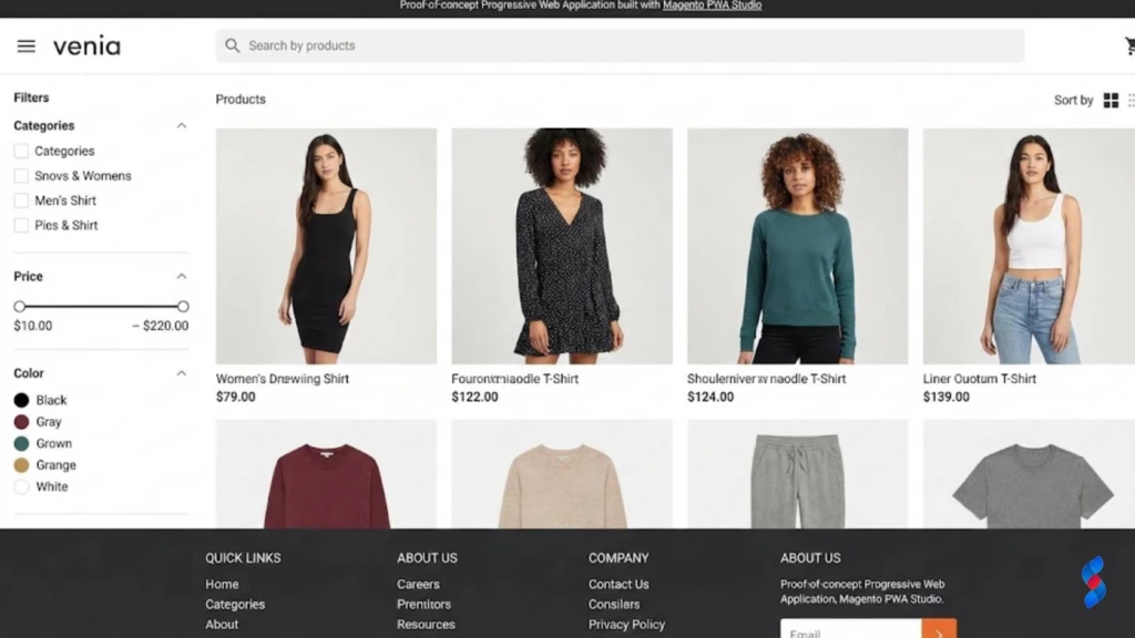
Magento PWA Studio: Magento PWA Studio is a suite of tools and libraries that allows developers to build PWAs on top of Magento. This is the recommended approach for new PWA implementations.
Third-Party PWA Solutions: Several third-party vendors offer PWA solutions for Magento that can be installed as extensions.
Custom Development: You can also develop a PWA from scratch using web technologies and integrating it with your Magento store.
Regardless of the approach you choose, consider these factors:
Performance Optimization: Ensure that your PWA is optimized for performance, including fast loading times and efficient caching.
User Experience: Design a user-friendly interface that is intuitive and easy to navigate on mobile devices.
Integration with Magento: Ensure that your PWA is seamlessly integrated with your Magento store, including product catalog, checkout process, and customer accounts.
“PWAs represent the future of mobile e-commerce. By combining the best of the web and native apps, they offer a superior user experience and drive significant business results.” – John Doe, E-commerce Consultant
Speed Optimization: The Key to Mobile Conversions
In the mobile-first world, speed is paramount. Users expect websites to load instantly, and they are quick to abandon those that don’t.
Why Mobile Page Speed Matters
Mobile page speed directly impacts several key metrics:
Conversion Rates: Faster loading times lead to higher conversion rates.
Bounce Rates: Slow-loading websites have higher bounce rates.
User Engagement: Users are more likely to engage with websites that load quickly.
Search Engine Rankings: Google prioritizes fast-loading websites in its mobile search rankings.
A study by Google found that 53% of mobile users abandon a website if it takes longer than three seconds to load. Therefore, Magento mobile speed optimization should be a top priority.
Identifying and Addressing Speed Bottlenecks (Images, Code, Caching)
Several factors can contribute to slow loading times on Magento stores:
Unoptimized Images: Large image files can significantly slow down page loading times.
Bloated Code: Excessive or poorly written code can increase the size of your website and slow down rendering.
Lack of Caching: Caching allows your website to store frequently accessed data, reducing the need to fetch it from the server every time.
Slow Hosting: Your hosting environment can have a significant impact on website performance.
Third-Party Extensions: Some third-party extensions can negatively impact website performance.
Here’s how to identify and address these bottlenecks:
Use Page Speed Testing Tools: Use tools like Google PageSpeed Insights or GTmetrix to identify performance bottlenecks.
Optimize Images: Compress images using tools like TinyPNG or ImageOptim. Use appropriate image formats (e.g., WebP) for mobile devices.
Minify Code: Minify HTML, CSS, and JavaScript files to reduce their size.
Enable Caching: Enable browser caching and server-side caching to store frequently accessed data.
Choose a Fast Hosting Provider: Select a hosting provider that offers fast servers and optimized configurations for Magento.
Optimize Third-Party Extensions: Disable or replace extensions that are negatively impacting performance.
Tools and Techniques for Magento Mobile Speed Optimization (e.g., Google PageSpeed Insights)
Several tools and techniques can help you optimize your Magento store for mobile speed:
Google PageSpeed Insights: Google PageSpeed Insights provides detailed recommendations for improving website performance.
GTmetrix: GTmetrix offers comprehensive performance analysis and recommendations.
WebPageTest: WebPageTest allows you to test your website’s performance from different locations and devices.
Magento Caching: Enable Magento’s built-in caching features to improve performance.
Varnish Cache: Use Varnish Cache as a reverse proxy to cache frequently accessed content.
Content Delivery Network (CDN): Use a CDN to distribute your website’s content across multiple servers, reducing latency for users around the world.
Lazy Loading: Implement lazy loading to load images and other resources only when they are visible on the screen.
Magento mobile speed optimization is an ongoing process and will require constant monitoring.
Mobile UX Best Practices for Magento
A positive user experience (UX) is essential for driving conversions and customer loyalty on mobile devices.
Simplifying Navigation and Search
Mobile users have limited screen space and attention spans, so it’s crucial to simplify navigation and make it easy for them to find what they’re looking for.
Use a Clear and Concise Menu: Implement a clear and concise menu that is easy to navigate on smaller screens. Consider using a hamburger menu or other mobile-friendly navigation patterns.
Implement a Powerful Search Function: Provide a powerful search function that allows users to quickly find products and information.
Use Breadcrumbs: Use breadcrumbs to help users understand their location within the website and navigate back to previous pages.
Optimize for Touch Interactions: Ensure that navigation elements are large enough and spaced appropriately for easy tapping on touchscreens.
Optimizing Product Pages for Mobile
Product pages are critical for driving conversions, so it’s essential to optimize them for mobile devices.
Use High-Quality Images: Use high-quality images that showcase your products in detail. Optimize images for mobile devices to reduce file sizes and improve loading times.
Write Concise Product Descriptions: Write concise product descriptions that highlight the key features and benefits of your products.
Display Customer Reviews: Display customer reviews to build trust and social proof.
Provide Clear Call-to-Actions: Provide clear call-to-actions (e.g., “Add to Cart,” “Buy Now”) that are easy to tap on touchscreens.
Ensure fast loading times
Streamlining the Checkout Process for Mobile Devices
The checkout process is often the most critical point in the customer journey, so it’s essential to streamline it for mobile devices.
Use a One-Page Checkout: Implement a one-page checkout that minimizes the number of steps required to complete a purchase.
Offer Guest Checkout: Allow users to checkout as guests without creating an account.
Simplify Forms: Simplify forms and use appropriate input types (e.g., number pads for phone numbers) to make them easier to fill out on mobile devices.
Offer Mobile Payment Options: Offer mobile payment options like Apple Pay and Google Pay to streamline the checkout process.
Provide Clear and Concise Instructions: Provide clear and concise instructions throughout the checkout process.
Ensure Security: Reassure users that their payment information is secure by displaying security badges and using HTTPS encryption.
Mobile-First Content Strategy for Magento
Optimizing your content for mobile devices is just as important as optimizing your website’s design and functionality.
Adapting Product Descriptions and Images for Mobile Screens
Mobile users have limited screen space, so it’s crucial to adapt your product descriptions and images for smaller screens.
Write Concise Product Descriptions: Write concise product descriptions that highlight the key features and benefits of your products. Use bullet points and short paragraphs to make the text easier to read.
Use High-Quality Images: Use high-quality images that showcase your products in detail. Optimize images for mobile devices to reduce file sizes and improve loading times.
Use Alt Text: Use alt text to describe your images, which is important for accessibility and SEO.
Consider Video: Video content can be very engaging on mobile devices. Consider using short videos to showcase your products.
Creating Mobile-Specific Promotions and Offers
Mobile users often have different needs and preferences than desktop users, so it’s important to create mobile-specific promotions and offers.
Location-Based Offers: Offer location-based promotions to users who are near your store.
Mobile-Exclusive Discounts: Offer exclusive discounts to users who purchase on their mobile devices.
Push Notifications: Use push notifications to promote special offers and discounts.
Personalized Recommendations: Provide personalized product recommendations based on the user’s browsing history and purchase behavior.
Optimizing Blog Content for Mobile Readership
If you have a blog on your Magento store, it’s important to optimize it for mobile readership.
Use Short Paragraphs: Use short paragraphs to make the text easier to read on smaller screens.
Use Headings and Subheadings: Use headings and subheadings to break up the text and make it easier to scan.
Use Images and Videos: Use images and videos to break up the text and make the content more engaging.
Optimize for Mobile SEO: Optimize your blog content for mobile SEO by using relevant keywords and optimizing your meta descriptions.
Testing and Monitoring Your Magento Mobile Performance
Testing and monitoring are crucial for ensuring that your Magento store is performing optimally on mobile devices.
Tools for Mobile Website Testing (e.g., Google Mobile-Friendly Test)
Several tools can help you test your website’s mobile performance:
Google Mobile-Friendly Test: Google Mobile-Friendly Test checks whether your website is mobile-friendly and provides recommendations for improvement.
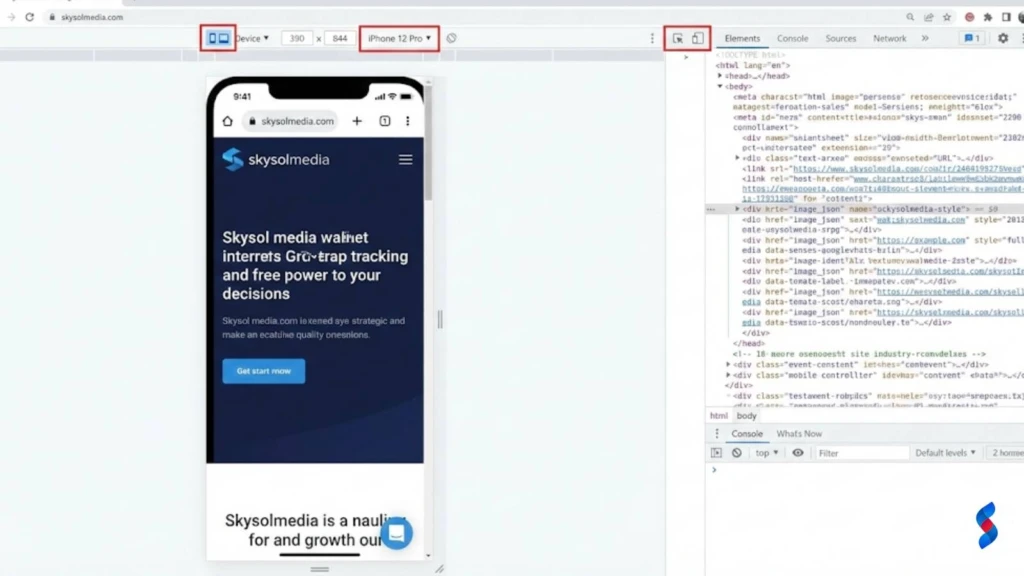
Browser Developer Tools: Most web browsers have built-in developer tools that allow you to test your website on different devices and screen sizes.
Third-Party Testing Tools: Several third-party tools offer comprehensive mobile website testing, including BrowserStack and Sauce Labs.
Key Performance Indicators (KPIs) to Track
Several key performance indicators (KPIs) can help you track your Magento store’s mobile performance:
Mobile Traffic: Track the percentage of your website traffic that comes from mobile devices.
Mobile Conversion Rate: Track the conversion rate for mobile users.
Mobile Bounce Rate: Track the bounce rate for mobile users.
Mobile Page Load Time: Track the average page load time for mobile users.
Mobile Revenue: Track the revenue generated from mobile devices.
A/B Testing for Mobile Optimization: Examples and Best Practices
A/B testing is a powerful technique for optimizing your Magento store for mobile devices.
Test Different Headlines: Test different headlines to see which ones perform best.
Test Different Call-to-Actions: Test different call-to-actions to see which ones generate the most clicks.
Test Different Layouts: Test different layouts to see which ones are most user-friendly.
Test Different Images: Test different images to see which ones are most engaging.
Best Practices for A/B Testing:
Test One Element at a Time: Test only one element at a time to isolate the impact of each change.
Use a Control Group: Use a control group to compare the results of your test against a baseline.
Run Tests for a Sufficient Length of Time: Run tests for a sufficient length of time to collect statistically significant data.
Analyze the Results Carefully: Analyze the results carefully to determine which variations performed best.
Troubleshooting Common Magento Mobile Issues
Even with careful planning and optimization, you may encounter issues with your Magento store on mobile devices.
Addressing Layout Problems on Different Devices
Layout problems can occur when your website doesn’t render correctly on different devices and screen sizes.
Use Responsive Design: Ensure that your website uses responsive design to adapt to different screen sizes.
Test on Multiple Devices: Regularly test your website on a variety of mobile devices and screen sizes to ensure that it renders correctly.
Use CSS Media Queries: Use CSS media queries to adjust the layout and styling of your website based on the screen size.
Inspect Element: Use your browser’s “Inspect Element” tool to identify the source of layout problems and make adjustments to your CSS.
Fixing Slow Loading Times on Mobile Networks
Slow loading times can frustrate users and lead to higher bounce rates.
Optimize Images: Compress images and use appropriate image formats for mobile devices.
Minify Code: Minify HTML, CSS, and JavaScript files to reduce their size.
Enable Caching: Enable browser caching and server-side caching to store frequently accessed data.
Use a CDN: Use a CDN to distribute your website’s content across multiple servers.
Lazy Loading: Implement lazy loading to load images and other resources only when they are visible on the screen.
Resolving Mobile Payment Gateway Issues
Mobile payment gateway issues can prevent users from completing purchases on their mobile devices.
Test Mobile Payment Gateways: Thoroughly test your mobile payment gateways to ensure that they are working correctly.
Provide Clear Error Messages: Provide clear error messages to users if there is a problem with their payment.
Offer Multiple Payment Options: Offer multiple payment options to give users more flexibility.
Ensure Security: Reassure users that their payment information is secure by displaying security badges and using HTTPS encryption.
We once had a client who struggled with mobile payment gateway integration. After auditing their setup, our team in Dubai discovered a conflict between a third-party extension and the payment gateway’s mobile SDK. By disabling the conflicting extension and reconfiguring the gateway, we resolved the issue and restored seamless mobile payments.
Case Studies: Successful Magento Mobile Implementations
Let’s explore some real-world examples of successful Magento mobile first implementations and extract valuable lessons.
Real-World Examples of Mobile-Optimized Magento Stores
Example 1: Fashion Retailer: A fashion retailer implemented a PWA for their Magento store, resulting in a 50% increase in mobile conversion rates and a 30% reduction in bounce rates.
Example 2: Electronics Store: An electronics store optimized their mobile website for speed, resulting in a 40% decrease in page load time and a 20% increase in mobile revenue.
Example 3: Home Goods Store: A home goods store implemented a mobile-first content strategy, resulting in a 25% increase in mobile engagement and a 15% increase in mobile sales.
Lessons Learned and Best Practices from These Cases
Prioritize Speed: Speed is critical for mobile success. Optimize your website for fast loading times.
Simplify Navigation: Make it easy for users to find what they’re looking for on mobile devices.
Optimize for Touch Interactions: Ensure that your website is optimized for touch interactions.
Create Mobile-Specific Content: Create mobile-specific promotions and offers to cater to mobile users.
Test and Monitor: Regularly test and monitor your website’s mobile performance.
How to Apply These Strategies to Your Own Store
Start with a Mobile Audit: Conduct a thorough mobile audit of your Magento store to identify areas for improvement.
Prioritize Key Areas: Focus on the key areas that will have the biggest impact on your mobile performance, such as speed, navigation, and content.
Implement Changes Gradually: Implement changes gradually and test them thoroughly before rolling them out to all users.
Monitor Results: Monitor the results of your changes and make adjustments as needed.
The Future of Magento and Mobile Commerce
The mobile landscape is constantly evolving, so it’s important to stay ahead of the curve and prepare your Magento store for future mobile innovations.
Emerging Trends in Mobile E-commerce
5G Technology: 5G technology will enable faster mobile data speeds and lower latency, which will improve the mobile shopping experience.
Augmented Reality (AR): AR will allow users to virtually try on clothes or place furniture in their homes before making a purchase.
Voice Commerce: Voice commerce will allow users to make purchases using voice assistants like Siri and Alexa.
Mobile Wallets: Mobile wallets like Apple Pay and Google Pay will continue to grow in popularity.
Personalization: Personalization will become even more important as users expect personalized shopping experiences on their mobile devices.
How Magento is Adapting to the Mobile-First World
Magento PWA Studio: Magento PWA Studio is designed to help developers build PWAs that are optimized for mobile devices.
Magento Mobile SDK: Magento Mobile SDK provides developers with the tools they need to build native mobile apps for Magento.
Magento Commerce Cloud: Magento Commerce Cloud provides a scalable and reliable platform for running Magento stores, which is important for handling mobile traffic.
Magento is also investing in mobile-first features
Preparing Your Store for Future Mobile Innovations
Stay Informed: Stay informed about the latest trends in mobile e-commerce.
Invest in Mobile Technology: Invest in mobile technology like PWAs and AR.
Personalize the Mobile Experience: Personalize the mobile shopping experience for your customers.
Optimize for Mobile Search: Optimize your website for mobile search.
Test and Monitor: Regularly test and monitor your website’s mobile performance.
Conclusion: Embrace the Mobile-First Revolution with Magento
In conclusion, mastering the Magento mobile first approach is not merely an option but a necessity for thriving in the competitive e-commerce landscape of 2026. By prioritizing responsive design, embracing PWAs, optimizing for speed, implementing mobile UX best practices, and crafting a mobile-first content strategy, you can unlock the full potential of mobile commerce and drive significant growth for your Magento store. We at SkySol Media are confident that by following the guidelines outlined in this comprehensive guide, you can create an exceptional mobile shopping experience that delights your customers and maximizes your revenue.
Recap of Key Strategies for Magento Mobile Optimization
Implement responsive design for seamless adaptation across devices.
Leverage PWAs for enhanced performance and app-like experiences.
Prioritize speed optimization to reduce bounce rates and improve conversions.
Apply mobile UX best practices for intuitive navigation and streamlined checkout.
Craft a mobile-first content strategy to engage and convert mobile users.
Call to Action: Implement These Tips Today to Drive Mobile Sales
Don’t wait to embrace the mobile-first revolution. Start implementing these tips today to transform your Magento store into a mobile powerhouse and drive significant sales growth.
Q: What is “mobile-first” in the context of Magento e-commerce?
A: “Mobile-first” means designing and developing your Magento store primarily for mobile devices (smartphones, tablets) before adapting it for desktop computers. It recognizes that a majority of online shoppers use mobile devices and prioritizes their experience.
Q: Why is mobile-first important for Magento stores in 2026?
A: In 2026, mobile devices are the dominant way people access the internet and shop online. A mobile-first approach ensures a better user experience, improved search engine rankings (Google prioritizes mobile-friendly sites), and increased conversion rates, ultimately driving more sales.
Q: What are Progressive Web Apps (PWAs) and how do they benefit a Magento mobile store?
A: PWAs are web applications that offer a native app-like experience. They provide benefits like offline access, push notifications, faster loading times, and the ability to add an icon to the user’s home screen, enhancing engagement and conversion rates for Magento mobile stores.
Q: How can I test the mobile-friendliness of my Magento store?
A: You can use tools like Google’s Mobile-Friendly Test to assess your website’s mobile-friendliness. You should also test it manually on various mobile devices and screen sizes to ensure proper rendering and functionality.
Q: What is Magento responsive design?
A: Magento responsive design involves creating a website that adapts its layout and content to fit different screen sizes and devices, providing an optimal viewing experience across desktops, tablets, and smartphones. It’s a core component of a mobile-first strategy.
Q: What are some common mobile payment gateway issues in Magento and how can I resolve them?
A: Common issues include integration problems, incompatible extensions, and security vulnerabilities. Solutions involve thoroughly testing the payment gateway, ensuring compatibility with mobile devices, providing clear error messages, and offering multiple payment options.
Q: What is Magento headless commerce and how does it relate to a mobile-first strategy?
A: Magento headless commerce separates the front-end (what the user sees) from the back-end (the e-commerce platform). This allows for greater flexibility in designing and optimizing the mobile experience, as developers are not limited by the constraints of the traditional Magento theme.
Q: How can I improve Magento mobile performance?
A: There are several ways, you should optimize images, minify code, enable caching, use a CDN, and optimize third-party extensions. Regularly monitor your website’s performance using tools like Google PageSpeed Insights and GTmetrix.
Q: What role does mobile UX play in a Magento mobile-first strategy?
A: Mobile UX is crucial. A good mobile UX involves simplifying navigation, optimizing product pages for smaller screens, streamlining the checkout process, and ensuring that all elements are easy to use on touchscreens. A positive UX enhances user engagement and increases conversion rates.
Explore the world of Headless Magento commerce. Discover if your current Magento store is truly ready to embrace this modern architecture and unlock its full potential. Learn about benefits, challenges, and preparation steps.
Explore Magento development for your e-commerce business in 2025. This ultimate guide helps you understand its benefits, costs, and whether it's the right fit for your needs. Learn from SkySol Media's expert insights.
Explore if Magento development is the right choice for your e-commerce business. Discover its features, benefits, costs, and alternatives to make an informed decision. Learn about the future trends in Magento development.
Explore if Magento 2 e-commerce is the right platform for your business in 2025. Uncover its features, benefits, and potential drawbacks to make an informed decision. Learn if its scalability and flexibility meet your e-commerce needs and growth aspirations.
Explore if your Magento store is truly prepared for headless commerce. This guide covers key considerations, benefits, and how to seamlessly transition. Optimize your online store for enhanced performance and customer experience today.
Considering Magento 2 for your online store? This guide explores the pros, cons, features, and costs associated with Magento 2 ecommerce to help you make an informed decision for your business's future success. Learn if it's the right platform for you.
This mode enables people with epilepsy to use the website safely by eliminating the risk of seizures that result from flashing or blinking animations and risky color combinations.
Visually Impaired Mode
Improves website's visuals
This mode adjusts the website for the convenience of users with visual impairments such as Degrading Eyesight, Tunnel Vision, Cataract, Glaucoma, and others.
Cognitive Disability Mode
Helps to focus on specific content
This mode provides different assistive options to help users with cognitive impairments such as Dyslexia, Autism, CVA, and others, to focus on the essential elements of the website more easily.
ADHD Friendly Mode
Reduces distractions and improve focus
This mode helps users with ADHD and Neurodevelopmental disorders to read, browse, and focus on the main website elements more easily while significantly reducing distractions.
Blindness Mode
Allows using the site with your screen-reader
This mode configures the website to be compatible with screen-readers such as JAWS, NVDA, VoiceOver, and TalkBack. A screen-reader is software for blind users that is installed on a computer and smartphone, and websites must be compatible with it.
Online Dictionary
Readable Experience
Content Scaling
Default
Text Magnifier
Readable Font
Dyslexia Friendly
Highlight Titles
Highlight Links
Font Sizing
Default
Line Height
Default
Letter Spacing
Default
Left Aligned
Center Aligned
Right Aligned
Visually Pleasing Experience
Dark Contrast
Light Contrast
Monochrome
High Contrast
High Saturation
Low Saturation
Adjust Text Colors
Adjust Title Colors
Adjust Background Colors
Easy Orientation
Mute Sounds
Hide Images
Hide Emoji
Reading Guide
Stop Animations
Reading Mask
Highlight Hover
Highlight Focus
Big Dark Cursor
Big Light Cursor
Cognitive Reading
Virtual Keyboard
Navigation Keys
Voice Navigation
Accessibility Statement
skysolmedia.com
October 14, 2026
Compliance status
We firmly believe that the internet should be available and accessible to anyone, and are committed to providing a website that is accessible to the widest possible audience,
regardless of circumstance and ability.
To fulfill this, we aim to adhere as strictly as possible to the World Wide Web Consortium’s (W3C) Web Content Accessibility Guidelines 2.1 (WCAG 2.1) at the AA level.
These guidelines explain how to make web content accessible to people with a wide array of disabilities. Complying with those guidelines helps us ensure that the website is accessible
to all people: blind people, people with motor impairments, visual impairment, cognitive disabilities, and more.
This website utilizes various technologies that are meant to make it as accessible as possible at all times. We utilize an accessibility interface that allows persons with specific
disabilities to adjust the website’s UI (user interface) and design it to their personal needs.
Additionally, the website utilizes an AI-based application that runs in the background and optimizes its accessibility level constantly. This application remediates the website’s HTML,
adapts Its functionality and behavior for screen-readers used by the blind users, and for keyboard functions used by individuals with motor impairments.
If you’ve found a malfunction or have ideas for improvement, we’ll be happy to hear from you. You can reach out to the website’s operators by using the following email
Screen-reader and keyboard navigation
Our website implements the ARIA attributes (Accessible Rich Internet Applications) technique, alongside various different behavioral changes, to ensure blind users visiting with
screen-readers are able to read, comprehend, and enjoy the website’s functions. As soon as a user with a screen-reader enters your site, they immediately receive
a prompt to enter the Screen-Reader Profile so they can browse and operate your site effectively. Here’s how our website covers some of the most important screen-reader requirements,
alongside console screenshots of code examples:
Screen-reader optimization: we run a background process that learns the website’s components from top to bottom, to ensure ongoing compliance even when updating the website.
In this process, we provide screen-readers with meaningful data using the ARIA set of attributes. For example, we provide accurate form labels;
descriptions for actionable icons (social media icons, search icons, cart icons, etc.); validation guidance for form inputs; element roles such as buttons, menus, modal dialogues (popups),
and others. Additionally, the background process scans all the website’s images and provides an accurate and meaningful image-object-recognition-based description as an ALT (alternate text) tag
for images that are not described. It will also extract texts that are embedded within the image, using an OCR (optical character recognition) technology.
To turn on screen-reader adjustments at any time, users need only to press the Alt+1 keyboard combination. Screen-reader users also get automatic announcements to turn the Screen-reader mode on
as soon as they enter the website.
These adjustments are compatible with all popular screen readers, including JAWS and NVDA.
Keyboard navigation optimization: The background process also adjusts the website’s HTML, and adds various behaviors using JavaScript code to make the website operable by the keyboard. This includes the ability to navigate the website using the Tab and Shift+Tab keys, operate dropdowns with the arrow keys, close them with Esc, trigger buttons and links using the Enter key, navigate between radio and checkbox elements using the arrow keys, and fill them in with the Spacebar or Enter key.Additionally, keyboard users will find quick-navigation and content-skip menus, available at any time by clicking Alt+1, or as the first elements of the site while navigating with the keyboard. The background process also handles triggered popups by moving the keyboard focus towards them as soon as they appear, and not allow the focus drift outside it.
Users can also use shortcuts such as “M” (menus), “H” (headings), “F” (forms), “B” (buttons), and “G” (graphics) to jump to specific elements.
Disability profiles supported in our website
Epilepsy Safe Mode: this profile enables people with epilepsy to use the website safely by eliminating the risk of seizures that result from flashing or blinking animations and risky color combinations.
Visually Impaired Mode: this mode adjusts the website for the convenience of users with visual impairments such as Degrading Eyesight, Tunnel Vision, Cataract, Glaucoma, and others.
Cognitive Disability Mode: this mode provides different assistive options to help users with cognitive impairments such as Dyslexia, Autism, CVA, and others, to focus on the essential elements of the website more easily.
ADHD Friendly Mode: this mode helps users with ADHD and Neurodevelopmental disorders to read, browse, and focus on the main website elements more easily while significantly reducing distractions.
Blindness Mode: this mode configures the website to be compatible with screen-readers such as JAWS, NVDA, VoiceOver, and TalkBack. A screen-reader is software for blind users that is installed on a computer and smartphone, and websites must be compatible with it.
Keyboard Navigation Profile (Motor-Impaired): this profile enables motor-impaired persons to operate the website using the keyboard Tab, Shift+Tab, and the Enter keys. Users can also use shortcuts such as “M” (menus), “H” (headings), “F” (forms), “B” (buttons), and “G” (graphics) to jump to specific elements.
Additional UI, design, and readability adjustments
Font adjustments – users, can increase and decrease its size, change its family (type), adjust the spacing, alignment, line height, and more.
Color adjustments – users can select various color contrast profiles such as light, dark, inverted, and monochrome. Additionally, users can swap color schemes of titles, texts, and backgrounds, with over seven different coloring options.
Animations – person with epilepsy can stop all running animations with the click of a button. Animations controlled by the interface include videos, GIFs, and CSS flashing transitions.
Content highlighting – users can choose to emphasize important elements such as links and titles. They can also choose to highlight focused or hovered elements only.
Audio muting – users with hearing devices may experience headaches or other issues due to automatic audio playing. This option lets users mute the entire website instantly.
Cognitive disorders – we utilize a search engine that is linked to Wikipedia and Wiktionary, allowing people with cognitive disorders to decipher meanings of phrases, initials, slang, and others.
Additional functions – we provide users the option to change cursor color and size, use a printing mode, enable a virtual keyboard, and many other functions.
Browser and assistive technology compatibility
We aim to support the widest array of browsers and assistive technologies as possible, so our users can choose the best fitting tools for them, with as few limitations as possible. Therefore, we have worked very hard to be able to support all major systems that comprise over 95% of the user market share including Google Chrome, Mozilla Firefox, Apple Safari, Opera and Microsoft Edge, JAWS and NVDA (screen readers).
Notes, comments, and feedback
Despite our very best efforts to allow anybody to adjust the website to their needs. There may still be pages or sections that are not fully accessible, are in the process of becoming accessible, or are lacking an adequate technological solution to make them accessible. Still, we are continually improving our accessibility, adding, updating and improving its options and features, and developing and adopting new technologies. All this is meant to reach the optimal level of accessibility, following technological advancements. For any assistance, please reach out to