Why Small Businesses Should Prioritize Mobile-First Websites
In today’s digital-first world, having an online presence is no longer optional for small businesses; it is essential. As we move further into 2025, one...



A mobile friendly website is no longer a luxury, but a necessity in today’s digital landscape. With the majority of internet users accessing websites via their mobile devices, ensuring your site provides an optimal experience on these devices is crucial for success. In this ultimate guide, we’ll explore the core principles of a mobile friendly website, its impact on SEO, and how to create a seamless mobile user experience.
A mobile friendly website is one that is easily accessible and usable on smartphones and tablets. This means that the website’s design, content, and functionality are optimized for smaller screens and touch-based navigation. In our experience, a truly mobile-friendly site goes beyond simply shrinking a desktop website to fit a mobile screen.
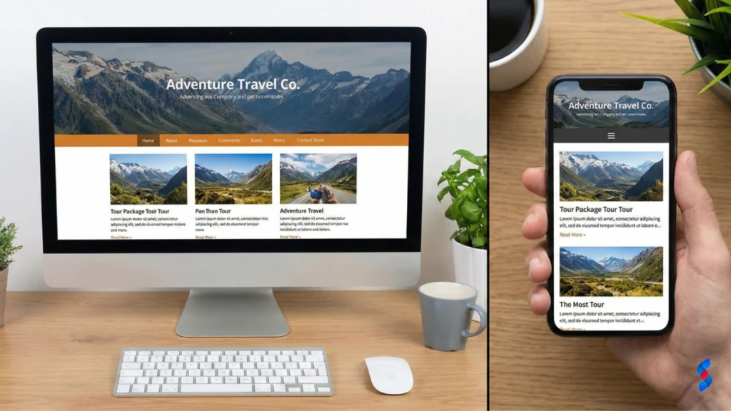
While responsive design is a key component of a mobile friendly website, it’s not the only factor to consider. Touch targets, viewport configuration, and mobile-first design are also crucial elements. For example, our team in Dubai often finds that clients overlook the size and spacing of touch elements, leading to frustrating user experiences.
Google’s mobile-first indexing means that Google primarily uses the mobile version of a website for indexing and ranking. This shift reflects the increasing dominance of mobile internet usage and the importance of providing a great mobile experience. Failing to have a mobile friendly website can severely impact your search engine rankings.
“Mobile is not the future; it is the present. You need to be where your customers are.” – Thomas Husson, Forrester
Mobile internet usage continues to grow exponentially, with smartphones becoming the primary way people access the internet. Statistics consistently show that mobile devices account for a significant portion of global web traffic. This trend is expected to continue in 2025 and beyond, making a mobile friendly website even more critical.
| Year | Mobile Traffic Share | Desktop Traffic Share |
|---|---|---|
| 2022 | 58.99% | 41.01% |
| 2023 | 60.68% | 39.32% |
| 2024 (Projected) | 62.39% | 37.61% |
| 2025 (Projected) | 64.13% | 35.87% |
The trend is clear: mobile traffic is surpassing desktop traffic and is projected to continue its ascent. Businesses that fail to adapt to this shift risk losing a significant portion of their potential audience. Understanding these trends is crucial for prioritizing mobile optimization efforts.
Mobile commerce, or m-commerce, is the practice of buying and selling goods and services through mobile devices. M-commerce is experiencing rapid growth, with consumers increasingly using their smartphones and tablets to make purchases online. A mobile friendly website is essential for capitalizing on this trend.
Google’s mobile-first indexing prioritizes the mobile version of your website when determining search rankings. If your website isn’t mobile-friendly, it may not be indexed properly, resulting in lower rankings and reduced visibility. We’ve seen numerous clients experience a significant drop in rankings after Google switched to mobile-first indexing.
Google uses mobile crawlers to index websites, assessing their mobile-friendliness based on factors such as responsive design, mobile usability, and page speed. Websites that provide a poor mobile experience are likely to be penalized in search rankings.
The consequences of not having a mobile friendly website can be severe, including:
To optimize your site for mobile-first indexing, focus on:
Mobile friendliness is a direct ranking factor, meaning that Google considers it when determining your website’s position in search results. Websites that provide a poor mobile experience are likely to be ranked lower than those that offer a seamless mobile experience.
There’s a strong correlation between mobile usability and organic traffic. Websites that are easy to use on mobile devices tend to attract more organic traffic from mobile users. Conversely, websites with poor mobile usability often experience higher bounce rates and lower organic traffic.
Google’s Mobile-Friendly Test is a valuable tool for assessing your website’s mobile-friendliness. The test analyzes your website and provides feedback on its mobile usability, including any errors or issues that need to be addressed.
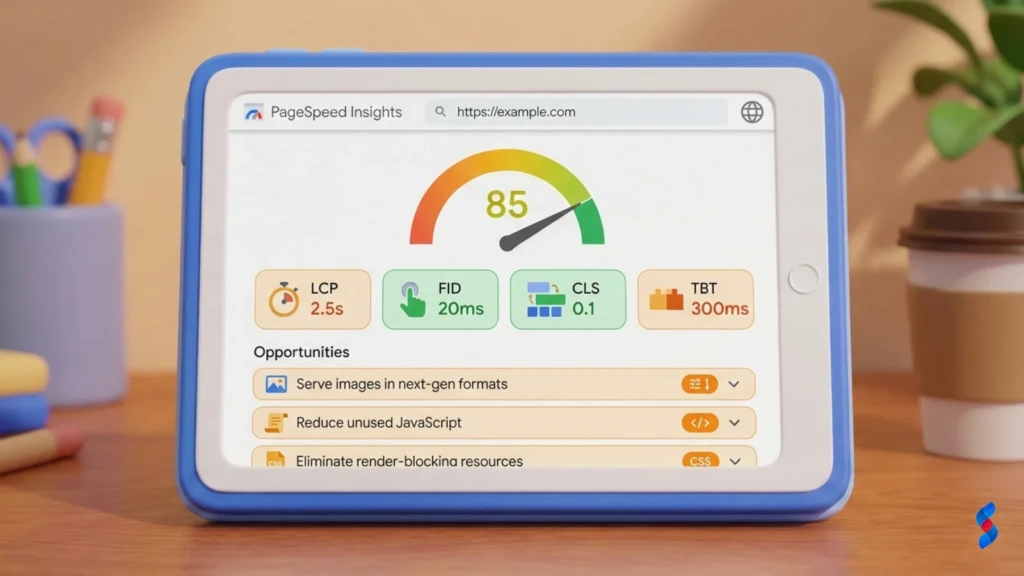
Page speed is even more critical for mobile users than desktop users. Mobile users often have slower internet connections and are less patient with slow-loading websites. A slow-loading website can lead to a high bounce rate and a negative user experience.
Several tools are available for measuring mobile page speed, including:
These tools analyze your website’s performance and provide recommendations for improvement.
To improve website speed on mobile devices, consider the following optimization techniques:
Responsive design is a web design approach that allows websites to adapt to different screen sizes and resolutions. This ensures that the website provides a consistent and optimal experience across all devices, from smartphones to desktops.
The core principles of responsive web design include:
Responsive design offers several advantages over creating separate mobile sites, including:
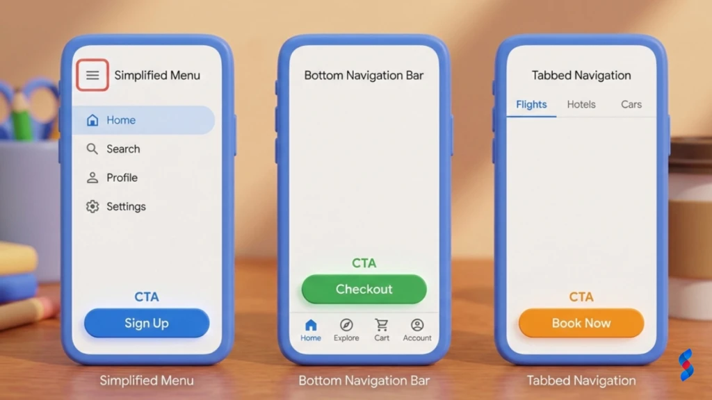
Mobile navigation should be simple and intuitive, allowing users to easily find what they’re looking for. Simplify menus and navigation structures for smaller screens to improve the mobile user experience. A client once asked us about simplifying their overly complex mobile navigation. We showed them how a streamlined approach led to a measurable lift in their KPIs.
The hamburger menu (a three-line icon) is a common way to hide navigation options on mobile devices. Use hamburger menus effectively by ensuring that they are easily visible and that the menu items are clearly labeled.
Call-to-action (CTA) buttons should be prominent and easy to tap on mobile devices. Use clear and concise language to encourage users to take action, such as “Shop Now,” “Learn More,” or “Contact Us.”
Touch targets (buttons, links, and other interactive elements) should be appropriately sized and spaced to be easily tapped on mobile devices. Aim for a minimum touch target size of 44×44 pixels, and ensure that there is sufficient spacing between touch targets to prevent accidental taps.
Forms should be optimized for mobile input to make it easy for users to fill them out on their smartphones and tablets. Use appropriate input types (e.g., email, tel) to trigger the correct keyboard on mobile devices, and provide clear error messages to guide users through the form.
Intrusive pop-ups and interstitials can be particularly annoying on mobile devices, disrupting the user experience and potentially harming your SEO. Minimize the use of these elements, and ensure that they are easy to close.
Mobile users often have shorter attention spans than desktop users. Use concise and scannable content to capture their attention and convey your message effectively. Break up long blocks of text with headings, subheadings, bullet points, and images.
Images and videos should be optimized for mobile viewing to ensure that they load quickly and display properly on smaller screens. Compress images to reduce their file size, and use responsive video players that adapt to different screen sizes.
Choose fonts and font sizes that are easy to read on mobile devices. Use a font size of at least 16 pixels for body text, and ensure that there is sufficient contrast between the text and background.
Google’s Mobile-Friendly Test is an essential tool for evaluating your website’s mobile-friendliness. It identifies potential issues and provides recommendations for improvement.
1. Go to the Google Mobile-Friendly Test website.
2. Enter the URL of the page you want to test.
3. Click “Test URL.”
4. Review the results and address any issues identified.
The Mobile-Friendly Test results will indicate whether your page is mobile-friendly and highlight any issues that need to be addressed, such as:
It’s crucial to test your website on a variety of mobile devices and screen sizes to ensure that it displays properly and functions correctly. This includes testing on different operating systems (e.g., iOS, Android) and screen resolutions.
Browser developer tools offer mobile emulation features that allow you to simulate different mobile devices and screen sizes. This is a convenient way to test your website’s mobile-friendliness without needing access to physical devices.
Device testing platforms like BrowserStack provide access to a wide range of real mobile devices and browsers, allowing you to thoroughly test your website’s compatibility and performance.

Regularly check your website for mobile usability issues to ensure that it continues to provide a great mobile experience. This includes monitoring user feedback, analyzing website analytics, and running periodic mobile-friendly tests.
Keeping your website software and plugins up to date is essential for security and performance. Outdated software can contain vulnerabilities that can be exploited by hackers, and it can also lead to compatibility issues on mobile devices.
Monitor your website’s mobile traffic and conversion rates to track the performance of your mobile optimization efforts. This data can provide valuable insights into how users are interacting with your website on mobile devices and identify areas for improvement.
While a responsive theme is a good starting point, it doesn’t automatically guarantee a mobile friendly website. Content optimization, usability testing, and performance optimization are also essential.
Content optimization and usability testing are crucial for ensuring that your website is easy to use and provides a great experience on mobile devices. This includes optimizing your content for readability, simplifying navigation, and ensuring that touch targets are appropriately sized and spaced.
Mobile optimization is beneficial for all types of websites, not just e-commerce sites. Whether you’re a blogger, a service provider, or a non-profit organization, a mobile friendly website can help you reach a wider audience, improve user engagement, and achieve your goals.
A mobile friendly website can significantly improve lead generation and engagement on mobile devices. By providing a seamless and user-friendly experience, you can encourage visitors to explore your website, learn about your products or services, and take action.
Accelerated Mobile Pages (AMP) is an open-source HTML framework that is designed to improve mobile performance by providing near-instant loading times. AMP pages are typically cached by Google and other platforms, allowing them to load much faster than traditional web pages.
Emerging mobile web technologies, such as service workers and web components, are further enhancing the mobile user experience and enabling developers to create more sophisticated and engaging mobile websites.
Progressive Web Apps (PWAs) are web applications that provide a native app-like experience on mobile devices. PWAs can be installed on the user’s home screen, work offline, and send push notifications, providing a seamless and engaging user experience.
PWAs offer several benefits over traditional web applications, including:
With the increasing popularity of voice assistants like Siri, Google Assistant, and Alexa, voice search is becoming an increasingly important part of the mobile landscape. Optimize your website for voice search queries by using natural language, long-tail keywords, and providing clear and concise answers to common questions.
Long-tail keywords and natural language are crucial for voice search optimization. Focus on using conversational language and answering questions in a clear and concise manner.
“Near me” searches are a common way for mobile users to find local businesses and services. Optimize your website for “near me” searches by ensuring that your business information is accurate and up-to-date on Google My Business and other online directories.
Ensure that your business name, address, phone number, and website URL are consistent across all online platforms. This helps Google and other search engines accurately index your business and display it in local search results.
Leverage local SEO strategies to improve your visibility in local search results, including:
Make it easy for mobile users to find your location and contact information by including a prominent map and contact details on your website. Ensure that your phone number is clickable, allowing users to easily call you from their mobile devices.
Incorporate maps and directions into your mobile website to help users easily find your business. Use Google Maps or other mapping services to provide directions from the user’s current location.
Google Analytics is a powerful tool for tracking mobile traffic and engagement. Use Google Analytics to monitor key metrics such as:
Analyzing these metrics can provide valuable insights into how users are interacting with your website on mobile devices and identify areas for improvement. A high bounce rate may indicate that your website is not mobile-friendly or that your content is not relevant to mobile users. Low conversion rates may suggest that your website is not optimized for mobile commerce.
Track your website’s conversion rates and revenue before and after implementing mobile optimization efforts to measure the impact of your changes. Use attribution modeling to determine how much of your increased revenue can be attributed to mobile optimization.
Demonstrate the value of investing in mobile friendliness by quantifying the results achieved, such as:
Highlighting specific companies that have successfully implemented mobile optimization strategies can provide valuable insights and inspiration. Share real-world examples of how these companies have benefited from mobile-friendly websites.
Describe the specific strategies and tactics that these companies used to optimize their websites for mobile devices. This could include responsive design, content optimization, page speed optimization, and mobile usability testing.
Quantify the results achieved by these companies, such as:
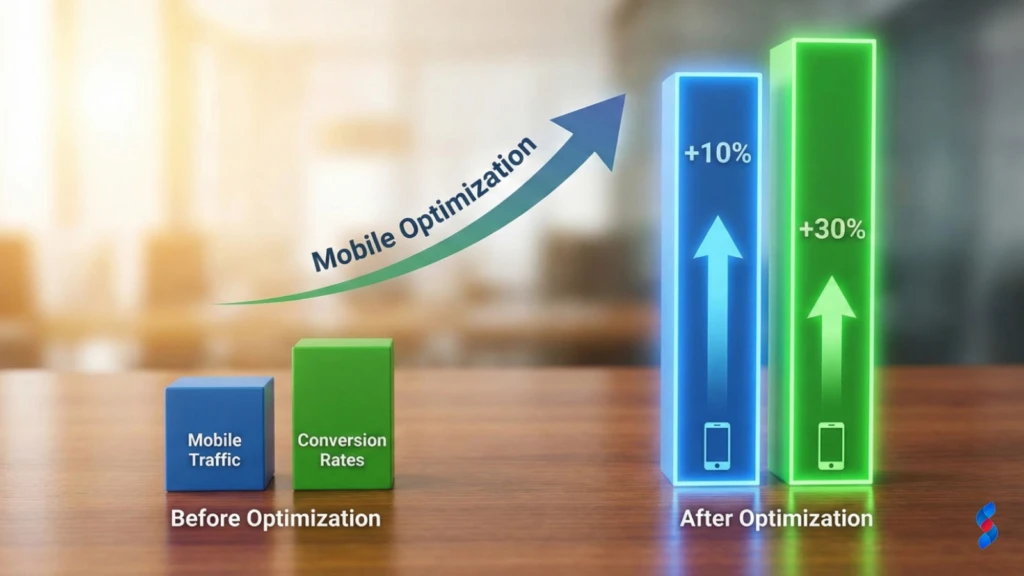
Understanding and implementing the principles of a mobile friendly website is crucial for success in today’s mobile-first world. By prioritizing mobile usability, optimizing website speed, and creating a seamless mobile user experience, businesses can attract more mobile traffic, improve conversion rates, and achieve their online goals. Ignoring mobile optimization is no longer an option. We are confident that by implementing these strategies, you’ll see measurable improvements in your website’s performance and user engagement.
Q: What is a mobile friendly website?
A: A mobile friendly website is one that is designed to be easily viewed and navigated on mobile devices, such as smartphones and tablets. It adapts to different screen sizes and resolutions, providing an optimal user experience.
Q: Why is having a mobile friendly website important?
A: With the majority of internet users accessing websites via their mobile devices, having a mobile friendly website is crucial for reaching a wider audience, improving user engagement, and boosting your SEO.
Q: What are the key elements of a mobile friendly website?
A: The key elements include responsive design, mobile usability, page speed optimization, and content optimization.
Q: How can I test if my website is mobile friendly?
A: You can use Google’s Mobile-Friendly Test to assess your website’s mobile-friendliness and identify any issues that need to be addressed.
Q: What is mobile-first indexing?
A: Mobile-first indexing means that Google primarily uses the mobile version of a website for indexing and ranking purposes.
Q: How can I improve my website’s speed on mobile devices?
A: You can improve your website’s speed by optimizing images, minifying code, enabling caching, and using a content delivery network (CDN).
Q: What is responsive design?
A: Responsive design is a web design approach that allows websites to adapt to different screen sizes and resolutions, providing a consistent and optimal experience across all devices.
Q: What are Progressive Web Apps (PWAs)?
A: Progressive Web Apps (PWAs) are web applications that provide a native app-like experience on mobile devices, offering features such as offline access and push notifications.
Q: How can I optimize my website for voice search?
A: You can optimize your website for voice search by using natural language, long-tail keywords, and providing clear and concise answers to common questions.
Q: What is the ROI of mobile optimization?
A: The ROI of mobile optimization can be measured by tracking key metrics such as increased mobile traffic, higher conversion rates, and improved SEO.


Why Small Businesses Should Prioritize Mobile-First Websites

The Future of WordPress Development in 2025

Web Development Meets Marketing: The SkySol Media Advantage

How to Make Your WordPress Site Lightning Fast in 2025-26

How Custom Plugin Development Can Solve Your Unique Business Problems

The Ultimate WordPress Speed Optimization Checklist for 2025-26